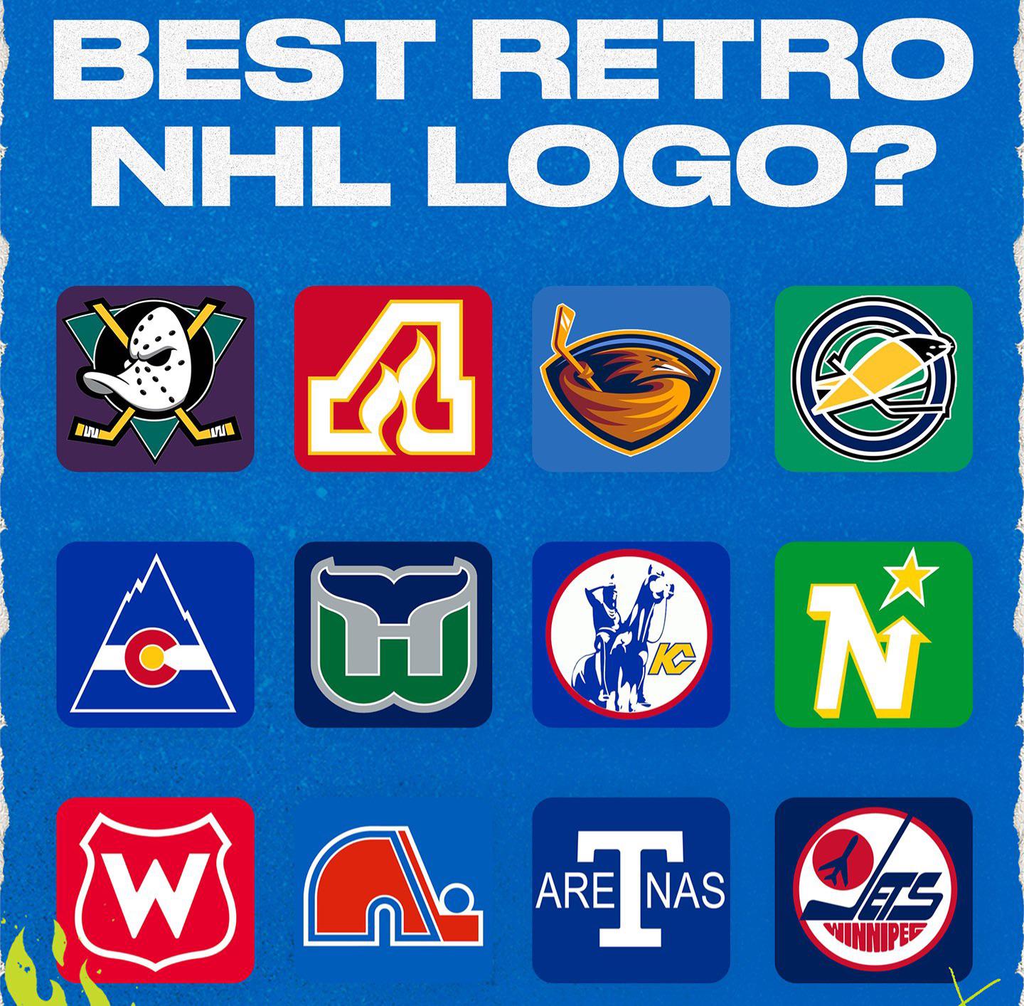
Toss up, but Hartford is boss. Ducks are sweet and should’ve stayed with it, I hate their new ones
Nordiques
AreTnas
Whalers
It’s a tie between the Nordiques and the Whalers
The AreTnaS
Whalers
Ducks & Whalers
Whalers.
Atlanta, Hartford, and Minnesota are all a clear cut top 3. They each appear to be simple but have great nods to the name of the team. Flames inside the Atlanta A. Whale’s tail and embedded gray H for Hartford. Letter N with a built-in arrow pointing up towards a star. Too many of the other logos are cartoony and were quickly dated as design aesthetics evolved. I personally love the Colorado and Quebec logos, but unless you are familiar with the Colorado state flag it would easily go over your head while the Nordiques logo is pretty abstract.
Definitely the ducks lol
The Whalers logo is one of the single best logos all time – sports or otherwise.
Thrashers fuck yeah
No robo pens logo? C’mon now.
Holy shit I just realized what the KC Scouts logo actually is I’ve only seen it in the NHL games on throwback jerseys so it wasn’t actually clear what the logo is supposed to be. I like it a lot actually now that I see what it is, it’s pretty cool
Flames and Whale. Nordiques too.
Admitted bias says North Stars. It’s a damn shame that team was moved when I was 12 years old, just becoming a big fan of the game. Fuck Norm Green.
Every NHL fan wants the mighty ducks logo back let’s be real here
Obviously the Jets.
And that California Golden Seals logo?!? Was it designed in a daycare?
Would love to see the Avs do something with the Colorado Rockies uniforms since they already did the Nordiques retro reverse. Ducks one should come back permanently though.
Whalers, in my opinion, is one of the greatest sports logos of all time.
Jets
Jets, avalanche, coyotes are already using theirs.
Winnipeg definitely.
Ducks 100%. Followed by Whalers.
The mighty ducks, and the Whalers
Ducks and it’s not even close
Ducks!!! The current logo and jerseys are so bad!
Mighty ducks
Kings chevron
The old Florida Panthers logo with the pouncing cat
Whalers followed by Jets
Ducks no competition
As a local guy, both of the Atlanta logos. Be cool if the Ducks would go back to their proper logo.


45 comments
Ducks
Whalers
Anaheim Ducks
North stars
Whalers
North Stars
Jets
What is the lower left logo?
07 Lightning logo ⚡️
Edit : Also Ducks x1000
Whalers
Ducks
Toss up, but Hartford is boss. Ducks are sweet and should’ve stayed with it, I hate their new ones
Nordiques
AreTnas
Whalers
It’s a tie between the Nordiques and the Whalers
The AreTnaS
Whalers
Ducks & Whalers
Whalers.
Atlanta, Hartford, and Minnesota are all a clear cut top 3. They each appear to be simple but have great nods to the name of the team. Flames inside the Atlanta A. Whale’s tail and embedded gray H for Hartford. Letter N with a built-in arrow pointing up towards a star. Too many of the other logos are cartoony and were quickly dated as design aesthetics evolved. I personally love the Colorado and Quebec logos, but unless you are familiar with the Colorado state flag it would easily go over your head while the Nordiques logo is pretty abstract.
Definitely the ducks lol
The Whalers logo is one of the single best logos all time – sports or otherwise.
Thrashers fuck yeah
No robo pens logo? C’mon now.
Holy shit I just realized what the KC Scouts logo actually is I’ve only seen it in the NHL games on throwback jerseys so it wasn’t actually clear what the logo is supposed to be. I like it a lot actually now that I see what it is, it’s pretty cool
Flames and Whale. Nordiques too.
Admitted bias says North Stars. It’s a damn shame that team was moved when I was 12 years old, just becoming a big fan of the game. Fuck Norm Green.
Every NHL fan wants the mighty ducks logo back let’s be real here
Obviously the Jets.
And that California Golden Seals logo?!? Was it designed in a daycare?
Would love to see the Avs do something with the Colorado Rockies uniforms since they already did the Nordiques retro reverse. Ducks one should come back permanently though.
Whalers, in my opinion, is one of the greatest sports logos of all time.
Jets
Jets, avalanche, coyotes are already using theirs.
Winnipeg definitely.
Ducks 100%. Followed by Whalers.
The mighty ducks, and the Whalers
Ducks and it’s not even close
Ducks!!! The current logo and jerseys are so bad!
Mighty ducks
Kings chevron
The old Florida Panthers logo with the pouncing cat
Whalers followed by Jets
Ducks no competition
As a local guy, both of the Atlanta logos. Be cool if the Ducks would go back to their proper logo.
Jets and Mighty Ducks
Yes