The helmets with the white front and red bill remind me of Joe’s catcher’s helmet. Great look!
I know everyone hates the M logo…but I think the design team knocked every other aspect of the new unis out of the park. Looks really clean, mix of modern and classic.
Hell, the M isn’t even that bad.
All this plus our off-season and I’m pretty stoked for 2023.
Oh yeah, those’ll get covered with pine tar really nice haha
Hot take: the M logo is a cool alternate. I know y’all have fond memories of the old M logo but it looks incredibly 90s.
Every time something new is revealed I dislike them more. (Except for the Twin Cities uniform, which rocks.) That home helmet is atrocious. I apologize for being such a butt, but I honestly dislike every change they have made. The uniforms they are replacing were much much better. The only thing they needed to do to improve them was to remove the kasota gold.
After giving it careful thought, and looking closely at each new uniform, I realize that 99% of my issue lies with home whites. I hate the red Twins across the chest. Red is by far my least favorite of the Twins colors. If that Twins were blue, like the Twin Cities alternates, I would like it *exponentially* better. The red belts also gotta go. They look terrible. I stand by what I said about these new helmets though. Not a fan. Blech.
The jokes at the time were that the new TC logo was identical to the old one, but the more I see it the more I can’t deny how much cleaner the new one looks. Definite upgrade.
I wish we could get a KASOTA gold helmet
Oh damn. Those are clean
…I like the m logo 🤷♀️
Those first ones look so fresh and the batting helmet looks fantastic with them.
I love the home, but I’m surprised so many people love the Twin Cities alternates. They remind me of the bland Padres uniforms they had a few years ago until they went back to the brown/gold. It’s so boring imo. Should have at least had a hint of red, like maybe the numbers (as the Saints have).
HOT. love the white fronts of the home. And I love the M
The M logo just doesn’t do it for me it’s so boring. Other than that these look great
Them white and navy’s tho 😋
That red, white, and blue helmet is fire but honestly I’m here for all three of them.
White uniform looks so much better with the red white and blue helmet, I hope they eventually go to a similar cap for that uniform.
Between the new looks and having Buxton/Correa locked in long term, this already feels like the beginning of a new era in club history and I couldn’t be more excited about that!
This might be the most exciting part of the new unis to me. It’s almost as good as the Carew era helmets.
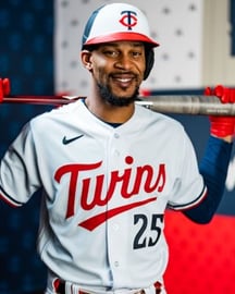
This is the first shot of the new “Twins” jerseys (the ones Buxton has on) that I’ve really LOVED. I thought it looked good, but not much better or worse than the old ones. But something about this image (maybe stupid sexy Buck) I’m sold on it.
Something about that 3d “m” on the batting helmet makes me like it more
They’re good!
Uni ok I hate the helmet lol
Unpopular opinion: the new M logo looks nothing like the Marlins M
oh fuck yes
Sick
I do hate that Miami Marlins logo
Don’t like the m
Are they doing a white panel hat? I haven’t seen it advertised.

32 comments
Oh man that home one is nice
The helmets with the white front and red bill remind me of Joe’s catcher’s helmet. Great look!
I know everyone hates the M logo…but I think the design team knocked every other aspect of the new unis out of the park. Looks really clean, mix of modern and classic.
Hell, the M isn’t even that bad.
All this plus our off-season and I’m pretty stoked for 2023.
Oh yeah, those’ll get covered with pine tar really nice haha
Hot take: the M logo is a cool alternate. I know y’all have fond memories of the old M logo but it looks incredibly 90s.
Every time something new is revealed I dislike them more. (Except for the Twin Cities uniform, which rocks.) That home helmet is atrocious. I apologize for being such a butt, but I honestly dislike every change they have made. The uniforms they are replacing were much much better. The only thing they needed to do to improve them was to remove the kasota gold.
After giving it careful thought, and looking closely at each new uniform, I realize that 99% of my issue lies with home whites. I hate the red Twins across the chest. Red is by far my least favorite of the Twins colors. If that Twins were blue, like the Twin Cities alternates, I would like it *exponentially* better. The red belts also gotta go. They look terrible. I stand by what I said about these new helmets though. Not a fan. Blech.
The jokes at the time were that the new TC logo was identical to the old one, but the more I see it the more I can’t deny how much cleaner the new one looks. Definite upgrade.
I wish we could get a KASOTA gold helmet
Oh damn. Those are clean
…I like the m logo 🤷♀️
Those first ones look so fresh and the batting helmet looks fantastic with them.
I love the home, but I’m surprised so many people love the Twin Cities alternates. They remind me of the bland Padres uniforms they had a few years ago until they went back to the brown/gold. It’s so boring imo. Should have at least had a hint of red, like maybe the numbers (as the Saints have).
HOT. love the white fronts of the home. And I love the M
The M logo just doesn’t do it for me it’s so boring. Other than that these look great
Them white and navy’s tho 😋
That red, white, and blue helmet is fire but honestly I’m here for all three of them.
White uniform looks so much better with the red white and blue helmet, I hope they eventually go to a similar cap for that uniform.
Between the new looks and having Buxton/Correa locked in long term, this already feels like the beginning of a new era in club history and I couldn’t be more excited about that!
This might be the most exciting part of the new unis to me. It’s almost as good as the Carew era helmets.
This is the first shot of the new “Twins” jerseys (the ones Buxton has on) that I’ve really LOVED. I thought it looked good, but not much better or worse than the old ones. But something about this image (maybe stupid sexy Buck) I’m sold on it.
Something about that 3d “m” on the batting helmet makes me like it more
They’re good!
Uni ok I hate the helmet lol
Unpopular opinion: the new M logo looks nothing like the Marlins M
oh fuck yes
Sick
I do hate that Miami Marlins logo
Don’t like the m
Are they doing a white panel hat? I haven’t seen it advertised.
Still don’t like that new M.
God that M is soooo fucking shitty
The M sucks… go back to the old one