
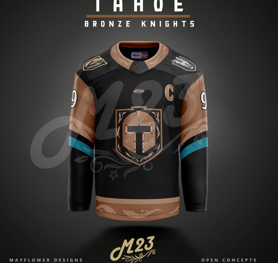
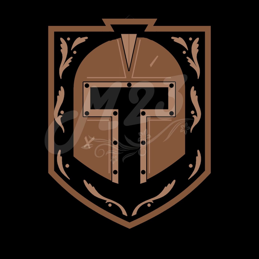
A concepts for a VGK affiliated ECHL team. I think they dropped the ball really bad when they decided to go with the “Tahoe Knight Monsters”, especially considering the logo has nothing to do with a knight aside from being affiliated with VGK being the bronze knights would lead to them having the *perfect* pipeline of affiliation with the Vegas Golden Knights, Henderson Silver Knights, and Tahoe Bronze Knights
7 comments
My [hockey design instagram](https://www.instagram.com/mayflower_designs023?igsh=MXJjZnNyY3d4cGlieA%3D%3D&utm_source=qr) for those interested
It’s a shame cause I really like some of the designs that they have – like the eye in the silhouette of Lake Tahoe, or the T flanked by mountain scapes.
Still might end up copping a jersey though cause I spent so many summers/winters driving out to Tahoe with friends and family lol
I’m pretty sure this far down the chain it’s the bronze peasants
Bronze Knights was such an obvious move that I have to assume there was some sort of trademark issue or something because wtf is a Knight Monster
Quite amazing, good job!
Tahoe troops.
Tahoe squires.
Tahoe metalmen.
Regardless that jersey slaps
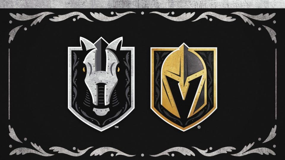
It’s cool synergy idea but the savanah ghost pirates are already the knights’ affiliate.