
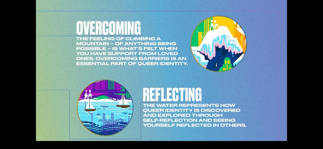
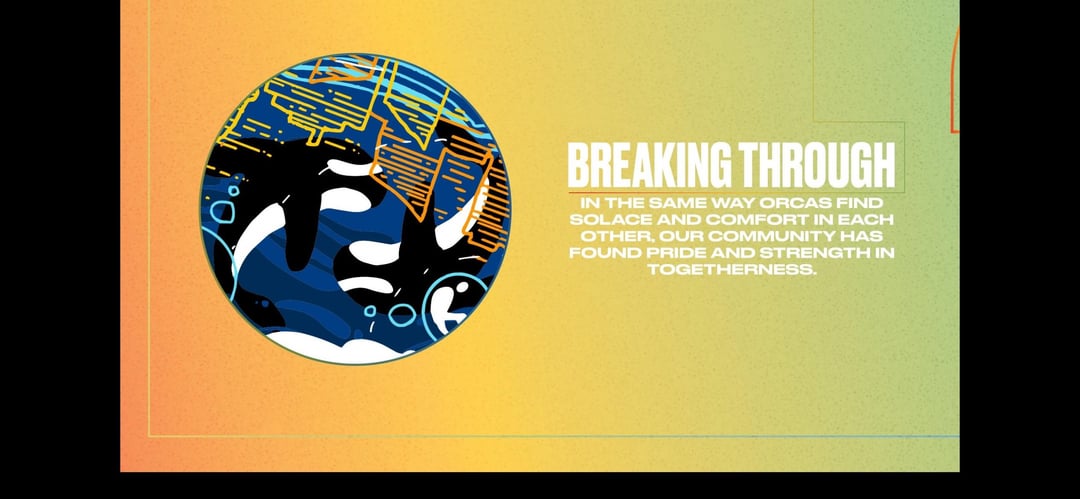
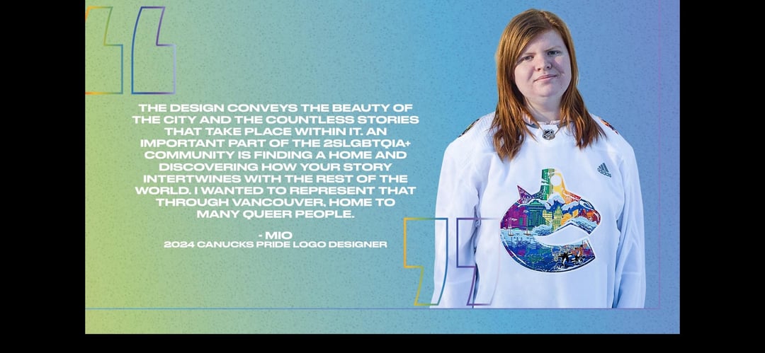
[Canucks] Encompassing the city of Vancouver and its diversity, understand all of the details behind the Canucks Pride logo, designed by artist Mio

[Canucks] Encompassing the city of Vancouver and its diversity, understand all of the details behind the Canucks Pride logo, designed by artist Mio
13 comments
Canucks always nail these, well done guys
Beautiful as always, and love to see Mio doing another one!!
Happy that they worked with Mio again, the other Pride [logo](https://x.com/canucks/status/1500994400540786692?s=46&t=7fabqgtgp69dNA1d51vxFw) she made 2 years ago is still one of the best in our specialty jerseys collection
No diss on the logo, I think it looks great, but from afar, it kinda looks like an orca riding a bike on the bottom left… which would still be fitting.
I need oneeeeee
I looks a bit messy as a logo but man I love the art style
A mountain with the colors of the trans pride flag? That’s a reference to the hidden gem Celeste!
Hell yeah
Does anyone know what the “2S” at the start of the LGBTQIA+ on the last page means?
The Canucks org is so fucking good at this.
How the fuck do the nucks always knock these sort of jersey designs out of the water?
Ohhhh this is a banger. I might grab a hoodie this year after I missed out on the tie-dye crop from last season.
She looks about as happy to wear a Canucks jersey as Boeser