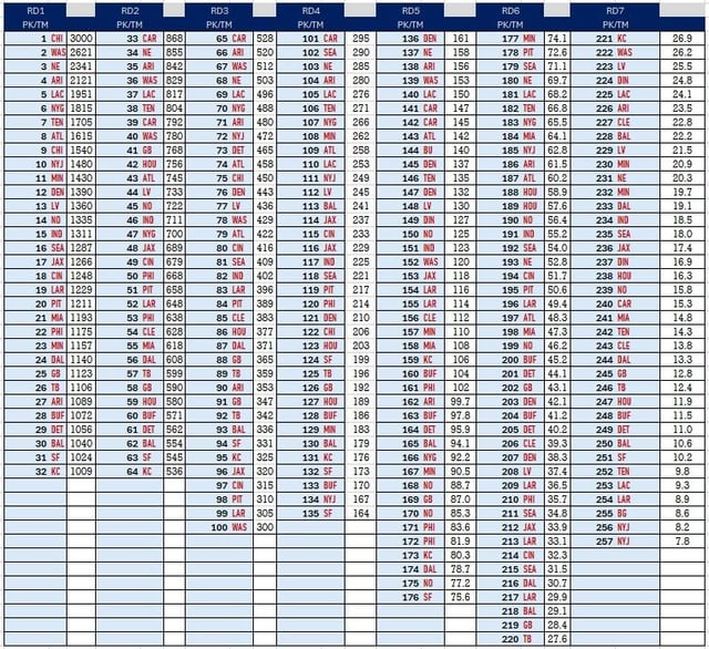
I created a draft capital chart. More details in comments
April 22, 2024
I created a draft capital chart. More details in comments
9 comments
I am sharing my version of a draft capital chart. I am sharing this chart in both the 1000-point and 3000-point scale since those are commonly used and allow for comparisons. I mimicked the most common formatting as well.
I thought that the existing charts had significant flaws and because I enjoy the draft and statistical modeling It was fun for me to make a chart. This is in no part a finished product as a statistical model should always be flexible to change and will respond to changes in data as well as other value considerations and feedback. And of course, new data should change the output as it is added each year.
**The existing charts.**
*Jimmy Johnson chart* – The 3000-point chart has existed unchanged since the early 90s and for better or worse is the chart that is most closely followed in the trades of draft picks. There are odd movements and changes in the rise over run that are curious and there doesn’t seem to be much rhyme or reason them. Such as pick 17-21 changing by 50, 25, 25, then 50 points. It is a very top heavy weighted chart
*Rich Hill chart*. – The 1000-point chart has existed since just before the 2017 draft. I don’t like this chart because the 3^(rd) pick has approximately half the value of the first pick. The drop off is aggressively steep and does not reflect the value of what is happening on the field with those players very well. Interestingly the chart was created to measure value through the trade activity since the introduction of the rookie wage scale however the sample size the chart was intended to cover has more than doubled while the chart has not updated to account for any changes in valuation.
*Fitzgerald-Spielberger chart* – The 3000-point chart has a stricter economic focus in that it accounts for the value of the contracts, but the sample size is the rookie contracts of the 2011-2015 draft classes. It is intuitively a bit heavy on the tail end in a way that is curios. In this chart the last 10 picks of the draft are the same value as the 7^(th) pick in the draft. While deals of draft picks will never follow a formula since many factors affect demand it is difficult to form an argument that would put those ten picks and the 7^(th) pick in the draft on equal footing. I suspect as others have said in comment threads that they aren’t accounting for the fact that it is better to have one player hold x amount of value than 10 players hold that same value due to roster limitations.
*Harvard chart* – The ~500-point chart focuses on career value but falls to some of the intuitive problems of the Fitzerald-Spielberger chart. It has been around since 2011 and isn’t worth discussing more except for the fact that it exists.
Factors included in my chart.
1.) The value of players at pick positions
2.) The rate at which players selected at that spot will be rostered through their rookie contracts.
3.) A discount for the additional roster allocation required at each pick spot to return the equivalent of the top valued spot.
4.) A value added to reflect the benefit of the fifth-year option.
I don’t expect my chart to be a perfect approximation of trades as there are many factors such as how many bidders there are, what players and positions are on the board, how the teams value the picks which should vary, as well as the perceived depth of the draft class. But I thought it would be fun to put my best estimation on pick values and that it would be something that would interest some in this community during draft week.
The fact all the teams are in bold red vs their normal color on these charts is more unsettling to me than it should be
S0 if the chiefs put in their 1st, 2nd, and 3rd (or maybe that 3rd we got from Tenn next year)… we can go up to 5… and get MHJ or Nabers???????
I have to dispute this chart. It suggests that the Vikings would only have to trade picks 11 & 23 to secure 3 from NE. Thats not nearly good enough compensation to secure that in reality.
Also, what’s the year over year value for future picks?
Edit: Panthers traded to the Bears pick 9, pick 61, 2024 1st, a 2025 2nd, & DJ Moore (who was seen as == to a 2025 1st). That’s 513+187+336+100+179 = 1315. Even then, Chicago took a lower offer than normal because they wanted to trade out.
So, Minnesota’s two 1st round picks this year plus a 3rd next year should be enough value to move into the top 5, unless someone like Denver offers three 1sts. Should be interesting to hear the rumors about how much folks were offering to move up.
This chart is genuinely terrible. I doubt you have ever taken part in an NFL draft, why spend so much time doing something that you know is nothing about?
Pick #1 isn’t worth three 32nd picks. That’s the first thing I checked and is clearly absolutely wrong. Probably even more egregious is 5 being two 32nds. Come on.
I’d love to see a pick value chart built empirically from trades we know happened in the past. It wouldn’t be perfect, I’m not sure if there’s even enough data on each pick, you might need to like interpolate a lot of them.
But basically, the Chargers made the point that they aren’t interested in a “fair” trade, which I think is… well it’s a fair point! Teams don’t always adhere to the trade charts, so in practice the “real value” of certain picks will have diverged from their theoretical value. It’ll also depend year to year, because during the draft teams know what players are falling and are willing to move for them, and that value depends on the team, player, and trade partner. That’s a lot of variables.
I want a chart that represents the _real_ historical value of picks in relation to one another. I’m not saying that would be more useful than the theoretical charts, but I want to see how they compare to each other, and it’s sorta an evaluation/validation of the theoretical trade charts in practice. I know I’m just “proposing another chart” but I think deriving one empirically gives us an interesting view that current charts don’t really give. And ironically, there isn’t really room for debate in calculating the value (except for however you actually crunch the numbers to derive the chart) because it’ll be based on real actions taken by GMs. The nice thing is, it’ll naturally factor in things like the “5th year option bump” without having to decide on that value arbitrarily.
so one Caleb Williams = 588 Brock Purdys
For the first overall pick I’ll trade you our 7th round draft pick for the next 150 years… do we have a deal?

9 comments
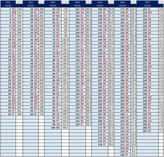
I am sharing my version of a draft capital chart. I am sharing this chart in both the 1000-point and 3000-point scale since those are commonly used and allow for comparisons. I mimicked the most common formatting as well.
I thought that the existing charts had significant flaws and because I enjoy the draft and statistical modeling It was fun for me to make a chart. This is in no part a finished product as a statistical model should always be flexible to change and will respond to changes in data as well as other value considerations and feedback. And of course, new data should change the output as it is added each year.
**The existing charts.**
*Jimmy Johnson chart* – The 3000-point chart has existed unchanged since the early 90s and for better or worse is the chart that is most closely followed in the trades of draft picks. There are odd movements and changes in the rise over run that are curious and there doesn’t seem to be much rhyme or reason them. Such as pick 17-21 changing by 50, 25, 25, then 50 points. It is a very top heavy weighted chart
*Rich Hill chart*. – The 1000-point chart has existed since just before the 2017 draft. I don’t like this chart because the 3^(rd) pick has approximately half the value of the first pick. The drop off is aggressively steep and does not reflect the value of what is happening on the field with those players very well. Interestingly the chart was created to measure value through the trade activity since the introduction of the rookie wage scale however the sample size the chart was intended to cover has more than doubled while the chart has not updated to account for any changes in valuation.
*Fitzgerald-Spielberger chart* – The 3000-point chart has a stricter economic focus in that it accounts for the value of the contracts, but the sample size is the rookie contracts of the 2011-2015 draft classes. It is intuitively a bit heavy on the tail end in a way that is curios. In this chart the last 10 picks of the draft are the same value as the 7^(th) pick in the draft. While deals of draft picks will never follow a formula since many factors affect demand it is difficult to form an argument that would put those ten picks and the 7^(th) pick in the draft on equal footing. I suspect as others have said in comment threads that they aren’t accounting for the fact that it is better to have one player hold x amount of value than 10 players hold that same value due to roster limitations.
*Harvard chart* – The ~500-point chart focuses on career value but falls to some of the intuitive problems of the Fitzerald-Spielberger chart. It has been around since 2011 and isn’t worth discussing more except for the fact that it exists.
Factors included in my chart.
1.) The value of players at pick positions
2.) The rate at which players selected at that spot will be rostered through their rookie contracts.
3.) A discount for the additional roster allocation required at each pick spot to return the equivalent of the top valued spot.
4.) A value added to reflect the benefit of the fifth-year option.
I don’t expect my chart to be a perfect approximation of trades as there are many factors such as how many bidders there are, what players and positions are on the board, how the teams value the picks which should vary, as well as the perceived depth of the draft class. But I thought it would be fun to put my best estimation on pick values and that it would be something that would interest some in this community during draft week.
The fact all the teams are in bold red vs their normal color on these charts is more unsettling to me than it should be
S0 if the chiefs put in their 1st, 2nd, and 3rd (or maybe that 3rd we got from Tenn next year)… we can go up to 5… and get MHJ or Nabers???????
I have to dispute this chart. It suggests that the Vikings would only have to trade picks 11 & 23 to secure 3 from NE. Thats not nearly good enough compensation to secure that in reality.
Also, what’s the year over year value for future picks?
Edit: Panthers traded to the Bears pick 9, pick 61, 2024 1st, a 2025 2nd, & DJ Moore (who was seen as == to a 2025 1st). That’s 513+187+336+100+179 = 1315. Even then, Chicago took a lower offer than normal because they wanted to trade out.
So, Minnesota’s two 1st round picks this year plus a 3rd next year should be enough value to move into the top 5, unless someone like Denver offers three 1sts. Should be interesting to hear the rumors about how much folks were offering to move up.
This chart is genuinely terrible. I doubt you have ever taken part in an NFL draft, why spend so much time doing something that you know is nothing about?
Pick #1 isn’t worth three 32nd picks. That’s the first thing I checked and is clearly absolutely wrong. Probably even more egregious is 5 being two 32nds. Come on.
I’d love to see a pick value chart built empirically from trades we know happened in the past. It wouldn’t be perfect, I’m not sure if there’s even enough data on each pick, you might need to like interpolate a lot of them.
But basically, the Chargers made the point that they aren’t interested in a “fair” trade, which I think is… well it’s a fair point! Teams don’t always adhere to the trade charts, so in practice the “real value” of certain picks will have diverged from their theoretical value. It’ll also depend year to year, because during the draft teams know what players are falling and are willing to move for them, and that value depends on the team, player, and trade partner. That’s a lot of variables.
I want a chart that represents the _real_ historical value of picks in relation to one another. I’m not saying that would be more useful than the theoretical charts, but I want to see how they compare to each other, and it’s sorta an evaluation/validation of the theoretical trade charts in practice. I know I’m just “proposing another chart” but I think deriving one empirically gives us an interesting view that current charts don’t really give. And ironically, there isn’t really room for debate in calculating the value (except for however you actually crunch the numbers to derive the chart) because it’ll be based on real actions taken by GMs. The nice thing is, it’ll naturally factor in things like the “5th year option bump” without having to decide on that value arbitrarily.
so one Caleb Williams = 588 Brock Purdys
For the first overall pick I’ll trade you our 7th round draft pick for the next 150 years… do we have a deal?