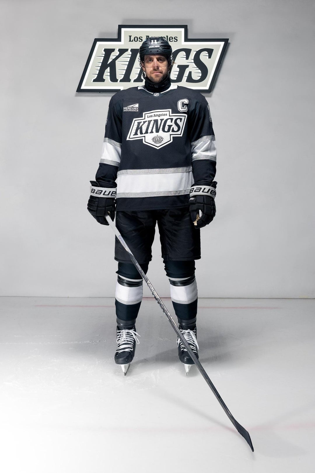
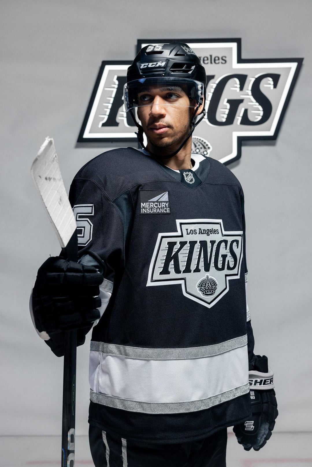
I like this look. That logo and the stripe on the bottom keep it really clean.
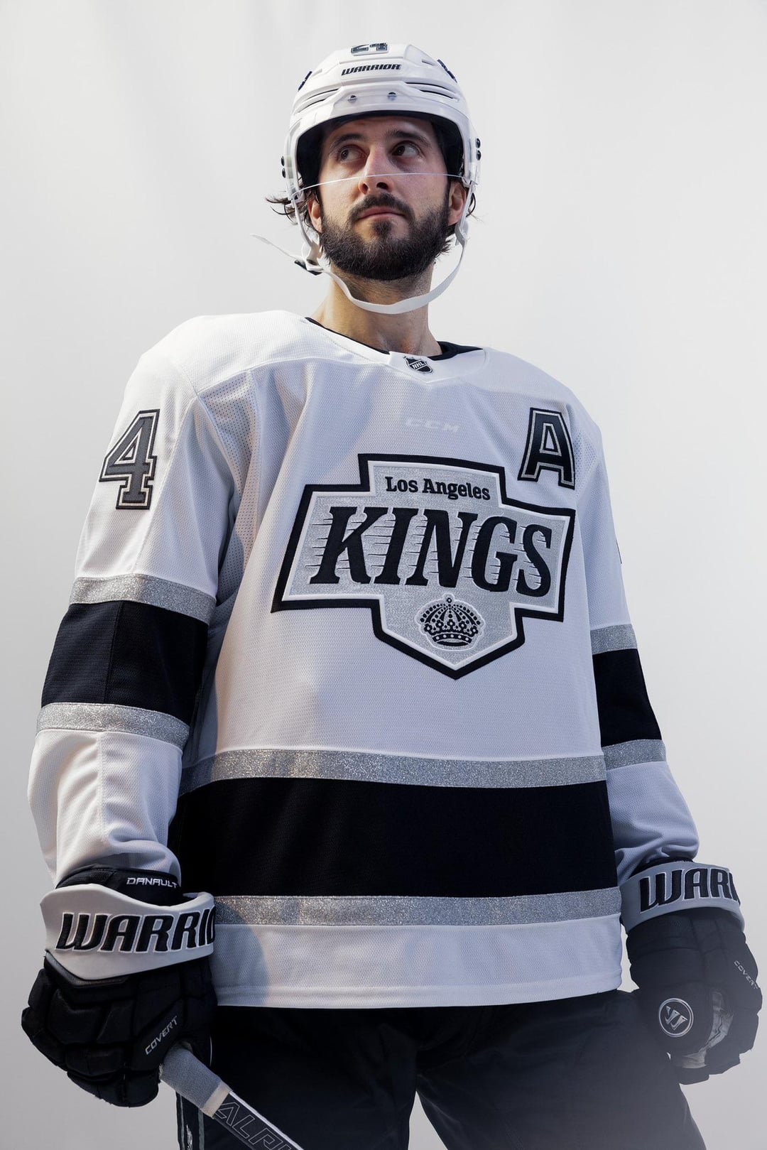
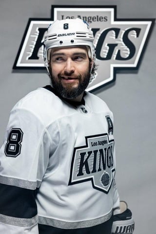
Those away jersey’s are fire
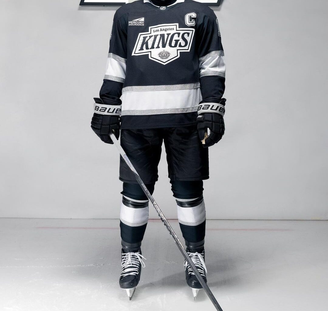
I like the stripe on the bottom half of the torso but I just wish it was a bit smaller.
Kinda looks like a cummerbund lol
Chevrolet Kings.
These are fuckin awesome. Couldnt stand LA unis anymore, primarily cause of the logo and it was too boring imo
Are the black helmets a matte material?
The waist stripes are ridiculous lol
Matte helmets look sick though. the Canucks have had them last year and it just completed the look of the third jersey. Coyotes had it on their arizona jersey and it looked fantastic. Here it looks just at home
Damn that white strip is soooooo thick on the black jersey. Just cut it off and make it a croptop /s. Makes it Looks kinda cheap but I can tell they are going for a minimalist look, will look better on the ice.
The logo is a definite improvement, not a huge fan of having 3-4 different fonts on the jersey. It wouldn’t be nearly as egregious if not for that ad logo, but at least it’s the same colors.
Man I liked the old ones a lot more
They look sick as fuck
🥶🥶🥶
The waiste strip is comically big, and the ‘KINGS’ font should’ve just been the same font that it was on the original Gretzky era jerseys. Every org always over-tinkers to add something new or modern just for the sake of adding something new or modern.
Other than that, this is a big upgrade overall. Both SoCal teams will be looking better on the ice in ’24/’25.
Admittedly I’m biased, but that’s not much of a “new” look imo.
I love the new Mercury Insurance patch.
Yeah that white bar is way too tall.
god i wish they’d just wear purple that would be sick
These are fire. Sure, the bottom stripe is a tad girthy, but otherwise they are a huge improvement on the regular ones the Kings have had for the last decade.
Cool but my god the waist stripe is too big
Beautiful. The ads are killing me tho.
Chevrolet … LIKEEEE AAAA ROCKKKK 🎶
I like the aways a lot
That is a King-sized stripe across the waist of the jersey, wow
I hate matte black helmets but at least they’re not chrome lol
Why even change the kits and logos if you aren’t gonna add purple?
Took me awhile to figure out why in the third pic it has CCM above the crest. Surprised it’s showing through the jersey.
A slight downgrade from the original 80s version and a near infinite upgrade from their last set
Those jerseys are incredible.
A concern I’ve seen on Instagram comments is people are disappointed the CCM logo on the gear is so visible through the white jersey. People are already making Fanatics jokes about it.
…what’s different?
I feel like I’m the only one who is whelmed. Not over, or under. Just…whelmed.
Ctrl+T, set scale 150%, Export.
Missed opportunity to go back to the purple jerseys with the crown

39 comments
I like this look. That logo and the stripe on the bottom keep it really clean.
Those away jersey’s are fire
I like the stripe on the bottom half of the torso but I just wish it was a bit smaller.
Kinda looks like a cummerbund lol
Chevrolet Kings.
These are fuckin awesome. Couldnt stand LA unis anymore, primarily cause of the logo and it was too boring imo
Are the black helmets a matte material?
The waist stripes are ridiculous lol
Matte helmets look sick though. the Canucks have had them last year and it just completed the look of the third jersey. Coyotes had it on their arizona jersey and it looked fantastic. Here it looks just at home
Damn that white strip is soooooo thick on the black jersey. Just cut it off and make it a croptop /s. Makes it Looks kinda cheap but I can tell they are going for a minimalist look, will look better on the ice.
The logo is a definite improvement, not a huge fan of having 3-4 different fonts on the jersey. It wouldn’t be nearly as egregious if not for that ad logo, but at least it’s the same colors.
Man I liked the old ones a lot more
They look sick as fuck
🥶🥶🥶
The waiste strip is comically big, and the ‘KINGS’ font should’ve just been the same font that it was on the original Gretzky era jerseys. Every org always over-tinkers to add something new or modern just for the sake of adding something new or modern.
Other than that, this is a big upgrade overall. Both SoCal teams will be looking better on the ice in ’24/’25.
Admittedly I’m biased, but that’s not much of a “new” look imo.
I love the new Mercury Insurance patch.
Yeah that white bar is way too tall.
god i wish they’d just wear purple that would be sick
These are fire. Sure, the bottom stripe is a tad girthy, but otherwise they are a huge improvement on the regular ones the Kings have had for the last decade.
Cool but my god the waist stripe is too big
Beautiful. The ads are killing me tho.
Chevrolet … LIKEEEE AAAA ROCKKKK 🎶
I like the aways a lot
That is a King-sized stripe across the waist of the jersey, wow
I hate matte black helmets but at least they’re not chrome lol
Why even change the kits and logos if you aren’t gonna add purple?
Took me awhile to figure out why in the third pic it has CCM above the crest. Surprised it’s showing through the jersey.
A slight downgrade from the original 80s version and a near infinite upgrade from their last set
Those jerseys are incredible.
A concern I’ve seen on Instagram comments is people are disappointed the CCM logo on the gear is so visible through the white jersey. People are already making Fanatics jokes about it.
…what’s different?
I feel like I’m the only one who is whelmed. Not over, or under. Just…whelmed.
Ctrl+T, set scale 150%, Export.
Missed opportunity to go back to the purple jerseys with the crown
RIP dimples
https://preview.redd.it/o3wh5mpeqy8d1.jpeg?width=1242&format=pjpg&auto=webp&s=155bdafac500e6d01c2a837f2a26e24bd72caea5
This is great, what it should have been all along.
Well done!
Those black helmets are fire
The trim striping along the bottom needs to be a bit thinner but that’s about it
MERCURY INSURANCE
These jerseys are 🔥