
The logo that ruined an NHL dynasty. | Islanders Fisherman Era
The full story of The New York Islanders Fisherman Era: when the Isles rebranded to the Fish Sticks Logo. A story involving: Snoop Dogg, N.W.A, Fishermen, Billy Joel, a con man, a homeless mascot, and the New York Rangers – all culminating in the most embarrassing rebrand in sports history. A decade of excellence thrown away like old fish-sticks.
Check out @TheHockeyGuy incredible NHL history breakdown videos and jersey collection.
I’d also like to recommend Nick Hirshon’s excellent book “We Want Fish Sticks: The Bizarre and Infamous Rebranding of the New York Islanders” – available on Amazon.
WATCH THIS NEXT: https://youtu.be/vZQtMN_G3oI
SUBSCRIBE to Sideline Archive: https://www.youtube.com/@sideline.archive
===========================
Connect with us!
IG: http://instagram.com/sideline.archive http://instagram.com/hughcoles
=============================
⏰ Timecodes ⏰
0:00 Intro
1:45 The Islanders Dynasty
3:30 Hockey Fashion & Hip Hop
5:21 The Rebrand
6:30 The Birth of “Nyiles”
7:25 Fish Sticks
9:21 The Coach – Mike Milbury
11:08 The Con Man – John Spano
12:16 The Fisherman Today
#nyislanders #islanders #newyorkislanders #newyorkrangers #nyrangers #nhl #nhlplayoffs
About:
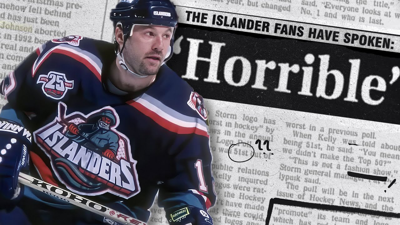
In this video we take a deep dive into the history of the infamous new York Islanders Fisherman logo, and how it became the laughing stock of the NHL and the ice hockey universe. The New York Islanders changed their famous Long Island logo after a particularly painful loss to the New York Rangers in the 1994 playoffs. Years of success were flushed away as the team embarked on a failed rebrand that angered fans and players alike. All culminating in John Spano’s deception, Mike Milbury’s trades and a team mascot afraid to leave the locker room – this story has it all. Strap in.
23 comments
Great job ! My life story in fact, I had Islanders season tickets in 91-93. I split them with a roller hockey coach in College Point, Queens who asked me to. I signed the petition against the logo change (8:30) sitting somewhere in the 300 level seats at Nassau Coliseum, after sitting in the last row of MSG's blue seats for Game 1 of the Eastern Conference Quarterfinals in 1994 wearing a New York Islanders original logo starter jacket. Thank you for including video of the roller blading players (4:20), the historical accuaracy of this video, the next stop for those kids on skates at this time was usually a Sega Gensis / Super Nintendo console that offered 4-way play on NHL 94. True hockey Nirvana, if you were 19 years old like I was. The most loyal of New York Islanders fans sat in section 329 at the Nassau Coliseum for home games. A lot of those guys are from Staten Island. Post dynasty, a good number of New York Islanders fans came from the surrounding areas of Queens, the boros, etc. simply because they did not want to root for the Rangers, or admired the great players and teams of the New York Islanders dynasty. Thank you for a great video, and keep in mind (Rangers Fans) the New York Islanders were at one time the greatest franchise in pro sports, and the envy of the sports world. The last North American sports franchise to win 4 consecutive championships.
Me personally I love it
It was one of the most horrific logos ever when then Islanders already had one of the most classic iconic logos already. I never wanna see that rubbish ever again. Their current/classic is the one forever. Never veer again.
When are you people going to ever understand the history of hockey ? Nobody cares about the Islanders "lucky" dynasty. And this logo just goes to prove it. I never said the Islanders were terrible but if you're going to tell me they are the best in hockey history or sports history or both, you're wrong. Nobody ever forgot Bill Smith's dirty antics. Nobody ever forgot what Denis Potvin did to Ulf Nilsson and nobody could ever beat the 1983-84 Oilers. Even if all 7 games were played on Long Island. The Oilers were a team of monstruous killers that year. 446 goals. A record that CANNOT be broken. Forget McDavid, he's definitely overrated and the league is different now anyway. How about some of these teams the Islanders DID NOT FACE during their run: the 1980-81 Canadiens, the 1981-82 Bruins and 1982-83 Sabres. These teams WERE the match the Islanders didn't face but the ridiculous NHL playoff schedule was the Islanders best friend in those days because they really had none. Reminds me of the Flyers of the 1970's. Every one from the guy making smoked meat sandwiches to cleaning the toilets wanted to club the Flyers. Go look at the statistics and tell me I'm wrong. I met Yvon Lambert one time and he said he and the Canadiens would have beaten the Islanders in 1981. Case closed.
Hey man. First video ive seen from your channel. Interesting topic to talk about. Noticed you also go out of your way to repond to comments. Thats great engagement with your fan base. Hope your channel continues to grow man 😊👍
I badly want a lighthouse logo alternate jersey made. The lighthouse patch was genius and sadly went overlooked because of the gortons fisherman logo. Which by the way those fishsticks are delicious. Just ask Kanye
We want fish sticks!
0:40 Gretzky in Rangers in 1994? Wut?
Not an Islanders fan, but I remember when a friend of mine first showed that to me, and my reaction was “what the hell is that?”
I’m also seeing a lot of similarities between the logo and the mascot to the bizzare story of Krusty Krab, the anti-mascot for the San Francisco Giants in the 1980’s (except Krusty Krab was specifically created to be hated. It was an anti-mascot). In both cases, the hate directed at the mascot was more or less cover for a team that was throughly awful, with an frustrated fan base taking their anger out on a mascot because of how much the team sucked.
I for one like the logo and whenever I’m clowned about it, I come back with, “C’mon…you know you want fish sticks now”.
I always get a laugh from that and they walk away happy.
I love that fisherman jersey and the colors
I liked the fisherman logo. I feel like Anaheim is the team that has butchered their logo (and colors) the most. They should’ve stayed purple and teal with the original logo. I also wish Sam Jose stayed with their original shade of teal instead of going more greenish and I prefer their original logo as well. Overall I wish every team didn’t have 20 different jerseys but I understand the NHL is more about selling stuff than retaining legacies.
Ah, Fish sticks.
we want fish sticks!!
The Burger King LA Kings Jersey were pretty BAD too
Bro, Gretzky never won a cup with the Rangers. Didn’t start playing here until 1996-97.
The idea of NILES just annoyed us ISLES fans of the dynasty era. He was just a cheap gimmick, we wanted a return to glory not garbage marketing strategies.
Cool videos man.
I don't consider them a franchise after logo. If they win the cap, I'll consider it a lockout year. They don't exist
The light house patch imo should’ve been the primary logo but only as a third jersey
Millbury really Sabotaged them!
If it's so bad, why did they bring it back a few years ago as a third jersey option?
Just a Gorton's fisherman!