
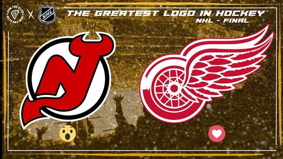
Hey Devils fans,
Just wanted to point out that the Devils logo has made the league final in a very-not-important-but-fun-to-win contest being help on Facebook.
Devils are currently down in the voting, but plenty of time left.
Go check out this post: https://www.facebook.com/share/p/15EGKnvidh/?mibextid=wwXIfr and react with a 😮 as a vote for the Devils!
14 comments
95 flashbacks
The Red Wings’ logo is mid at best if you ask me. Downvote if you want but I never understood why everyone glazes it so hard.
Really? I’m kinda surprised the Minnesota Wild logo didn’t make it to the finals?
How did the red wings make it this far? I’d put Blackhawks above them and maybe even Montreal or Pittsburgh before thinking of the wings
I have both on my vehicle. 😆
Say less
Let’s be honest. Nothing about Detroit’s logo would lead you to believe they are from Detroit. NJ’s logo is fucking perfection. What do I know? I’m a dumbass biased Devils fan.
Devils have the best logo in all of sports. I believe it’s the only logo that you can tell the mascot and where they play just by looking at it with no words incorporated into it. Perfect design.
Detroit making the finals makes no sense, theres SO many better ones, what the heck
I’m surprised that many people voted for the wrench that it got to the finals but then again devils fans are feral
People forget the blind reverence for ‘Original Six’ teams. It is ridiculous at this stage.
Best logo in hockey is Toronto.
NJ
The Detroit logo is literally the Red Wing shoes logo.