
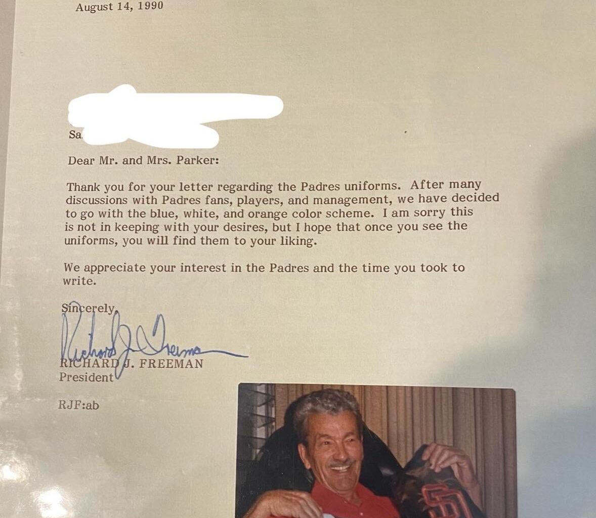
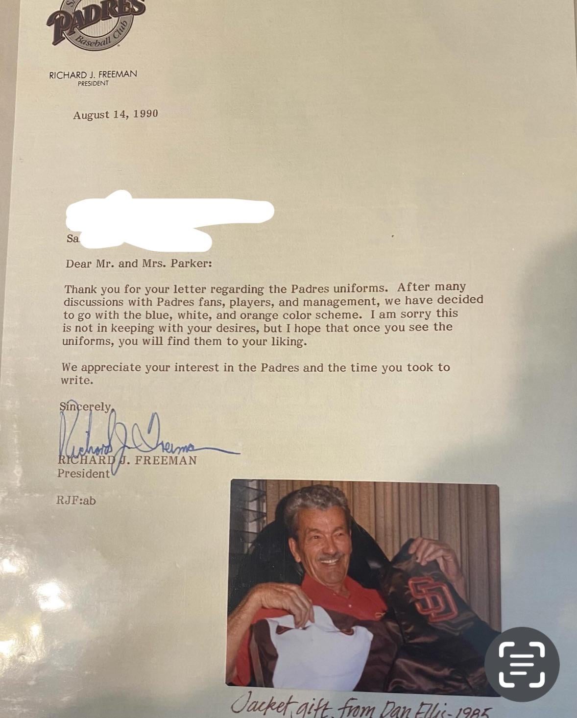
I recently came across some of my grandparents keepsakes. My grandpa who passed away in 2001 was a big “letters to the editor” type of guy. He had a binder filled with letters he received in return from Congress members, TV stations, authors, reporters etc. Apparently he mostly wrote fan letters based on the replies. When I came across this one, I remembered how pissed off he was about the Pads switching from brown. “The Padres should always have brown uniforms! Don’t mess around with something that’s already works!” Obviously his dismay fell on deaf ears. He hated the blue and orange. “We’re not the Broncos!” When we switched back to brown my mom said “my dad would’ve been thrilled.” I bet he’d have written a letter to Ron Fowler in appreciation. PS. He was a graphic artist and designed several signs in San Diego including the entrance to the SD Zoo from the 70s/80s. His design was on the Aztec football helmets in the 90s. He had an eye for color and design.
5 comments
I agree with Gramps. The only uniforms worse that those in my opinion were the boring navy blues
Never thought about the Broncos comparison lol. I could see a Padres and [REDACTED] fan being annoyed about that.
That being said those uniforms were still cool and I can appreciate the variety we’ve had over the years in spite of the damage it did in terms of our brand cohesion.
Yeah, I hated the color change. Your grandpa was a man of taste.
I have a soft spot for the jerseys simply because of the magic of 98, but I always thought it was us chasing the likes of the Dodgers and Yankees.. which I felt was beneath us. Be who we are, Brown and Gold!
Regarding the letter, It’s interesting how that was a huge thing back in the day, and you could reliably expect a reply, and back then, it was typed. Now things are form email templates.
Also, get off my lawn!!
Welp, Mr. Freeman, gramps was right.
Brown and orange is the way.
Can’t wait til they move on from the yellow.