

Hi there,
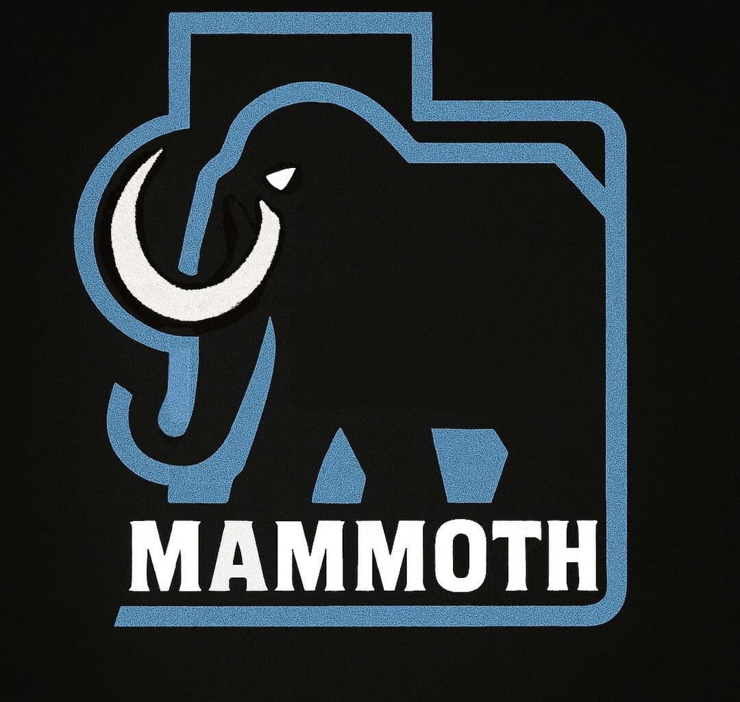
In my last post, I mentioned that I had various versions of the same logo/idea, and some people wanted to see them (I don't mean to bombard you with logo posts; I wish I could edit the last post). So here they are, and I hope it’s okay. I did my best to throw them on some sweaters for context. I don't have time at the moment to make alternate colorways, but maybe in the future. Anyway, let me know what you think and if you have questions about the designs!
7 comments
4 and 6th looks so nice
Slide 4 is the best. Seriously incredible
[deleted]
completely off topic but this picture of the three of them makes me laugh every time. keller is so square and tiny; he looks like a lego. sergy’s cunty little hip pop. and crouse is making this exact face: 😐
and THATS my leadership team babeyyyy
Would love to see the wording removed from the chest crest and perhaps enlarged with the background state colored in blue
Really like these. Nice work! Hoping we end up Mammoth and they use some of these
I’m so in on the mammoth tusk being the U. If they don’t incorporate that into the final logo I’m gonna be pissed.