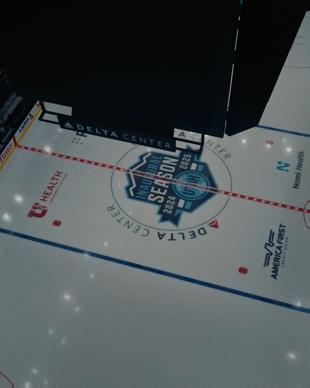
[Utah] A new Ice Age dawns. Introducing Utah Mammoth.
May 7, 2025
[Utah] A new Ice Age dawns. Introducing Utah Mammoth.
42 comments
The biggest news that they accidentally foreshadowed weeks ago…
#tusksup 🦣
Like the name. Good play on the adjective and the noun by not making it plural. Would love to see another color added in the future to break up the monotony of blue.
Finally, the name we all kinda wanted with a logo that is a bit better than something you can make in a video game.
“Real Salt Lake” was the floor here and they beat that comfortably.
Tusks up?
They’re just slapping the logos onto the preexisting jersey? That’s lame, I was hoping they’d make the mountain blue the primary color
Another non-plural team name!
I really wish they could’ve gone with Yeti. Mammoth is decent, but I was rooting for the Bandits. Either way, glad they finally have a name
Good name. Good logo!
Safe to say blue on baby blue is this eras teal and purple lol
Not bad, not bad
I mean, goes kinda hard. The logo is pretty cool.
I dig it
From the promo it looks like the “Utah” script is staying on the white jersey.
That’ll do.
🦣🦣🦣🦣🦣
Logo is awesome, definitely better than expected. Just glad they finally ditched the generic name – the team feels legit now
Yo that’s a cephalopod
I’m sold
Not my favorite name and there are too many blue teams, but the mountains incorporated in the mammoth head and the tusk across the U are very nice touches.
Very solid. Nothing too crazy, but not lame either. I like how they incorporated the mountains and the U into the logo.
Unironically very good logo
Logo is sick
Well done Utah. Great visual identity and story. Happy to see the script remain on the Aways. Such a clean look.
ngl this goes fuckin hard
That alternate U with the tusk is clean
I may be in the minority, but I like it better than Yeti.
Well done, killer logo.
Not a bad name, but that logo kind of reminds me of an E Sports team or something. I feel like that logo would be a for an League of Legends team or something
Tusks Up. Great name
Holy shit! Great colors, great logo, and great jerseys
And that video was cinema
Pretty clean imo, W
Not bad!
While it looks nice, don’t think the logo will age well. Too much going on. I expect a revised minimalist version within five years.
I’m shocked so many people like the logo. I’ve seen countless logos by independent creators and on minor and beer league teams that have this pseudo-geometric, blocky, soulless style. A lot of Instagram reels and tiktoks will do this, where they jam references to the state or team into the shape of the logo instead of real personality – in this case it’s the mountain range. Maybe I’m old fashioned, but it just feels lifeless and bland. I’m sure it’s not AI generated, but it looks like it could be.
The U with the tusk is pretty decent, I guess.
Really cool guys! Excited for your team! Looking forward to a future Ducks vs Mammoths WCF 😅
Brown would be such a better color for this team, but I like the name
Never been a fan of the colours, I just don’t really like sky blue, but that logo is cool
Trunks out
Logo could also be from EA NHL, looks really cool but also a bit generic. I like the color scheme though.
I’m fine with the name (I would’ve preferred Outlaws), but in my opinion, the logo doesn’t look good… at all.
P.S. I feel like they should’ve adopted copper as a color, too, and I like the ‘U’ logo.
Utah vs Nashville, Manny vs Diego
Not a fan of team names that are concepts rather than actual things (ie. Orlando Magic, Miami Heat, etc). Mammoth sounds the worst.
They were given a completely blank slate to do something truly creative and unique with the entire uniform and they produced something that is 90% black for home and 80% white for the road. Incredibly boring and unoriginal. Plus, the league already has one primarily black & white team with the LA Kings. I’m not crazy about “Mammoth”, but I’m sure I’ll get used to that, but these entirely black and white uniforms are so boring and lazy.

![[Utah] A new Ice Age dawns. Introducing Utah Mammoth.](https://www.rawchili.com/wp-content/uploads/2025/05/aGowdnBnZjlhZHplMXkwaPqu1ec-Ybf1Ns_gw9VAIt92Btf1VkfBjxCCBWz4-1080x1024.png)
42 comments
The biggest news that they accidentally foreshadowed weeks ago…
#tusksup 🦣
Like the name. Good play on the adjective and the noun by not making it plural. Would love to see another color added in the future to break up the monotony of blue.
Finally, the name we all kinda wanted with a logo that is a bit better than something you can make in a video game.
“Real Salt Lake” was the floor here and they beat that comfortably.
Tusks up?
They’re just slapping the logos onto the preexisting jersey? That’s lame, I was hoping they’d make the mountain blue the primary color
Another non-plural team name!
I really wish they could’ve gone with Yeti. Mammoth is decent, but I was rooting for the Bandits. Either way, glad they finally have a name
Good name. Good logo!
Safe to say blue on baby blue is this eras teal and purple lol
Not bad, not bad
I mean, goes kinda hard. The logo is pretty cool.
I dig it
From the promo it looks like the “Utah” script is staying on the white jersey.
That’ll do.
🦣🦣🦣🦣🦣
Logo is awesome, definitely better than expected. Just glad they finally ditched the generic name – the team feels legit now
Yo that’s a cephalopod
I’m sold
Not my favorite name and there are too many blue teams, but the mountains incorporated in the mammoth head and the tusk across the U are very nice touches.
Very solid. Nothing too crazy, but not lame either. I like how they incorporated the mountains and the U into the logo.
Unironically very good logo
Logo is sick
Well done Utah. Great visual identity and story. Happy to see the script remain on the Aways. Such a clean look.
ngl this goes fuckin hard
That alternate U with the tusk is clean
I may be in the minority, but I like it better than Yeti.
Well done, killer logo.
Not a bad name, but that logo kind of reminds me of an E Sports team or something. I feel like that logo would be a for an League of Legends team or something
Tusks Up. Great name
Holy shit! Great colors, great logo, and great jerseys
And that video was cinema
Pretty clean imo, W
Not bad!
While it looks nice, don’t think the logo will age well. Too much going on. I expect a revised minimalist version within five years.
I’m shocked so many people like the logo. I’ve seen countless logos by independent creators and on minor and beer league teams that have this pseudo-geometric, blocky, soulless style. A lot of Instagram reels and tiktoks will do this, where they jam references to the state or team into the shape of the logo instead of real personality – in this case it’s the mountain range. Maybe I’m old fashioned, but it just feels lifeless and bland. I’m sure it’s not AI generated, but it looks like it could be.
The U with the tusk is pretty decent, I guess.
Really cool guys! Excited for your team! Looking forward to a future Ducks vs Mammoths WCF 😅
Brown would be such a better color for this team, but I like the name
Never been a fan of the colours, I just don’t really like sky blue, but that logo is cool
Trunks out
Logo could also be from EA NHL, looks really cool but also a bit generic. I like the color scheme though.
I’m fine with the name (I would’ve preferred Outlaws), but in my opinion, the logo doesn’t look good… at all.
P.S. I feel like they should’ve adopted copper as a color, too, and I like the ‘U’ logo.
Utah vs Nashville, Manny vs Diego
Not a fan of team names that are concepts rather than actual things (ie. Orlando Magic, Miami Heat, etc). Mammoth sounds the worst.
They were given a completely blank slate to do something truly creative and unique with the entire uniform and they produced something that is 90% black for home and 80% white for the road. Incredibly boring and unoriginal. Plus, the league already has one primarily black & white team with the LA Kings. I’m not crazy about “Mammoth”, but I’m sure I’ll get used to that, but these entirely black and white uniforms are so boring and lazy.