
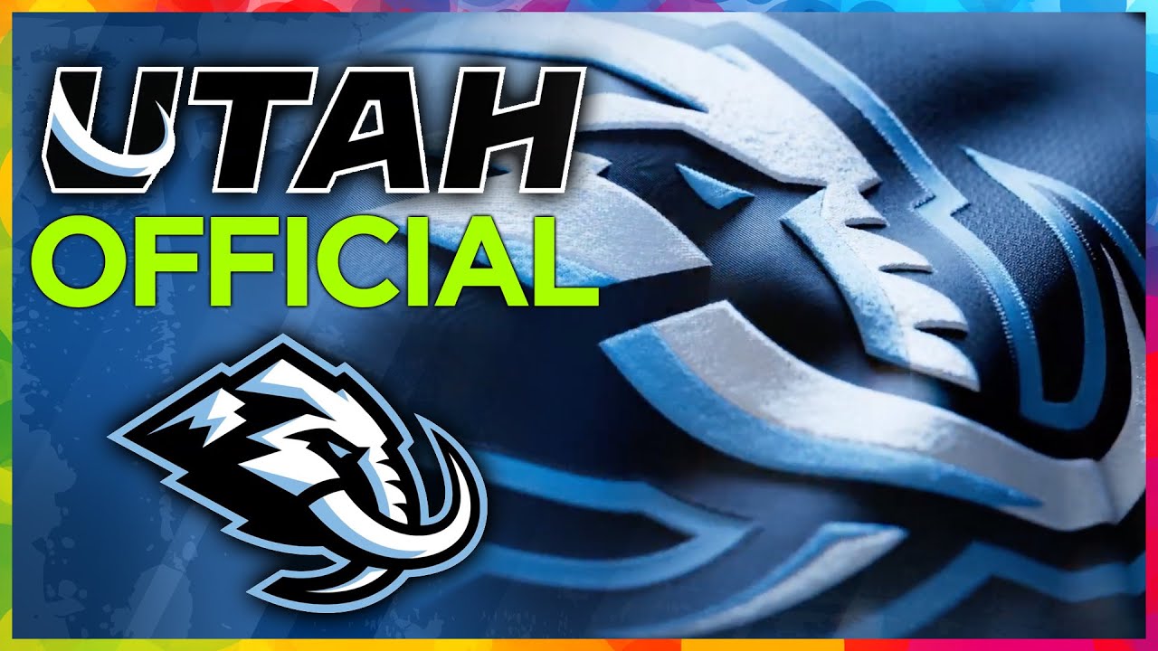
Utah MAMMOTH become official NHL name
Join channel, access perks ✅ http://brodie.bz/join
*Subscribe now, get more* 📺 http://brodie.bz/YouTube
[[ *MY PLAYLISTS* ]]
San Jose Sharks: https://brodie.bz/sharks
San Francisco 49ers: https://brodie.bz/49ers
San Francisco Giants: https://brodie.bz/giants
Golden State Warriors: https://brodie.bz/warriors
Howard Terminal Ballpark: https://brodie.bz/HowardTerminal
Oakland Athletics: https://brodie.bz/athletics
[[ *MY OTHER CHANNELS* ]]
*BRODIE BRAZIL AVIATION* ✈️ http://brodie.bz/Aviation
*HOME STUDIO PRO* 🎥 http://brodie.bz/HomeStudio
📸 *Instagram* ➡️ http://brodie.bz/IG
🐦 *X /Twitter* ➡️ http://brodie.bz/X
👍 *Facebook* ➡️ http://brodie.bz/FB
*Support this channel* 🎉 https://brodie.bz/PayPal
#utah #sports #hockey
43 comments
It's clean, I like it 👍
Started following you from the Arizona relocation! Always love your attention to this whole process. We are incredibly grateful for your coverage and to have hockey in Utah!
Instant rivalry with the Nashville Predators. We can call it the Ice Age Rivalry.
Utah Stormin Mormons is still better
I guess it's better than the Stegasaurus
Tusks up! Go mammoth!🦣
I still wish they would have gone with OUTLAWS. Utah was a haven for lawbreakers back in the "olden days" of the Wild West.
I'll give my take. I'm an professional artist. I like the logo with the mammoth facing the side. However that Utah with the tusk coming out of it out of U is abysmal. It looks like something a six-year-old would do. They should just do the word Utah in the Stonehenge font that they picked. However they have to do something about that Tusk that's sticking out of the letter U because that looks absolutely horrible. It looks out of place and it just isn't necessary in the design.
It's such a corporatized, boxy logo. It looks very cookie-cutterish. 5/10
They should take note on what the Senators did or the Sharks or even Pittsburgh's robo-pen.
Mountain blue pants with their home jerseys would’ve been really nice. I would’ve preferred the Mammoth logo on their road jerseys but I get wanting to represent Utah. Those are minor things though; overall I was pretty happy with this reveal and stylistic choices.
Not bad. Thankfully the Sharks are way better.
Dumb should be Yeti..so ridiculous they couldnt use Yeti
just seems like still a placeholder jersey with their new logo on it. should you really start with a jersey that will only get used for a few years? go baby blue for your home jerseys and do black thirds or whatever, too many primary black teams as is
Not just sports, go visit Utah, they're doing a lot of things right.
This guy saying the s like a moron no shit it sounds stupid that way. I refuse to say it singular every other team is plural with their name, it’s dumb as fuck I now hate them
Like the name ans logo but dont know how a Mammoth connects with the state of Utah
The mid-90s Penguins had the robo penguin at home and a Pittsburgh cross chest on the road. In those days it was the whites at home
What a stupid name!
Too bad Fanatics wasn’t ready with a merch drop with the new logos.
The colors are very much Penguin pre- Mario colors. I saw them in
the 70's vs. the Seals. I love em. If they went more with the baby blue at home that would be even more original Penguin like.
Instead of black it should be a dark blue similar to the Yankees blue.
Logo reminds me of the Wild. I see why the team shied away from Outlaws, though I like the name better. Still a solid choice.
OMG WHY THEY GOTTA COPY SAN JOSE SHARKS WITH THE BKACK JERSEY COME ON. BLACK JERSEYS STARTED IN THE BAY WITH MY OAKLAND RAIDERS NOW IT SEEMS LIKE EVERY SPORTS TEAM WANNA HAVE A BLACK JERSEY DAMN. BAY AREA BE SETTING AND WILL ALWAYS BE SETTINGS TRENDS PERIOD
Enough with teams without plural names like most every other team names. Still nice unis.
This is so cool! 👏🏼👏🏼👏🏼
Utah Rap would be peter
The mascot could be called Wooly Bully.
The Utah Mammoth are born.
I still like my idea of the Utah Crawdads to continue with the New Orleans theme.
It would have been cool if they made the U on their away jerseys that U with a tusk
This name is absolute trash. No question.
I wanted the Yeti but my second fav was the Mammoth! Ya the Yeti cooler company really messed up. I'm also glad they kept the same color scheme and the new logo with the mountain back drop. They did a really good job plus renovating the arena to better accommodate the NHL is awesome!!
I actually think the name sounds awesome!
TusksUp 🤘Utah Mammoth 🦣
7:30 The Pittsburgh Penguins used their "Robo-Pen" logo for their home sweaters and "Pittsburgh" spelled out at an angle (much like the New York Rangers) on their home sweaters through most of the 1990s.
Now they should lean on the ice age theme! Caveman mascot for the win! Maybe a couple caveman and cavewoman carrying around clubs? Or maybe a squirrel creature like scrat from ice age?
The Utah Estonians
utah mammoth mountain
LIKE, DISLIKE?
Some other videos you might like:
Utah MAMMOTH become official NHL name
📺 https://youtu.be/uEhm-xlAn5w
Orlando Dreamers investor is HONEST about moving Rays
📺 https://youtu.be/LQ6vSC_eIyk
LASIK trolling all referees, umpires, officials… but why?
📺 https://youtu.be/b3_RkLkBp40
NHL quietly CANCELS 2026 All-Star Game (for a good reason)
📺 https://youtu.be/2xIyKVeVewQ
Q&A: Shedeur Sanders, MLB moves, Coliseum future…
📺 https://youtu.be/B3PH23SFE9s
St. Pete getting REVENGE on Rays… with Al Lang Stadium?
📺 https://youtu.be/ccHdwgCEzgA
Why I care about the Tampa Bay Rays future…
📺 https://youtu.be/b3h1dxXlK1I
Vegas JUNE groundbreaking for A's… or not?
📺 https://youtu.be/JG4FrxV1t8E
"Here's Brodie Brazil" REVEALED: Jeff Collins, Voice Artist
📺 https://youtu.be/ueb_w_dR734
I'm glad Yeti company screwed themselves out of millions of free advertising!!
Tusks Up feels too close to the Canadian unity message Elbows Up
From a Kings fan, nice uniforms and logo. I would like to have seen the mammoth logo on the road jersey as well.
im so happy for this