
Are these the BEST city connect jerseys yet?!
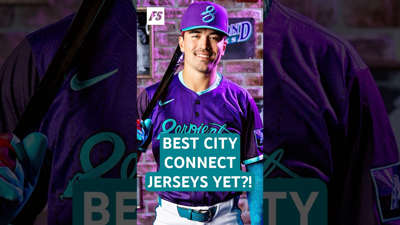
The Diamondbacks New City Connects lean into so much of what I like about this program, but they came up one decision short of a perfect score. Arizona leaned on their legacy here and emphasized the purple and teal, which I kind of wish they’d never gotten rid of in the regular jersey sets when they decided to pivot to rust. The snakes skin pattern and sleeve piping are incredible. The 1998 state silhouette patch is going to make an incredible alternate t-shirt design, which I will buy. The only bummer is that we saw a leaked version that featured Arizona Diamondbacks across the front in a font that evoked their origins. And on the real jerseys, it’s replaced by Serpientes. Essentially, this is now an alternate colorway of their first CC, but it’s a damn good one. Eight out of 10 for
These Diamondbacks Jerseys Were *So* Close to Perfection
#thebaseballinsiders #mlb #baseball #dbacks #diamondbacks #cityconnect
3 comments
There's a lot more going on with this jersey than just being a "recolor". Diamond snakeskin pinstripes. The AZ flag on the side. The AZ state with 1998/48 logo. The black sleeves give it that vest look from the old days. They nailed it.
These are by far the best City Connects.
Why is it in Spanish? Did they move?
🔥🔥🐍🌵