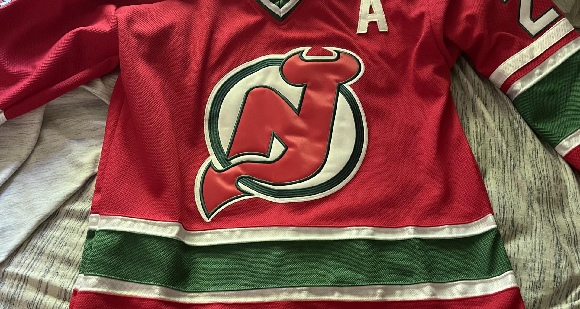
Always wanted a throwback red one. Anyone else in agreement they need to bring these back full-time?
May 10, 2025
Always wanted a throwback red one. Anyone else in agreement they need to bring these back full-time?
13 comments
1000%
At the very least these need to be a regular alternate.
Anyone else remember when these were our jerseys?
These need to stay as alternate at most. I love the throwback look but they lose the magic of how cool the retro aesthetic looks if you’re seeing this set 82 times a year. Like the couple games a year they’d wear the white throwbacks in recent years felt so cool to see for those limited times, and back further when they’d wear the red and green throwbacks just for the St Patrick’s Day games it was such a treat to see as a One Night Only sort of deal.
HELL YES!!!!!!!!!!! 👍🏻
I just want the waist stripes back
I said this the other day, the NHL needs more green! Would love it if the devil’s brought these back.
Don’t get me wrong, I have both classic home and aways and yearn for them to bring back the retro reverse green. Black and red are most associated with the winning years and better suited for a Devil’s colors, IMO. There are better ways to do red and green and not look like Christmas.
Again, my opinion, our tones of red and green are simply too out of 12 box of Crayola and look too associated with Christmas.
Could we make this work with a “Brick City” red and a darker earthier “Pine Barren” green – uniting North and South Jersey (Bennys and Pineys together strong) Rework the striping and overall design of the jersey and I think you’d have a bonafide hit.
Why did they even get rid of the green? It feels like a pretty nice identifier when there’s a bunch of teams with red, white and black color schemes
I like these, but 4 or 5 times a year is good.
Is that Bruce??
NHL Hockey on Genesis flashbacks.
I’ve got a Utica Devils “Christmas Tree” sweater. At least that’s what we called them back then. Tied an onion to our belt, etc…