
Utah Mammoth NHL jerseys are UNIQUE #nhl #hockey #utah
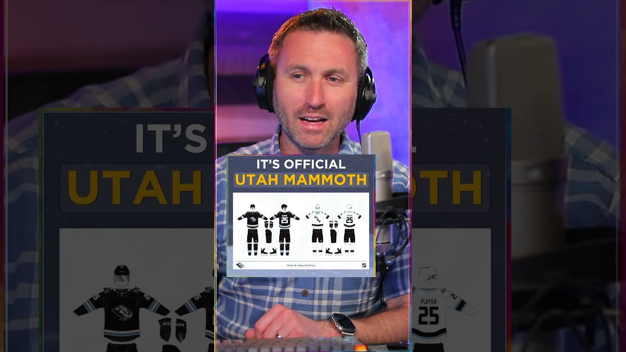
when they go play on the road, they’ll have Utah right across the chest. Not a lot of teams have something different on the front of their jerseys from the home and road situations. But that is the case. That’s what the Mammoth are going to do here. I’ll give you a bigger and better look at the overall jerseys. I guess now if I could if I could be particular here, I like everything they’ve done. So I don’t want to take away I don’t want to be a dark cloud over this. I just kind of wish like the homem jerseys that’s a lot of black, right? top to bottom from the bucket to the sweater to the breezers to the so the socks like and the mits everything is top to bottom black. What if they went with a baby blue bucket at home? Or would would baby blue pants, breezers, would those would those would that be too much baby blue, you know? Or or excuse me, what mountain blue? What what was the official name? I I just feel like there could be a little bit more pop in the home sweaters. The road ones I don’t mind because it goes white, black, white. Um, and there is some some baby blue in there. Again, I I I just want to see a little bit more pop
Join channel, access perks ✅ http://brodie.bz/join
*Subscribe now, get more* 📺 http://brodie.bz/YouTube
[[ *MY PLAYLISTS* ]]
San Jose Sharks: https://brodie.bz/sharks
San Francisco 49ers: https://brodie.bz/49ers
San Francisco Giants: https://brodie.bz/giants
Golden State Warriors: https://brodie.bz/warriors
Howard Terminal Ballpark: https://brodie.bz/HowardTerminal
Oakland Athletics: https://brodie.bz/athletics
[[ *MY OTHER CHANNELS* ]]
*BRODIE BRAZIL AVIATION* ✈️ http://brodie.bz/Aviation
*HOME STUDIO PRO* 🎥 http://brodie.bz/HomeStudio
📸 *Instagram* ➡️ http://brodie.bz/IG
🐦 *X /Twitter* ➡️ http://brodie.bz/X
👍 *Facebook* ➡️ http://brodie.bz/FB
*Support this channel* 🎉 https://brodie.bz/PayPal
41 comments
Dont know the names of hockey gear unfortunately 😂 but i agree the home needs more light blue 🩵
Such a shame yotes left
It would have been cool if they made the U on their away jerseys that U with a tusk
The games between the Utah Mammoth and Nashville Predators will be a matchup of pre-historic proportions.
Thanks for the Utah coverage Brodie
a blue 3rd jersey would go hard
I still wish that it could have been the Utah Yeti. But with that name apparently unavailable, Utah Mammoths is the next best name I have seen suggested.
They look a lot like the old Sharks jerseys. Same colors, too.
I believe the team will be called the Utah Mormans
Blue bucket and mitts. Nice thick stripe on the socks. If I'm a player I'm throwing on blue laces as well.
it should have been the Utah Everest's, they could have had the Paw Patrol dog Everests as the mascot
Like the name, not 100% sold on the logo. Don't know how to make it better, and I might like it with time, but for now, not the biggest fan
Black jerseys look like crap on TV! They do know games are televised in color, right?
Agree 👍🏻
Maybe. The NHL is thinking about making the home teams wear white as they did yearssssss ago.
The eye in the mammoth should be red, to make it pop, like he said. It's similar to Seattle's difficult colour scheme, I very dislike Seattle colours
I think if you're gonna add blue, it would be the socks and gloves. Also, I HATE the wordmark on the road. Put the logo on both.
Agreed baby blue would rock. 🏒🏒
Baby blue pants sound pretty nasty not going to lie Brodie😅 I could get behind the baby blue hats though!! I’m going to guess they didn’t go that way to have the logos on the hats be more visible
I actually like it as a road jersey. It’s a unique look
I agree with Brodie. The Avalanche did something similar with blue helmets instead of the previous version which were black. The blue looks 50% better, huge upgrade. It also makes sense to use the same colors for the gloves.
I'd be cool with Mammoths, why the fuck singular?!?
Well there’s also the Colorado Mammoth NLL team too so Utah Mammoth isn’t very original 🤔😬
Its Carolina Blue
Hurricanes wear an away one that says canes
Men don't wear baby blue. I remember as a child being mystified at UCLA. Did they not know that baby blue was for, uh, babies?
They’ll eventually have a third jersey…THAT will be your baby blue one
The jerseys just look bland and dull.
Of all the teams in the NHL to copy for their branding, they chose the Carolina Canes?
I think blue pants would be too much but the helmet. Youre definitely on to something
Socks and gloves, blue.
No
It’s not uncommon in baseball to have the team name on the front of the jerseys on the home uinforms and the city’s name on the front of the uniform on the road uniform. I guess Utah’s adopting that tradition.
Sweet Jerseys
I'm hoping they come up with a light blue (Mountain Blue) alternate,that would eventually become the main. That said,these colors are so nondescript. It's giving "Just in case we wanna relocate" vibes. I know they decided these were gonna be their colors,which was disappointing. When it was first announced they were moving to Utah, I was hoping they'd use the Jazz's colors, especially since LA and Anaheim have decided not to use purple
Amen. Too much black on the home uniform. I would have gone with the blue they use as trim for the socks and the sweaters.
In the late ‘80’s the New York Rangers had “Rangers” on the home jersey and “New York” on the road jersey. But the style & font were the same. What Utah is doing is like MLB where the team name is on the home jersey and the city name is on the road jersey.
Nothing wrong with black home jerseys! 👑
Singular Name "Mammoth" is problematic , although I understand that pronouncing the plural word "Mammoths" would be awkward because the "ths" at the end would be clumsy.
Canes
Do we really need another team with black as their primary colour? It’s so boring. Did they learn nothing from the Jazz? They had the colours right there: purple, white and sky blue. It’s different and cool. But nah, let’s go with black.. lmao.