
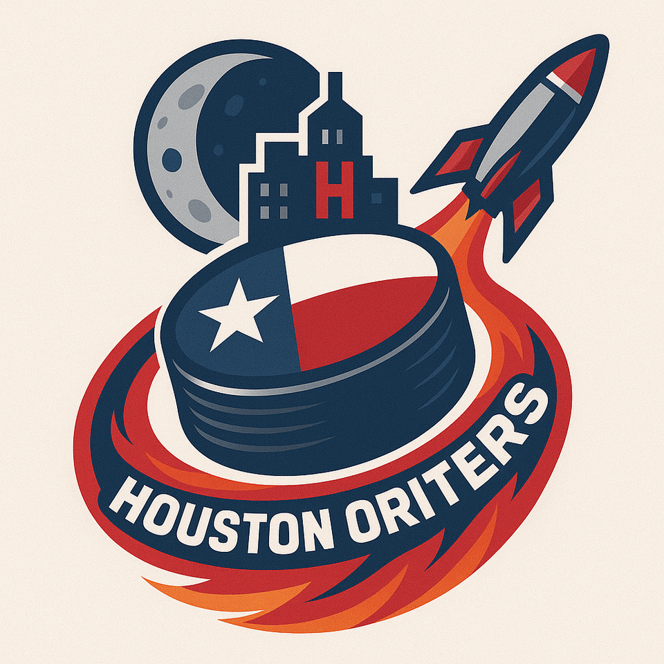
Bored and made this random logo using chat gpt and illustration i was thinking looked kinda cool.
Would this be an interesting logo and name for a possible Houston NHL Franchise.
Name & Identity:
Houston's long and decorated history of the pioneering of space exploration is extremely important to the city.
Given the name 'Space City', so it may be overdone and/or cliché but its too good to pass up. Keeps the theme of the other major sports teams in the city; Houston Rockets, Houston Astro's.
I included the moon in the logo because NASA's Johnson Space Center became the home of mission control which guided all of the famous apollo missions. An important part of american and world history.
Rocket represents the city history with space obviously, but can also be seen as a metaphor for the city's rapid economic expansion and population growth as one of the biggest cities in the United States.
Having the puck in the center of the logo acting as a planet being was something i thought was clever. Has a similar feel to teams like the columbus blue jackets, especially with the orbiting rocket next to it. I think it's a cool way to represent a hockey team, but again incorporating space exploration. This was the main reason i thought this logo would work.
Name feels cool enough to be a legitimate option for a future franchise here.
Other options were like,
Houston Voyagers, Houston Pioneers, Houston Orbit.
I liked this logo concept the most.
Elements of logo:
1: The puck as a planet with the Texas Flag on the top, represent the state's significance and their role in pioneering and shaping space exploration as we know it.
2: The rocket 🚀 Orbiting the planet with the exhaust flame 🔥 incorporating the name,'HOUSTON ORBITERS' within it.
3: City Skyline that Houston is known for on the top of the puck showing their rapid growth in population, and their economy, plus their robust night life. 'H' hidden within one of the buildings to represent the nickname "H-Town". I like this as it's on brand for NHL logos to include easter eggs within them.
– Examples of this are the Minnesota Wild, Washington Capitals, And now even the Utah Mammoth.
4: The Moon as a Backdrop behind the city skyline referencing their significant involvement in NASA's Space programs; like the apollo missions, etc..
Colour Scheme:
Red: A classic colour, used in the Texas flag, and also in the 🚀 and flames. Used for the houston rockets.. so it's familiar. Fits well within the theme of space. Popular but possibly overdone primary color.
Navy Blue: represents the night sky, space exploration, Houston's night life and skyline, as well as one of the main colours of the texas flag. Clean snd simple.
Silver: Adds more depth to the design and fits the theme; adding sharpness to the logo and team identity.
White: Represents the Texas flag. And obviously necessary in most logos.
Additional Colors: Accents of orange within the flames for added detail. Possibly different varying shades of the main colors for contrast could be used.
Its possible its too similar to the Winnipeg Jets and Columbus Blue Jackets but who knows.
Let me kmow what you think.. idk if its good or not.
Also let me know if there's already an idea or logo like this, i dont kmow if this is unique or not to be honest.
Thanks
28 comments
Oriters, Obiters, Orbiters? How about the Houston Rockets?
Houston has a great team name on their AHL franchise. That name needs to be their NHL team name.
Never AI. Please, never AI.
Don’t feed the bots, ya’ll. Any feedback you give them improves their uncannyness
“Concept” No shit.
Orbiters? I can’t think of a worse name
Terrible. Sorry. Orbiters is awful.
What a shitty logo.
Logo looks like Houston Floor Buffers
Oof. Houston team, yes, space-related, yes, orbiters, please god no.
Edit: The logo is cool, maybe a little busy though. I like the rocket and the puck with the texas flag. I think the “H” placed onto the rocket, drop the moon and the skyline would be cool.
That rocket looks like it gambled on a fart and lost a loaf!
No
Spell much?
Houston Aero would be better than Orbit__
The Houston NASA
Let’s ignore the AI.
The problem with coming up with designs like this is that if we ever had a Houston team they can’t use a design similar to this without people claiming they stole the design
So if you want a team to go with a design, it’s better to not post
Genuine question: did you use AI for this? Or did you just not spell check before posting?
Ignoring the misspellings, that “logo” violates the Geneva convention it’s so bad
The Houston Thrusters
Chatgpt 🤮
Houston Apollo’s. Away unis are all white to look like space suits. Home can be orange or something, idk haven’t gotten that far.
O-Biters. 😁
Bring back the Aeros.
Houston Oilers has a better ring to it.
Obiters. People who write obituaries. Like when we slay our opponents. I’m trying to help you out
I’d kill to keep another team out of Texas.
#TexasHockey is ours⭐️
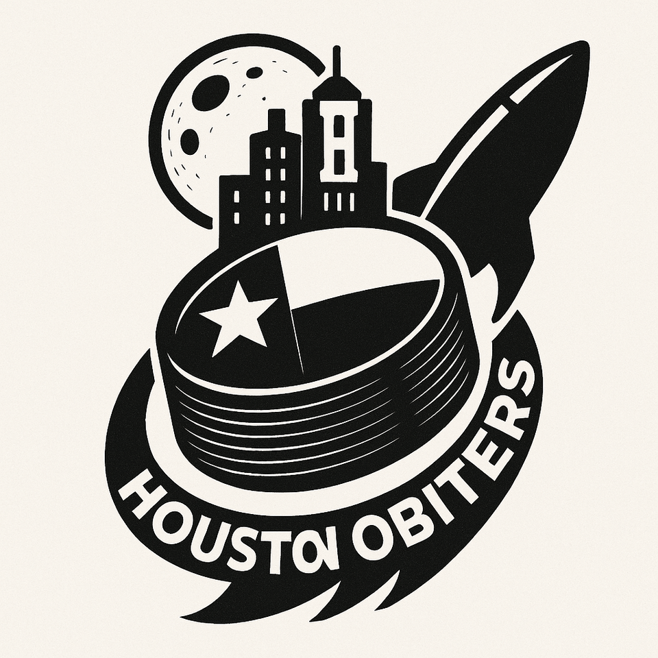
The only problem with using anything rocket related is everyone will think it’s a rip off from the Houston Rockets NBA team. If anything, maybe a logo with a man on the moon or something. Also next time make sure the AI generator spells things correctly and doesn’t make the last N in Houston look like an I which is happening in the second logo.
Houston We-Have-a-Problems
You just need to convince Edmonton to relocate to Houston. Built in brand recognition right there. I bet a lot of Albertans would think it’s an upgrade.