
Mammoth Reveal, Blues Rebrand Leak, and Westward Expansion | THREADS
A mammoth reveal in Utah. A golf shirt goof in St. Louis. A lackluster logo for the draft in L.A. And new hockey teams are
cropping up across the west. This is Threads—a monthly recap of
news and reviews only on Icethetics. I’m Chris. Thanks for watching. But first… the 2026
Winter Classic logo reveal. Next season, the 17th edition of
the NHL’s marquee outdoor game will be held for the
first time ever in sunny Florida. Miami, to be specific. And on May 27, we got our first look
at the very Miami-centric branding. Unsurprisingly, it’s a mix of
bold and bright tropical colors including blues, greens and pink, complete with palm trees,
coconuts, and some faux snow. It’s a bit too early for word
on the uniforms, but this artwork does make me wonder if we could see the NHL
go in a whole new direction this year. The Florida Panthers will host
the New York Rangers on January 2 loanDepot park,
home of the Miami Marlins. The Sunshine State has become
the unlikely center of the hockey universe to some degree lately,
with the Lightning or Panthers appearing in the Stanley Cup
Final for six straight seasons. Tampa Bay, meanwhile, will host
the Stadium Series a month after. All right, let’s get right
into this new series. A few weeks ago, without warning the Utah Hockey Club sprung a big
announcement on the hockey world. The official reveal of
their permanent branding. Meet the Utah Mammoth arriving
with no overhyped countdown, no elaborate launch,
just a simple press conference with a cinematic intro video. But to be honest,
it all felt a little…hasty. And maybe it was. A week earlier some eagle-eyed fans
picked up on an apparent slip-up. Late on a Tuesday night—April 29—
the team’s YouTube handle suddenly switched from
@UtahHockeyClub to @UtahMammoth. Had the team finally made up
its mind on a permanent name? Were they starting to lock down
new social media handles? It appeared someone jumped the gun
with their YouTube account. Basically, the club scooped itself effectively revealing the
new name before they meant to. Spoiler alert:
that will be a theme in this video. The team went into damage control
mode that night. The channel was deactivated
entirely for a time, perhaps with the hope
that no one would notice. But that’s not really
how the internet works. Major media outlets picked it up and fans
braced for the official announcement. Then, on the morning of Wednesday,
May 7, out of nowhere the official unveiling. The launch video centered around
Utah’s prehistoric ice age, bouncing between a cave explorer
and some young museum visitors, culminating with the reveal
of the new name and logo. The club played up the paleontological
discoveries of mammoth fossils across the state over the years,
and the groundswell among fans who showed a clear preference
for this name. SEG said Mammoth was
the clear winner, beating out Utah Hockey Club
and Utah Outlaws after several rounds
of surveys and polls. The irony is that Mammoth is also
a term that can mean huge or epic, which is the opposite of the feeling
I got from their brand reveal. Still, it should have
been an epic announcement, but it came with no real lead-up,
no anticipation. They just sort of surprised us
with it one morning. But there was nothing
particularly surprising about it. The name had been
leaked by the team itself. The logo concept had been leaked
during the fans surveys and there was just no sense of spectacle. This should have been a major fan event,
like the day the players arrived in Salt Lake and gathered
with fans at the Delta Center. That’s how Vegas did it. I was there outside T-Mobile Arena
on November 22, 2016, when the Golden Knights
let loose the confetti and streamers. I was not there when Seattle declared
themselves the Kraken, but then again, we were all dealing with Covid, so fan
gatherings weren’t really the thing to do. I’m not sure what the excuse
was for Utah, but it seemed like they blew what could have
been a *mammoth* moment. Okay, rollout aside,
let’s focus on the new identity itself. Is the name any good?
Utah Mammoth. To be fair,
this was obviously a fan favorite. The #TusksUp hashtag saw
a lot of organic use well before the team officially adopted it. And of the three options given,
it was clearly the only good one. But a small part of me was hoping for a
bait and switch and unexpected dark horse. Of course, that would have gone
against the fan feedback philosophy. Look, it’s not a bad name at all. It’s a good fit for Utah. A little safe, maybe.
A little bland? But in the greater context
of the NHL, it works. So how about the new primary logo? Frankly,
I wasn’t exactly wowed by that either. It’s a bit of a stereotypical sports
logo, isn’t it? I mean, it would look right at home
in the minor leagues, really, alongside some other angry animals that have joined
the ranks of the AHL and ECHL. But again, don’t misunderstand. I don’t mean to say it’s bad. In fact, from a technical standpoint,
it’s very strong. The linework is crisp and bold,
even if there are elements like shadows that don’t
quite stand up to scrutiny. In fairness, that type of thing
might have been cleaned up had the design timeline
not been so rushed. Still, it contains one of my favorite
NHL logo Easter eggs to date. The head of the mammoth is sculpted
into a mountainous silhouette, which, by the way, is a blend of designs
that leaked during the fans surveys. The grinning mammoth, combined
with the yeti’s head of icy peaks. But look closer
at the mountain on the left. That shape is no accident. It’s Utah, with its
iconic notch in the northeast. And the blue shading forms
an “M” for Mammoth. The team claims the tusk
is shaped like a “U” for Utah, but that one feels like
a bit of a stretch to me. What other shape would a tusk be, exactly? Then again, the Colorado Mammoth
of the National Lacrosse League might have something to say about that. In fact, they did— reposting Utah’s announcement
with a jab about the copycat newcomers. With their launch,
the Mammoth released a collection of additional logos
to support their new identity. This wordmark introduces us to a new
custom typeface they call Mammoth Sans. It’s a heavy block font
with these 10-degree chips on the letters’ rounded corners. This angled slant
turns out to be a running theme overall. Every logo is basically italicized,
which is a little funny. The secondary mark is the U Tusk,
which I really like. It’s simple and well built. I kind of wonder whether this concept,
with a little more time spent on it, could have made for a better primary logo. Then again, it’s effectively
the same idea as the Seattle Kraken logo, a letterform intertwined
with a creature’s body part. So maybe not. Though for that matter, it’s
not hard to draw conceptual similarities between the Mammoth’s primary mark
and those of the Nashville Predators and Minnesota Wild. You have the angry animal profile
mixed with the local nature scenery. An alternate version of
the U Tusk spells out Utah, which ends up being a suitable replacement for the basic scoreboard logo
the franchise used previously. Another element from last season
that’s been enhanced is the stairstep crest now merged with an abstract
version of the state outline. There’s also a hockey stick
whose blade tape forms a subtle “U.” I wish they had this one last year, because it would have been a much better
jersey crest than what they wore. And on that note,
let’s talk about the jerseys. As expected, the colors
and striping pattern will remain the same, with a minor change
that I’ll go over in a moment. As a reminder,
this is what they wore this past season. A basic font laid out
diagonally down the chest. On the new home uniform,
the Mammoth itself takes center stage. It’s a definite improvement over the
stairstep crest, a version of which is still hanging around
in the form of this shoulder patch. The new road sweater, on the other hand,
is effectively the same. That’s a bit of a letdown. I was hoping if they had to keep
the diagonal text, it would be as a third jersey for a little while
and not a permanent uniform. What they did do, however,
was update the design to utilize the new Mammoth Sans
font with that ten degree slant. I get the idea that when you’re traveling, some teams want to showcase
the name of their home city to the locals. It’s why, after their 2011 rebrand,
the Lightning wore “Tampa Bay” across their away jersey,
but not on those home blues. And why the Panthers still do it with
Panthers in the crest of the home jersey but Florida there on the road designs. In my mind, the new Tusk would’ve
been a better way of doing this. Instead, that mark is relegated to the pants. But hey, I’m just glad
they’re using it on the uniform. On the other hand, their primary logo
does work well here as a shoulder patch. The only other change to the away sweater
is the extra pop of white in the collar. And both jerseys now feature a hanger
effect, with the inside of the collar highlighting the year of
the franchise’s founding. In addition,
the uniform diagrams they shared show us the Utah wordmark is planned
for use on the helmets. That’s assuming, of course, that the
team doesn’t sell a helmet sponsorship between now and the new season. And finally, we have the new
number and letter designs, which come from Mammoth Sans, naturally. However, it’s the only part of the brand
that is not angled ten degrees. So there you go. With that, I think I’ve
exhausted the discussion of the Utah Mammoth for now,
but we’re far from done here. We’ve still got to talk about the
St. Louis Blues, the NHL Draft, some upcoming centennials,
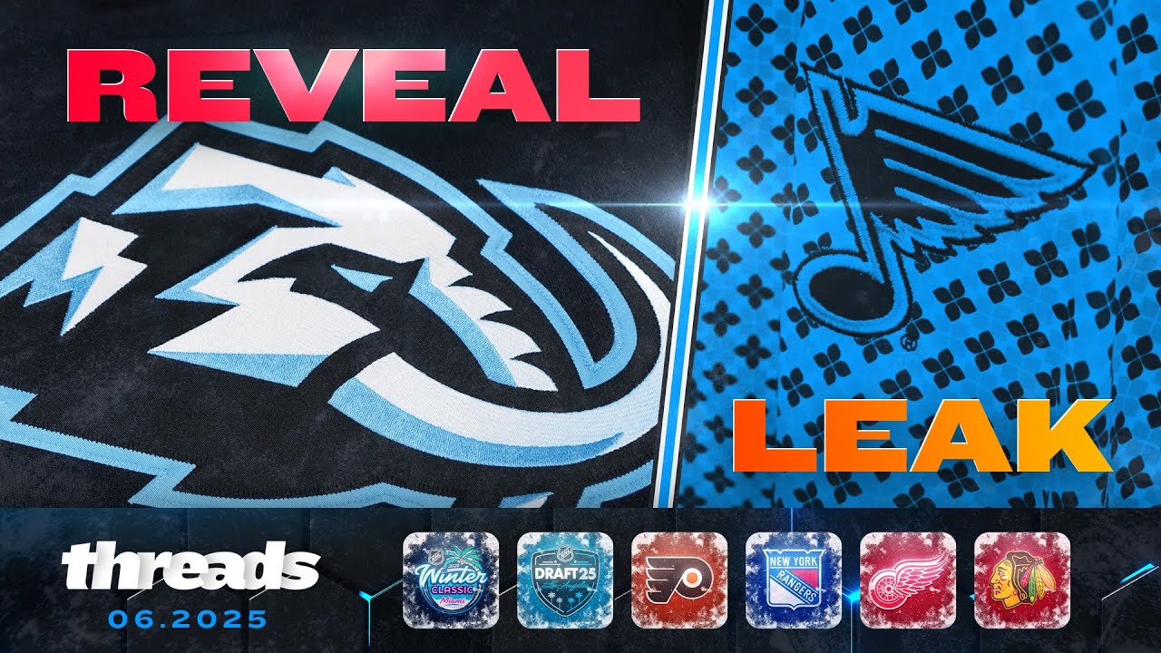
and some new expansion teams. In my last NHL JerseyWatch I called the St. Louis Blues
rebrand “very likely.” I said a source told me the Blue Note
itself was even getting a redesign and then taking a page out of
Utah’s book with the YouTube leak, the team all but confirmed
my report with a leak of their own. STL Authentics is the official
team store of the Blues. They maintain a strong social media
presence to spotlight new merchandise. And on May 9, they posted
photos of premium golf apparel, complete with a close-up of a logo
we’ve never seen before. Remember how I said the redesigned
retro logo on the shoulders of the Blues’ Winter Classic jersey
could be a hint toward what’s to come. Turns out it was. This version of the Blue Note
is the same as that one, except for the color application. Instead of the lighter throwback blue,
it’s the current navy blue. Will the new uniforms align with that? As in—navy blue jerseys? A couple of sources tell me no. They say the retro blue is here to stay. The only change we’re likely to see is a brightening of the vintage white
to a proper white. Something like this. For what it’s worth,
a hoodie shown in the same post used a monochromatic version
of the new logo, which looked like this. But there’s an interesting wrinkle. The Blues’ baseball brethren,
the St. Louis Cardinals, announced a theme night
for late in the season. On September 19, right around the time
we’re gearing up for a new hockey season. The Cardinals are giving away
a Blues-themed hoodie which uses the new Blue Note on
the front in retro Winter Classic colors. I don’t know if there’s any real relevance
to this, and I’m still unsure about how the navy blue logo on the golf
shirts fits into the larger rebrand, but I don’t think we’ll have to wait
long to find out. Given that the Blues are planning
to debut a new look for next season, I would expect to get our first peek at it no later than the
NHL Draft on June 27. Speaking of which… the first edition of the NHL’s
new decentralized draft format will take place in Los Angeles later
this month on June 27. And this is the logo for that event. Okay, so not exactly
a groundbreaking design. All the NHL seems to associate
with L.A. are palm trees. To wit, here’s the logo
from the last time L.A. hosted hosted the draft 15 years ago. Though I have to say I am partial to the
use of Icethetics Blue in both of these. Anyway, we got our first look at this
branding a few weeks ago at the draft at the Draft Lottery where the Islanders won
big jumping from 10th to first overall. If the awarding of the Stanley Cup
is the official end of hockey season, the draft is generally considered
the start of a new season. So when teams have new logos
or jerseys to launch, this is the time they usually do it. Remember, the Ducks and Kings introduced
new branding last year in the days leading up to the draft, so that their redesigned jerseys
would be ready for their new draftees. This year, I’m anticipating new designs
for a handful of teams the Blues, of course, they select
in the first round at 19th overall so they’ll need to jersey
on hand for the big night. The Boston Bruins home
jersey has already leaked, so I’d expect to see an official reveal
for that one before the draft. They pick seventh overall. And I’ve heard the Chicago
Blackhawks will have a new home jersey Blackhawks will have a new home jersey
for their upcoming 100th anniversary. They pick third overall, but would they give out a special
one-off jersey at the draft? Or would it be their standard design? For comparison, in 2023, the Bruins were going
into their centennial season, but used their standard
home jersey at the draft. The anniversary uniforms
were not revealed until three months later
ain mid-September. Hard to say if the Hawks will follow
a similar pattern, but… let’s more about that. On May 15, the Blackhawks,
Rangers and Red Wings all commemorated the 99th anniversary
of the founding of their franchises using that as a launch pad
for their upcoming centennial. The Rangers kicked
things off back in March, but the Hawks and Wings
joined the party on the 15th. Chicago gave us a rhyming hype video
declaring themselves: “Always an Original” along with the many firsts
they lay claim to. The Hawks also gave us a better
look at their 100th anniversary logo, then proved I was right
to call out the gold outline surrounding their primary logo by changing out their
social media profile pics to this. And I’m now wondering if their
so-called new home jersey will feature little more than a familiar design
with a metallic gold around the crest. We’ll have to wait and see on that. The Red Wings also published a short hype
video showcasing historical highlights and announcing their
Centennial is “coming soon.” But in classic Wings style,
they’re playing this one pretty close to the vest and giving us
little else to go on just yet. With a trio of teams commemorating
their 100th anniversaries, I would expect to see a good handful of throwback jerseys
throughout the season. All right, home stretch time.
Let’s do a few quick hits. First, the Flyers. I don’t usually talk about jersey ads
because—why give these people more than they’re paying for? But one of them may finally be doing
something fans can appreciate. While they’re not taking their logo off
of Philadelphia’s iconic orange sweater they do seem to be fixing
the egregious color discord. When new head coach Rick Tocchet
met cameras at his introductory media conference,
the jersey shown off had the sponsor logo in white instead of the bright blue
that we’ve seen for the past two seasons. Assuming this change is extending to
the on-ice jerseys the players wear, it’s a minor but welcome improvement. The Professional Women’s
Hockey League is expanding. The PWHL announced two new franchises
will join the league for its third season this fall in Vancouver and Seattle. Brand development is currently underway. In the meantime, these placeholder logos are being used to represent the franchises. And here’s a good
question for the comments: What do you think
the team names should be? Speaking of expansion out west,
the ECHL will grow to 31 teams not this fall, but next in the 2026-27 season
when New Mexico gets a franchise. The team will play in Rio Rancho,
just north of Albuquerque. They’re currently holding a
“name the team” contest. ABQ was previously home
to the New Mexico Scorpions of the Western Professional Hockey
League in the mid-’90s, with one of the coolest logos
I have ever seen. They later joined the
Central Hockey League and played there until 2009,
with a less cool logo. And that’s it for this
first edition of Threads. My idea here is to create
a monthly series to recap all the news and updates
from across the hockey branding universe. It’s basically replacement for the old
Flash Reports, which had two problems. First, it was tough for me to keep up
with them given my busy work schedule. And second, you guys weren’t
really watching them so I’m hoping this longer
magazine-style format is a better fit. I’ll plan to release new episodes
once a month with other videos coming in between. And that’s all for now. Leave a like before you go
if you enjoyed this video. It’s a big help to keep
the channel in business. And be sure to subscribe so you
don’t miss out on upcoming videos, including my next JerseyWatch,
which is on the way. Thanks again for watching
and see you next time.
Welcome to THREADS — a new monthly series created to replace the old Flash Reports. Get your hockey branding news recapped all in one place!
In this episode, everything from May 2025, from the Utah Mammoth brand reveal and a St. Louis Blues rebrand leak to Rangers, Blackhawks, and Red Wings Centennial previews and some new expansion teams out west.
▪️ CHAPTERS ▪️
00:00 – Intro
00:23 – 2026 Winter Classic Logo
01:25 – Utah: Mammoth Reveal
04:48 – Utah: Logo Details
07:39 – Utah: Jersey Details
09:52 – Blues Redesign Leak
11:48 – 2025 NHL Draft Logo
13:33 – NYR, CHI, DET Centennials
14:46 – Flyers Jersey Ad
15:25 – PWHL & ECHL Expansion
16:22 – Outro
THREADS is a monthly recap of news and reviews from across the hockey branding universe.
📢 Icethetics Memberships Available!
Join the Icethetics channel to show your support ▸ https://www.youtube.com/channel/UCVuaXpzE6NrlUfPVKw5Yc_w/join
If you’re already a member, THANK YOU!
28 comments
Siiick logo!
Love the format. Also, as a Blues fan I'm super intrigued to see what we get this year!
Wish they would have picked some better colors. Light blue and black is so bland. Wish they would mix in some purple to match the Utah Jazz uniforms, and to give the NHL an actual purple team.
If the Panthers don't do something with a Miami Vice theme, they are missing the boat.. Have one team dress as Crockett, the other as Tubbs. Have a Daytona Spyder come out onto the ice.
Is the website dead?
This was my first time watching a full vid from you. Man, very nice work. Clean, great production, tone of voice was all good. Well done sir. I enjoyed this.
Sleeveless jerseys for the Winter Classic?
The road whites are disappointing
Production quality on video is top notch love this this project!
Excellent content.
Should've been the Utah Nordiques.
The Blues update is a big step backwards…
"I kinda like." What does that mean?
i hate that its “mammoth” singular and not “mammoths” plural
My wife's been shouting to anyone listening it Seattle's PWHL team should be called the Valkyrie or Valkyries. I've heard a bunch of people suggesting emeralds but feels a bit too on the nose branding wise.
How can 2 teams represent one city
New follower here from 🇨🇦. Well done. 🏒👏👏🏒
4:06 I don’t think they need an excuse…it’s really not that big of a deal
Miami Vice themed Winter Classic uniforms?
another masterpiece from icethetics🙏🙏
STLs ufl team has wings in its battle axes logo similar to the edge of the new blues logo
I’m a Mammoth fan! At first, I wasn’t too impressed with the logo, but it’s really grown on me, especially the Utah state outline Easter Egg. On the bottom of that outline too, it forms a letter “M”, which I think is really clever. I also like that they kept the same colors, and I love the updated font. I’m also a huge fan of stair step lettering on Hockey sweaters, so I’m happy that they kept that on the road uni, especially since there’s a tie-in to our inaugural season! Overall, they did a good job, and even though it wasn’t the early favorite, the Mammoth mascot really took off here in Utah. It’s regionally, and historically relevant, and fits in perfectly. It’s unique to us. I love it. Tusks up! 🦣
1000% AI voice. You’re not fooling anyone bud
Utah Mammoth is an epic name!
my guess for team names 1. New Mexico Scorpions 2.Seattle Seas 3. Vancover Maple Leafs
I’ve heard the LA Kings might unveil a new crown alternate jersey this summer….could not be true ??
The Mammoth and the Predators need to establish a rivalry, just because their logos match so well.
What happened to the icethetics website?