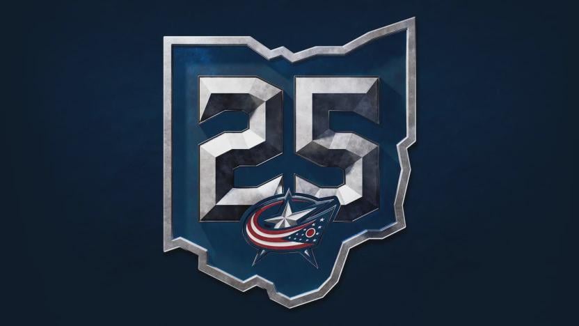
CBJ unveil 25th season logo honoring franchise legacy and Ohio roots
June 17, 2025
CBJ unveil 25th season logo honoring franchise legacy and Ohio roots
28 comments
I like this one a bit better than the 20th season logo
Having the outline of Ohio go around the letters for “Captain” and “alternate Captain” was such a good idea
An even better idea would be having the cannon jersey be the primary, but I’ll take uniform wins where I can
Nice logo. Just enough darkness in it to pay tribute to the Dougie Mac and GMSH eras.
Looks good.
Too bad for my unreasonable expectation that the stadium series unis were an indication of new branding but maybe we can potentially still see some updated uniforms? Please?
They definitely consulted whoever designed the Crew 30th year logo lol
I sewed the 20th anniversary patch on my jerseys and I am SO PUMPED to sew this on next
Still boring ole’ C swipe design tho.
So kind of a copy and paste job of the Crew’s 30th anniversary logo, which isn’t all that great.
is this a tribute to the serpent mound?
wonder if one of rick nash’s kids did this, if this was commissioned or thought of at all for longer than 15 minutes.
You can really tell this logo honors the franchise legacy and Ohio roots by the way that it is. 😐
I don’t like it. Still better than the clip art BS they used for the stadium series.
Cool Logo for the Blue Jackets. The Silver in the Logo pays tribute to the Silver Medals worn by the Union Army. Another fun way to use the Blue Jackets’ Civil War Theme.
I can dig it, I still want a complete rebrand of the logo/jerseys, but that’s likely no happening
Can we drop the red after this year. I’d like the uniforms to do a better job representing what the team is named after.
Redesign the real logo you pansies
Can someone this into a phone wallpaper? Kthxbye
Oof, this is giving “just discovered the Appearance panel in Illustrator and went feral.” Like bro really said, metal texture overlay + complex 4 bevel x4 = graphic design is my passion.
This would be vastly better for the Cleveland ‘Fear The Depths’ Monsters…
Dunno how well it will look with our two baried shades of blue.
Dig this. Gonna get me a Fantilli or Olivier when the season starts!
Anyone else see a bent up aluminum can?
not….great.

Crisp, clean, simple. I love it.
now time to unveil a new jersey design! (…pleeaassseee)
Nice but was really hoping they would leave this logo behind move to the canon as main logo
Will this be at center ice?
I couldn’t be more underwhelmed. 25 years and this is what we roll out?
I’m wondering if this is going to be one of those “iron on” patches like the NFL uses. I can’t see this looking good with thread stitching.

28 comments
I like this one a bit better than the 20th season logo
Having the outline of Ohio go around the letters for “Captain” and “alternate Captain” was such a good idea
An even better idea would be having the cannon jersey be the primary, but I’ll take uniform wins where I can
Nice logo. Just enough darkness in it to pay tribute to the Dougie Mac and GMSH eras.
Looks good.
Too bad for my unreasonable expectation that the stadium series unis were an indication of new branding but maybe we can potentially still see some updated uniforms? Please?
I don’t like it at all.
https://preview.redd.it/8wk8vrewui7f1.jpeg?width=2304&format=pjpg&auto=webp&s=8f935731f43908681aeb84ba891c5e65ed91631b
They definitely consulted whoever designed the Crew 30th year logo lol
I sewed the 20th anniversary patch on my jerseys and I am SO PUMPED to sew this on next
Still boring ole’ C swipe design tho.
So kind of a copy and paste job of the Crew’s 30th anniversary logo, which isn’t all that great.
is this a tribute to the serpent mound?
wonder if one of rick nash’s kids did this, if this was commissioned or thought of at all for longer than 15 minutes.
You can really tell this logo honors the franchise legacy and Ohio roots by the way that it is. 😐
I don’t like it. Still better than the clip art BS they used for the stadium series.
Cool Logo for the Blue Jackets. The Silver in the Logo pays tribute to the Silver Medals worn by the Union Army. Another fun way to use the Blue Jackets’ Civil War Theme.
I can dig it, I still want a complete rebrand of the logo/jerseys, but that’s likely no happening
Can we drop the red after this year. I’d like the uniforms to do a better job representing what the team is named after.
Redesign the real logo you pansies
Can someone this into a phone wallpaper? Kthxbye
Oof, this is giving “just discovered the Appearance panel in Illustrator and went feral.” Like bro really said, metal texture overlay + complex 4 bevel x4 = graphic design is my passion.
This would be vastly better for the Cleveland ‘Fear The Depths’ Monsters…
Dunno how well it will look with our two baried shades of blue.
Dig this. Gonna get me a Fantilli or Olivier when the season starts!
Anyone else see a bent up aluminum can?
not….great.

Crisp, clean, simple. I love it.
now time to unveil a new jersey design! (…pleeaassseee)
Nice but was really hoping they would leave this logo behind move to the canon as main logo
Will this be at center ice?
I couldn’t be more underwhelmed. 25 years and this is what we roll out?
I’m wondering if this is going to be one of those “iron on” patches like the NFL uses. I can’t see this looking good with thread stitching.