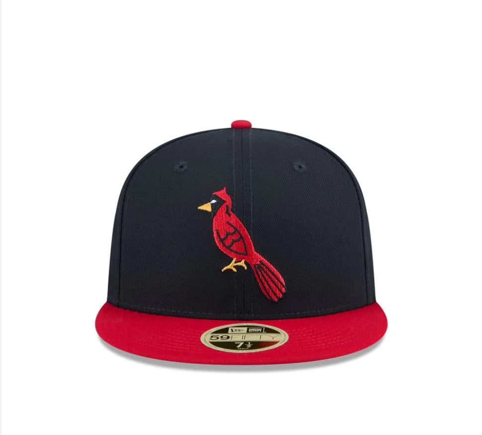
The 2025 HOF caps feature a version of the Cardinals logo I've never seen. What is that beak?? The wing is also super cartoony. I've scoured sportslogos website and can't find it anywhere.

The 2025 HOF caps feature a version of the Cardinals logo I've never seen. What is that beak?? The wing is also super cartoony. I've scoured sportslogos website and can't find it anywhere.
10 comments
AI?
The logo is fake and contrived by MLB. A lot more insight will be posted in the editorials section on the cardinalsuniformsanslogos site this weekend.
The same logo/hat has been for sale at Mickey’s Place for a while now [listed](https://www.mickeysplace.com/product/st-louis-cardinals-1942/) as being from 1942. From the uniform and logo site (that another commenter mentioned) it looks most similar to the hat worn with the 1941 uniform set [seen here.](https://cardinalsuniformsandlogos.com/database/fulluniformtimeline/)
https://preview.redd.it/t14tpx5ip0ff1.jpeg?width=1366&format=pjpg&auto=webp&s=d90df1c03757ad2189b3547a354197d0c9570162
This is the cardinals logo from their 1942 jacket. They took some liberties in changing some aspects of the cardinal.
It’s a very bad reference to the 1941 cap logo.
https://preview.redd.it/5rl0i4eos0ff1.jpeg?width=962&format=pjpg&auto=webp&s=cbe2f348b1d3b790fec58296330540ae6536eb67
https://preview.redd.it/qirrs5dis0ff1.jpeg?width=1337&format=pjpg&auto=webp&s=046704a3317947405dd3b5bc74adb5c51372baf7
Fake, altered or not, this hat is sick. Been wearing it most days for the last couple weeks. Really like it, and it fits me super well.
Temu
https://cardinalsuniformsandlogos.com/
We actually have a detailed database for this particular topic. As others have posted this logo appears to be a new design, but heavily inspired by the 1941 cap
That looks like the 2025 HOF Weekend Logo /s