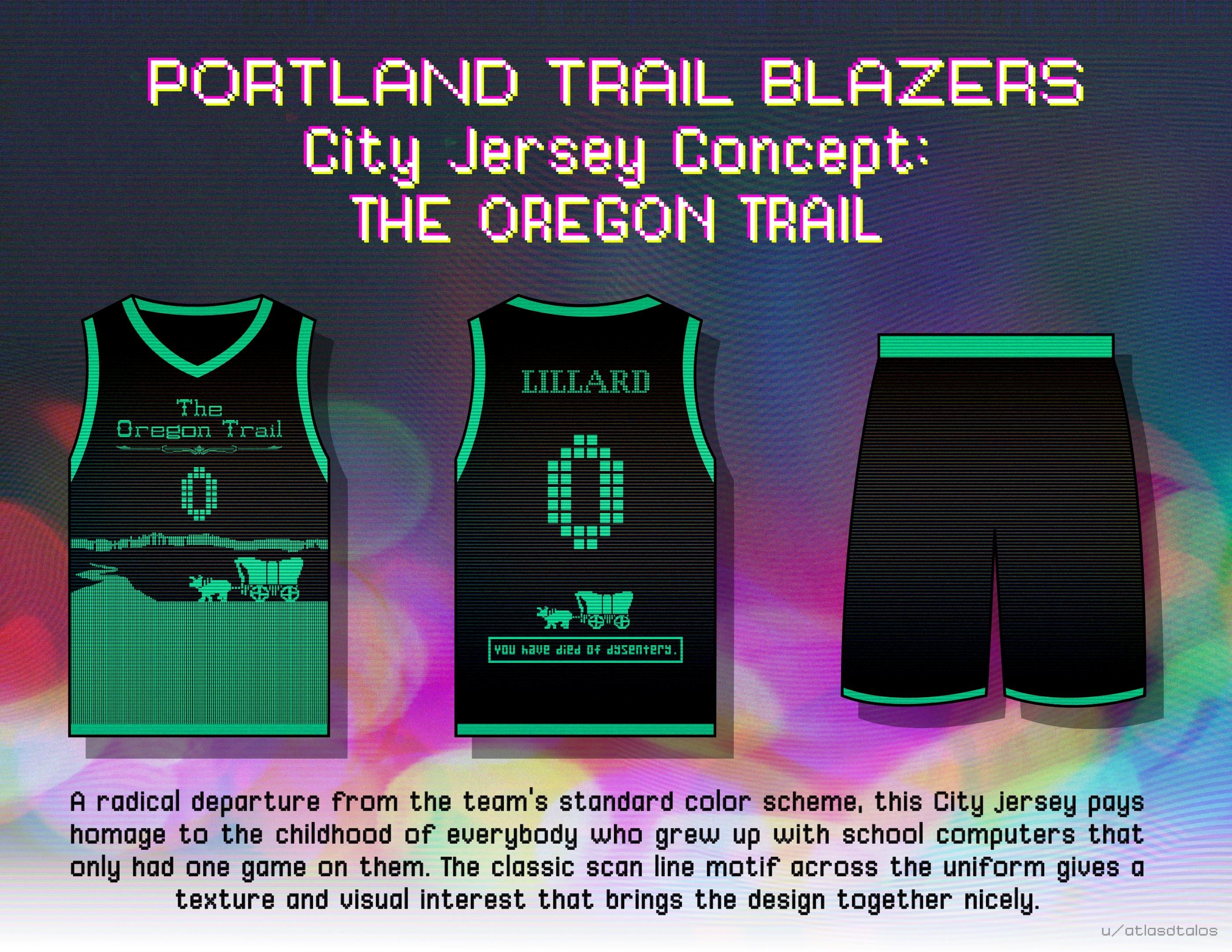
The underwhelming jersey refresh inspired me to finally render this City jersey concept I’ve had kicking around my head for a few years now.

The underwhelming jersey refresh inspired me to finally render this City jersey concept I’ve had kicking around my head for a few years now.
23 comments
It’s too good, that’s why it could never happen
It’s all fun and games till dysentery sweeps through the team
Glorious. I would spend many actual human dollars on this opus.
I think it’s a little overcooked but I love the idea. I’d probably make it Oregon trail themed without all the specific details. Maybe just “Oregon” in the font, and just keeping the front stuff.
But I love the pixel numbers and the slight CRT line effect you have going on here
What a fun idea. I was just telling my husband about the new blah jerseys.
This is fucking insane in the best way lmao nice work
Back of the uniform inspires me to get a “you have died of dysentery” tramp stamp
There’s just something so absurd about the word “dysentery” on a professional sports teams jersey
I think we need to start the conversation.
Change the slogan on the back to “You have died by getting dunked on.”
Yo this is awesome. Super original and creative.
Don’t stop! Make more! What other weird, quirky jerseys could you make? Something inspired by a Douglas fir? A food cart one? Timberline Lodge? Haystack rock? Goonies?
This will never be a team jersey but I need a bootleg version immediately
So good
Amazing replacement for the PDX jerseys
Jack Moran on X/Twitter (@JackMoranDesign) has some killer ideas too!
Nike would laugh at you then fire you then make a worse version of it.
The first jersey to ever reference someone dying of anything on them.
So good!
These are killer
Fun fact, the phrase “you have died of dysentery” never actually showed up in the game. It would always say “X has contracted dysentery” and then later “X has died”, but that phrase still stuck with people.
https://preview.redd.it/o4oevf3xtwff1.png?width=1080&format=png&auto=webp&s=d7149db7a4aae6a22508d8f4ecd1b6d56c2a9fec
I mentioned this on another thread. I brought this exact concept up in a brainstorm meeting for future city editions in 2020 or 2021. Let’s just say, it is not an option.
I’m not a fan of the Oregon Trail theme, but that scan line idea is fireeee
It is insane we have never gotten an Oregon trail inspired jersey