
Visiting Habs fan here! I built a tool to create these cumulative performance charts and decided to make one for every NHL team before the start of the season.
I originally created this for my baseball team, the Pirates, who hit a franchise milestone this season – reaching exactly .500 (10,879-10,879) on July 19th for the first time since 1903. I wanted to visualize the incredible downward spiral back to 0.500 (for those interested: Pirates chart), and it turned out so compelling that I decided to bring the concept to my second favorite sport: hockey.
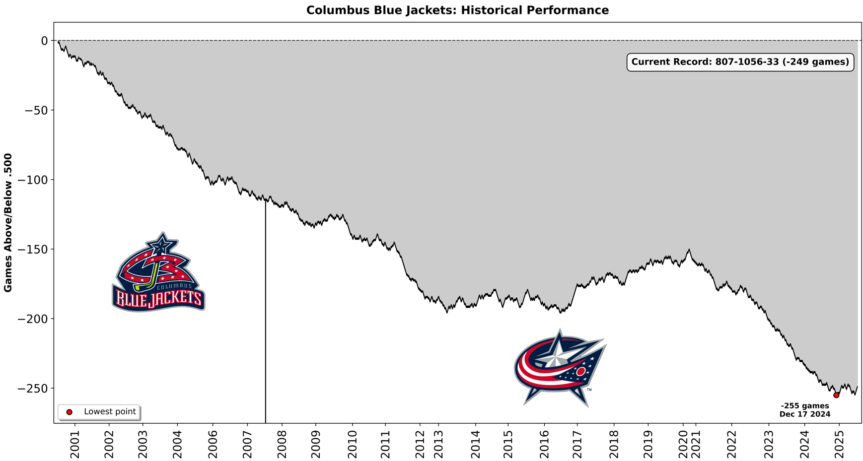
Technical note: Each win (regulation/OT) moves the line up +1, each loss (regulation/OT) moves it down -1, and ties keep the value unchanged. The vertical black line shows the logo change.
10 comments
Yikes thanks but no thanks
Does this include playoffs? If not, then 3 perfect 82-0 seasons gets us close to .500!
Yeah…that looks right 😔 hopefully we’re at the start of an upward trend for a while.
Once they moved to the eastern conference it kind of flatlined a little bit and started to trend back up. I legit think being in the west set the team back to start. Fan base wasn’t huge bc they sucked but also bc they were on at 10pm for like half their games which makes it hard to watch. Once they moved to the east they started winning and the fan base also grew.
My point is if they had started in the east they’d probably have a dozen cups by now.
How hard would it be to make one of these for the Ottawa Senators? Really cool idea!
Vincent and Larsen were historically bad coaches. And at one point Doug MacLean was both coach and GM.
Thanks, I hate it
Hmmm seems like the team’s performance went down after they changed the logo and the red jersey cuff. Coincidence? I think NOT!
Unsubscribe
Damn. Tough hill to climb. This is awesome. I’d love to see the Browns graph if there is one for NFL.