
Visiting Habs fan here! I built a tool to create these cumulative performance charts and decided to make one for every NHL team before the start of the season.
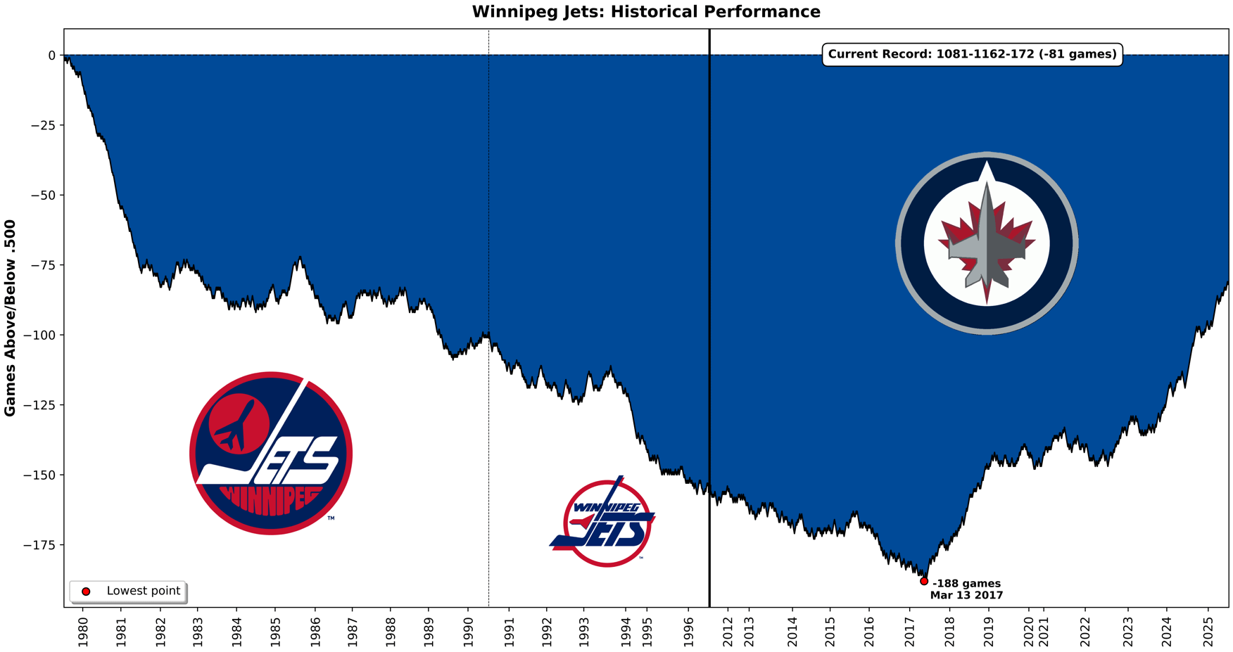
I originally created this for my baseball team, the Pirates, who hit a franchise milestone this season – reaching exactly .500 (10,879-10,879) on July 19th for the first time since 1903. I wanted to visualize the incredible downward spiral back to 0.500 (for those interested: Pirates chart), and it turned out so compelling that I decided to bring the concept to my second favorite sport: hockey.
Yes, I combined the Jets franchise and ignored everything in Arizona and Antlanta… sue me!
You have a chance to go 82-0-0 this season and get over 0.500, isn't that exciting!?
Technical note: Each win (regulation or OT) moves the line up +1, each loss (regulation or OT) moves it down -1, and ties keep the value unchanged. The vertical line shows a relocation and the dotted vertical line show a logo change.
PS: You guys have the best logos
4 comments
I love how perfectly this shows how spoiled we are in recent seasons despite our playoff woes. Thanks for this it’s awesome
Cool chart! I think you could have been sued if you DID include the Arizona/Atlanta data.
This is the kind of summer content that keeps me frickin going!
I always thought that the 80´s teams with Hawerchuk were better