
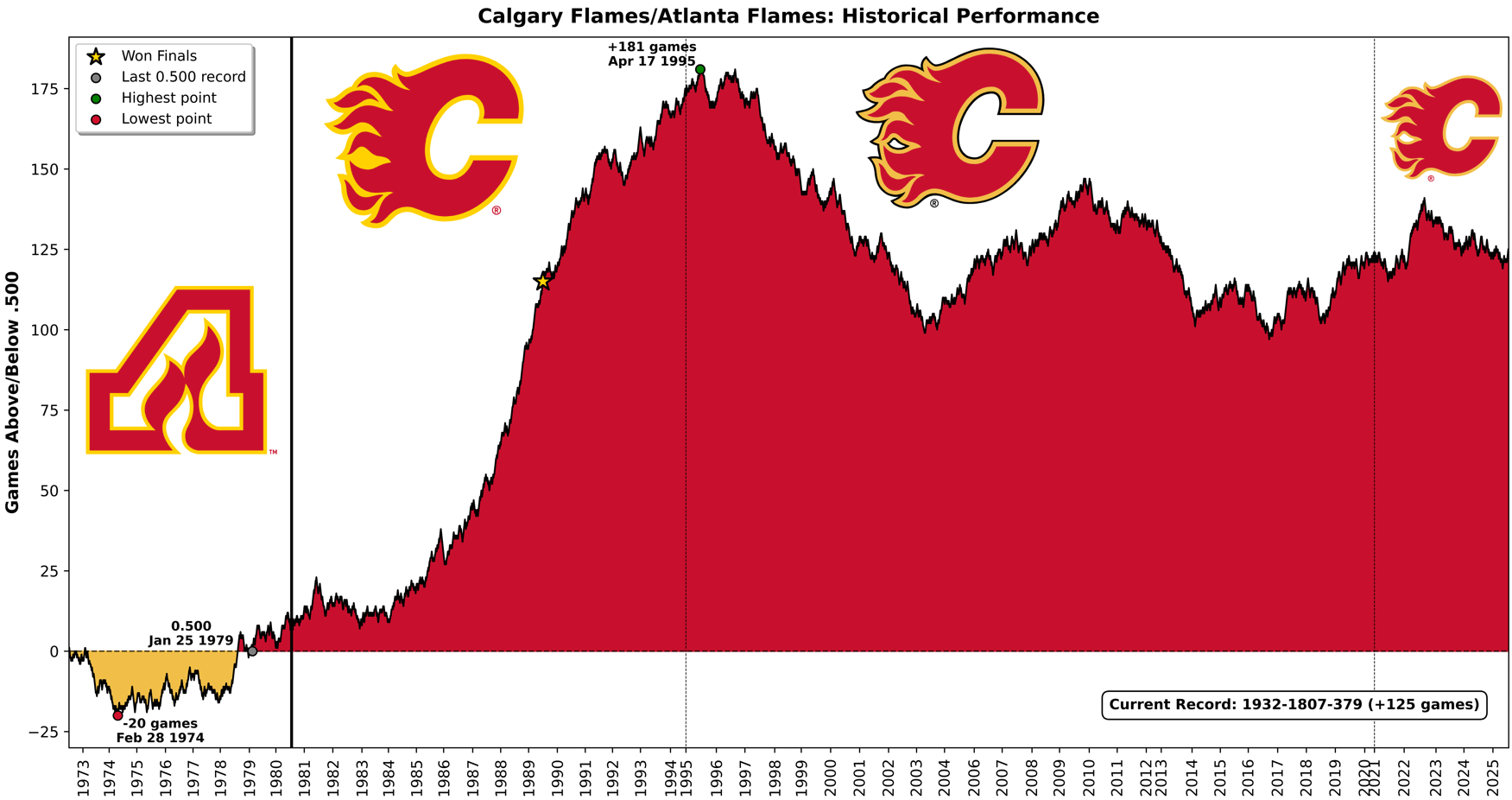
Visiting Habs fan here! I built a tool to create these cumulative performance charts and decided to make one for every NHL team before the start of the season.
I originally created this for my baseball team, the Pirates, who hit a franchise milestone this season – reaching exactly .500 (10,879-10,879) on July 19th for the first time since 1903. I wanted to visualize the incredible downward spiral back to 0.500 (for those interested: Pirates chart), and it turned out so compelling that I decided to bring the concept to my second favorite sport: hockey.
Technical note: Each win (regulation or OT) moves the line up +1, each loss (regulation or OT) moves it down -1, and ties keep the value unchanged. Vertical full line shows relocation, and vertical dotted lines show a logo change.
4 comments
This is a really cool visualization! Thanks for putting it together.
Interesting to see the rise and falls of the last 25 years!
Would like to see it without Atlanta in it
God the late 80’s must have felt like a movie
Well done OP reminds me of Jon Bois franchise deep dives and was always interested what it would look like for the Flames
I never realized:
1 – The Flames were pretty mediocre in the early 80’s but I guess it was pretty easy to make the playoffs then
2 – How good the Flames were in the early 90’s because we had no playoff success to show for it post 89