
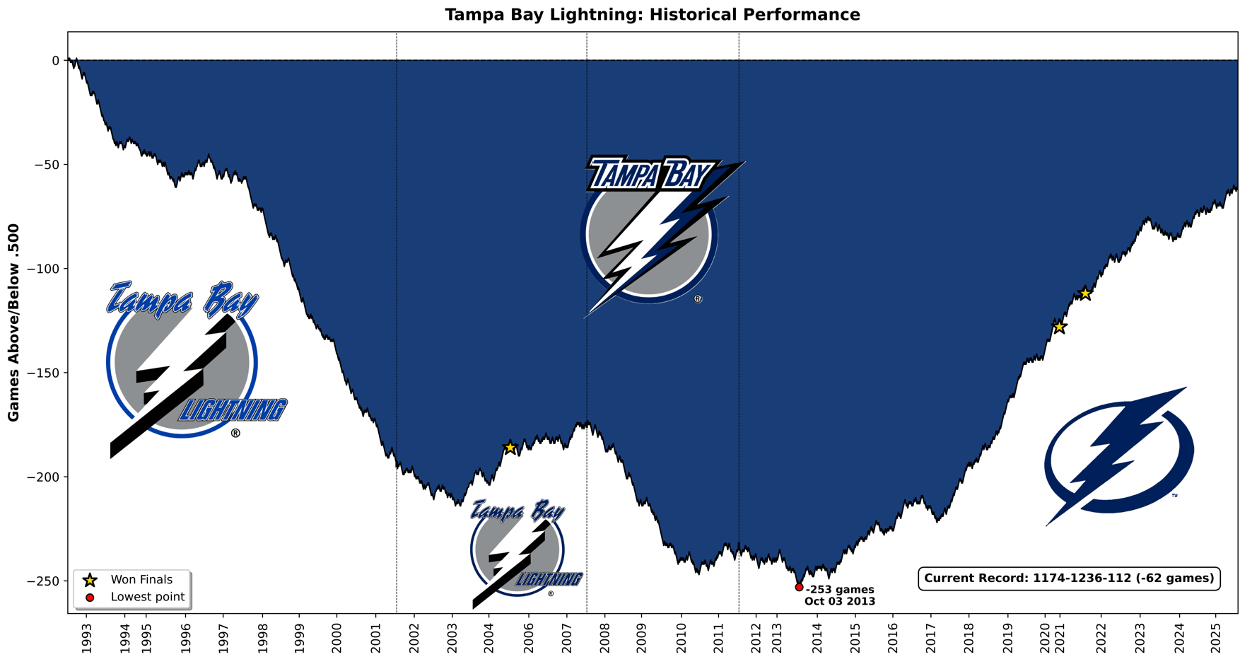
Visiting Habs fan here! I built a tool to create these cumulative performance charts and decided to make one for every NHL team before the start of the season.
I originally created this for my baseball team, the Pirates, who hit a franchise milestone this season – reaching exactly .500 (10,879-10,879) on July 19th for the first time since 1903. I wanted to visualize the incredible downward spiral back to 0.500 (for those interested: Pirates chart), and it turned out so compelling that I decided to bring the concept to my second favorite sport: hockey.
Technical note: Each win (regulation or OT) moves the line up +1, each loss (regulation or OT) moves it down -1, and ties keep the value unchanged. Vertical dotted lines show a logo change.
3 comments
I’m actually astounded to learn the pirates hit .500.
I’m not a baseball fan, but my family is from Pittsburgh and growing up we always joked that the Steelers had a better chance at making the MLB playoffs than the Pirates do. They were atrocious for so long lol.
Edit: oh also this is a really cool graph man thanks for posting this.
This is cool thanks
This is pretty awesome thanks dude