The Brooklyn Nets 2025-26 schedule, as drawn by Brooklyn Basketball campers. 26 comments The Pacers one is pretty good Rockets one is sketchy Wizards should do another rebrand around that logo Is this in the new youth training facility across from Barclays? That one looks so dope. This is cute. The kid that drew Nuggets must be a Jokic fan lol. Ok, this was pretty cute “BS” This is adorable. The Raptors one looked cute and the Pacers one was actually pretty good Toronto Cobras This was gold lol. I’m gonna need a T-shirt with that Kings logo. I love my team, but I can’t take things seriously with this management. These would be fun logos on uniforms for a special game partnered with children’s charities. Lmaooooo did the Mavs kid draw fucking Chicken Jockey? The Utah Car Air Freshners Magic did all that work for a rebrand. Magic in shambles This is the cutest schedule reveal ‘26 ALTERNATE JERSEYS JUST DROPPED The Charlotte Bumble Bees I didn’t realize Chris Bosh was the Raptors logo. But honestly what an adorable video. The fake out with having the one random high schooler draw the terrible grizz logo lol Ho—us—ton was accidentally very clever, I can see some matching shirts come playoff time with the emphasis on *US* for unity. I’ll take it! Absolutely nailed it. I would legitimately buy a hat with that suns logo if the revenue goes to the kid. Kid has all the confidence in the world, but absolutely bombed on his Lakers logo Wizards logo is actually straight 🔥 I like how the Bulls logo is unnecessarily suspicious. The Spurs kid nailed it, kept it simple and iconic. This kid’s Wizards logo unironically better than their original logo. Leave a ReplyYou must be logged in to post a comment.
Is this in the new youth training facility across from Barclays? That one looks so dope. This is cute. The kid that drew Nuggets must be a Jokic fan lol.
I’m gonna need a T-shirt with that Kings logo. I love my team, but I can’t take things seriously with this management.
Ho—us—ton was accidentally very clever, I can see some matching shirts come playoff time with the emphasis on *US* for unity.
I’ll take it! Absolutely nailed it. I would legitimately buy a hat with that suns logo if the revenue goes to the kid.

26 comments
The Pacers one is pretty good
Rockets one is sketchy
Wizards should do another rebrand around that logo
Is this in the new youth training facility across from Barclays? That one looks so dope.
This is cute. The kid that drew Nuggets must be a Jokic fan lol.
Ok, this was pretty cute
“BS”
This is adorable. The Raptors one looked cute and the Pacers one was actually pretty good
Toronto Cobras
This was gold lol.
I’m gonna need a T-shirt with that Kings logo. I love my team, but I can’t take things seriously with this management.
These would be fun logos on uniforms for a special game partnered with children’s charities.
Lmaooooo did the Mavs kid draw fucking Chicken Jockey?
The Utah Car Air Freshners
Magic did all that work for a rebrand. Magic in shambles
This is the cutest schedule reveal
‘26 ALTERNATE JERSEYS JUST DROPPED
The Charlotte Bumble Bees
I didn’t realize Chris Bosh was the Raptors logo.
But honestly what an adorable video.
The fake out with having the one random high schooler draw the terrible grizz logo lol
Ho—us—ton was accidentally very clever, I can see some matching shirts come playoff time with the emphasis on *US* for unity.
I’ll take it! Absolutely nailed it. I would legitimately buy a hat with that suns logo if the revenue goes to the kid.
Kid has all the confidence in the world, but absolutely bombed on his Lakers logo
Wizards logo is actually straight 🔥
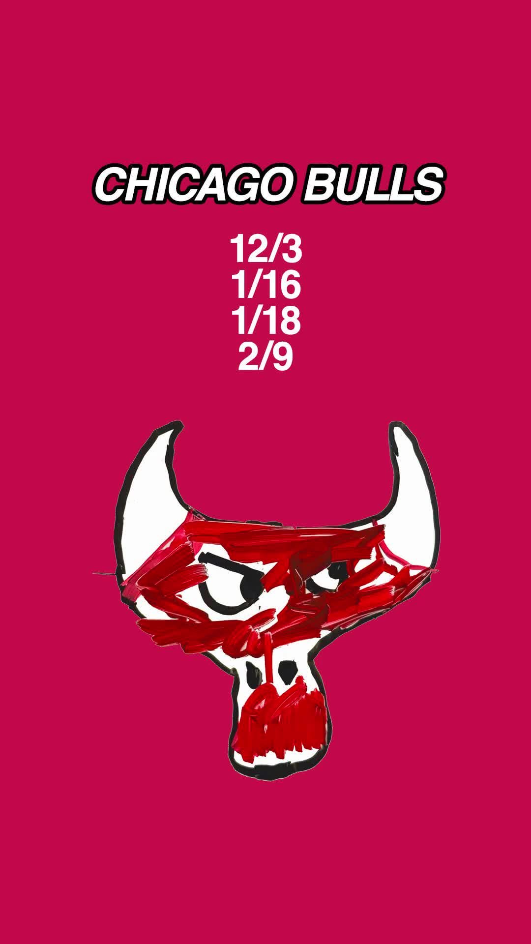
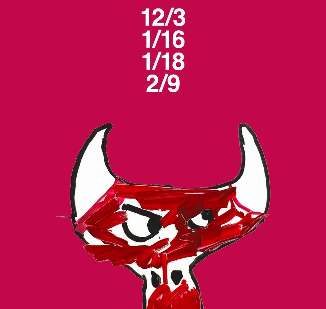
I like how the Bulls logo is unnecessarily suspicious.
The Spurs kid nailed it, kept it simple and iconic.
This kid’s Wizards logo unironically better than their original logo.