
NEW Carolina Hurricanes Away Jersey!
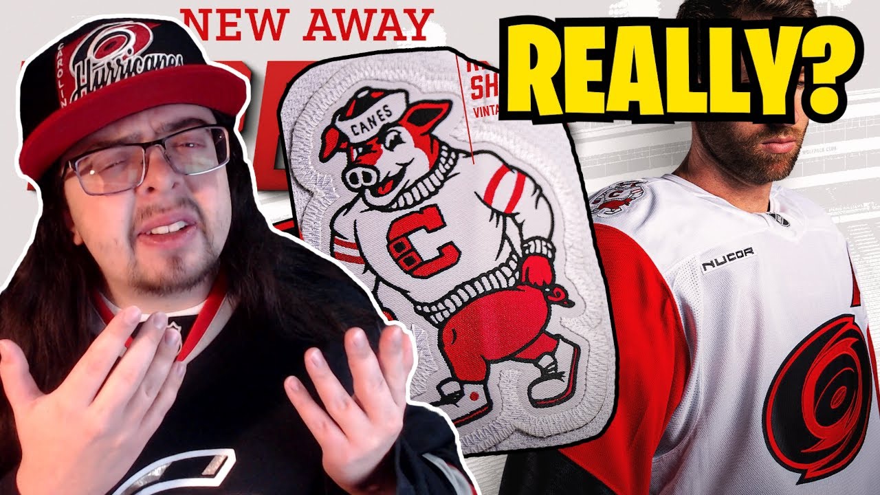
The Carolina Hurricanes just revealed their brand new away jersey. I was so excited when I heard that the Hurricanes were going to have a new away jersey this season cuz man, I did not like their previous away. It did not vibe with me whatsoever. So, this one right here, it is a massive improvement on that previous away jersey, but it still has a couple of strange things about it. So, before we dive into it, if you guys are new to the channel and you like hockey jersey content, please make sure to hit subscribe. I would really appreciate it. All right, let’s get into it. I just want to take a quick look at their previous OA jersey first. So, this is what it looked like. I really did not like this thing. First of all, I hate wear mark jerseys and I really hate nickname mark jerseys. I don’t think they work whatsoever. Those sends bolts and canes jerseys. I just don’t like them. The only positive thing I would say about this jersey here is I did like the detail in the sea. I thought that was cool and I kind of have kept that on these new OA jerseys as well. So, this is the new OA jersey. It’s I I do really like it a lot. I don’t know if I love it as an away jersey, though. It feels a lot more like a Stadium Series jersey because that’s what it is. It is just a reverse of their 2023 Stadium Series jersey uh where they played against the Capitals. But yeah, like it’s a it’s a really cool looking jersey. I do like it a lot. It feels like it would fit a lot better as an alternate jersey, which is kind of the same thing with their home jersey as well, where I love their home jersey. I think it looks great, but I don’t know really how much it works as a home jersey. Probably works a lot better as an away jersey. So, both are home and aways don’t really feel like home and aways. And they’re also very different from each other, which kind of still feeds into the whole Carolina identity crisis, you know, thing that’s been going on for a while now. And just a little side note here, I don’t know if the Carolina Hurricanes know what nostalgia or retro means cuz when they revealed these jerseys, they said that it was a nostalgic look re-imagined in white, but it’s not a nostalgic look. Like I said, it’s from 2023 and that was a Stadium Series game where it’s supposed to be futuristic. So, I don’t know why they said that. And then, of course, on top of that, they had the reverse retro 2.0 jersey, which was just a, you know, reverse jersey of their away jersey from 2019. So, like, do they know what nostalgia or retro means or do they just have nothing to pull from and they just like using those words? I don’t really know. I thought it was just kind of a funny thing. Anyways, I do think that the logo on this jersey here, it pops really well. Like, I think it looks gorgeous on that white background there. It feels strange once again that it’s just a two-tone version of their regular logo that they don’t even have on their home jersey except for on the shoulder, but it looks nice. Once again, I think that is great. We can even take a closer look at it. So, yeah, that looks phenomenal. Now, they have some really weird, or at least one really weird shoulder patch. The left shoulder patch is fine. It’s what was on that stadium series, just colorized a little bit differently. Uh, it’s just the North Carolina State flag. That looks good. The other one is Stormy. A vintage Stormy, which is their mascot. It’s weird. I Why do you have this on your away jersey? I love it. I do like it. Like, I think it’s really funny, but man, it’s weird that it’s on your away jersey. It would be once again fine as an alternate. I think it would be okay as an alternate, but having that on your way jersey is a choice. And I guess I kind of have to respect it cuz like I don’t know why you would do that. It’s it’s crazy to me. I feel like especially as they have it tagged here, a vintage Stormy on a jersey that I mentioned. It’s not very nostalgic. It’s not very retro. So, it does feel a little bit out of place. I do like the sweater that the Stormmy is wearing. Uh they’ve kind of teased that logo like they I think they’ve used that logo a few times uh with just like the C as just that uh which I think does look kind of cool. It’s a neat looking spider. But yeah, it’s just it’s weird, man. It’s weird that they have that on this jersey here. Uh I I do kind of like it though cuz I like when teams do weird or kind of stupid things. Uh so I’m a fan of it, but I can understand if people would really not like this. I definitely would get that. Moving on to the sleeve numbers. These do feel really awkward to me because, you know, if you take a look at them here, they seem just so small. And maybe that’s just because my brain is used to seeing, you know, pretty much this jersey just in black and having the big numbers on the sleeves, uh, cuz it’s a Stadium Series game and they always have those big numbers. So, going from that jersey to this one, maybe that’s why it comes off as a little bit awkward. Uh, it’s not like I have this issue with the jerseys that usually have this type of striping pattern. For example, the Pittsburgh Penguins. They have kind of a similar, you know, at least like blob of color right here that holds the numbers right on their home jersey. Um, and I don’t have an issue with those numbers on that jersey. So, I don’t know if it’s because these numbers here are a little bit farther down. They’re not set in the middle of that, you know, kind of splotch of red and that’s why it feels a little bit smaller. Maybe that’s it. I’m not really quite too sure. Um, like I said, I think I’ll probably get used to it, but right now, uh, they do feel a little tiny with the back numbers. It’s literally just a stroke of red. That’s all it is. There’s nothing too special with it. Uh it’s a very similar uh you know font to the Stadium series, but I think it’s slightly different. Like almost just like spaced out a little bit more. Um otherwise like it looks pretty identical. Like it’s very very close. Without comparing the two, I didn’t notice a difference, but looking at them side by side, yeah, there’s very very slight differences, but it’s pretty much just the Stadium Series font. So it looks fine. I don’t really have a huge issue with it, but I don’t think it looks fantastic either. And then we can take a look at inside the back of the collar. So, it just has, you know, the little hurricane warning flags. And then, of course, you know, that gray stripe right below the red stripe that is heathered like it was on those 2023 Stadium Series jerseys. Uh, so I do like that they kept that aspect. I was a little bit surprised, honestly, that they like literally just swapped the black to the white. I was talking about this when I was doing all of like the rumors and stuff. I think like a week or two back whenever I uploaded that video and I kind of made a very quick Photoshop and I said they’ll probably do something a little bit more than just this adjust a color swap of the black into white. But no, that’s pretty much what they did other than putting Stormy on the shoulder. Yeah, they did not change really anything about the jersey. So I I was a little shocked about that. I really thought that they would change a little bit more, but I guess they thought it was good enough so they didn’t need to change anything. Uh one more thing that I do want to take a look at is the seat on the jersey, the captain’s patch. uh cuz I don’t think they showed Jordan Stall in any of their promotional images. Uh but they do have this jersey right here uh just on the NHL site. And so we can see the sea. It does have the sea that is basically from that previous OA jersey where it has the hurricane warning flag uh in the sea. And I think that is that’s where I like the sea. I think as a captain’s patch, it’s a really nice looking sea. Don’t love it a whole lot as a wear mark or you know part of a wear mark. And I don’t think that I would like it as just the sole thing on a jersey like we see on the Stormy patch. I I don’t think I would like that as just the logo for a jersey. I think that would be a little bit too basic. I think it would be fine as a sweater like it is on that Stormy patch, but maybe not really quite so much as a jersey. But my overall thoughts are I really like the jersey a lot. Like I would probably give it an 8 out of 10. Think it looks really clean, really sharp. I love how much the logo pops. Uh that it’s great. Like it’s really really nice. However, as a Hurricanes away jersey, because of all their brand identity issues, it does get knocked down to probably a six. Like really, it’s just I really want the Hurricanes to pick a direction. If they wanted to, they could use the Stadium Series jersey as their home jersey and then this new away jersey and have it like that and then I would be fine with it. I’d be totally okay with it. You know, maybe not my favorite Hurricanes, you know, set of jerseys, but it would be a lot better than what they have now where it’s just so confusing. and they just don’t have a specific brand image. It’s just different throughout all of their jerseys and their social media sometimes. It’s just really really strange honestly. And it’s not even like this away jersey is their regular Carolina Hurricanes logo. Like it’s colorized differently. It’s just the two-tone instead of like how it usually looks. So it’s weird. It’s just a really weird thing. I don’t know why the Hurricanes have such an issue with this. I really don’t get it. And I don’t even think the jerseys that they’ve had are bad. The only one that I don’t like was their previous away jersey. Outside of that, like I I basically like most of their jerseys. It’s just yeah, it’s just one way or the other. They don’t really just stick with one thing. It’s weird. I don’t know. But anyways, those are just my thoughts. I would love to know what you guys think about this jersey in the comments down below. How do you feel about it just as a jersey? And how do you feel about it as the Hurricanes away jersey and kind of maybe that difference there? I would love to know your guys’ thoughts. But yeah, like I said, that’s it for me. Thank you so much for watching. If you guys like the video, make sure to leave a like, subscribe to the channel, follow me on all my social medias. I’ll see you guys next time. Bye.
The Canes just released a new away jersey… they are not beating the identity crisis allegations
Join my discord!: https://discord.gg/TgeBpaEzXH
Follow me elsewhere
TikTok: https://www.tiktok.com/@thejerseyzone
Twitter: https://twitter.com/TheJerseyZone
Instagram: https://www.instagram.com/thejerseyzoneyt/
29 comments
The identity crisis lives on with the Hurricanes
I never understood why Carolina just didn’t go back to their 06 jerseys as their home and away and make the black jersey the alternate. Seems like a missed opportunity.
I love the shoulder patch
I think this is what they were rumored to go with so it's not surprising that this was the result
Their best jerseys are the Whalers jersey, that says it all.
I think the stormy patch is probably an homage to the arena being also home to NC State basketball so a bit of a college tie.
I love the new jersey. The logo will probably become a home logo in the future, with the stadium series look.
The shoulder patch is reminiscent of the college mascot logos in the region, NC State, UNC, Wake Forest, App State, and ECU all have similar mascot logos. I wish every Hurricanes jersey had a storm flag stripe on the belt
Better then the Stupid Canes jersey
Should've rounded off the shoulders
The 2023 stadium series look like the inverse of this version they might get a new home
Personally I have always loved the hurricane brand, but their identity is a problem that needs addressing. I do appreciate the thought of going more modern vs classic as a large group of the league is going classic. Innovation is important, so I do think that tipping my hat is granted. HOWEVER, they need to pick a direction that is consistent with both home and road. Upgrade the Stadium series design to match this, and then their current home can be an alternate. But who am I to say, I’m just a jersey nerd 🤓 🤷♂️
Anything was gonna feel like an upgrade from the old aways, hated the wordmark. I think you're spot on with the identity thing. I don't really mind very different looks for the home and aways but I just think we should embrace the swirl! The problem is Tom Dundon hates it.
I'm also a huge fan of the shoulder stormy. Like others said its evoking the mascots of the local colleges especially NC State who we share a parking lot with and they really captured the feel of it. If you look up the drawn nc state mascot you'll see it!
I like these
The black arm numbers on a red background seem like they’ll be difficult to see from afar.
what on earth are they doing?
The Canes stadium series evokes immediate nostalgia for anyone who was there, or anyone who lived in Raleigh at the time. The whole city showed up for that game and i am pretty sure it set big attendance numbers for hockey special events outside of historic markets. Celebrating college sports is a big deal down here too. I am sure we will see the limited edition golden collegiate "C" jersey with the same stormy patch make an appearance as an alternate jersey at some point as well.
These jerseys suck hard
Not a fan just go back to the 05-06 jerseys call it a day
⚠⚠Disclaimer up front I'm a Ducks fan so biased opinion⚠⚠
I love the old Might Ducks logo and I like the "new" one.
Yet to me some teams "just" have a boring logo and the canes is just such a team I really don't like or get what we saw here as the main logo I like the hockey stick with the 2 flags I'm just not a fan of the puck in the mid. of a hurrican sorry canes fan.
This is technically better than the Canes jersey, but it's still an Identity Crisis
It's not perfect, and I could easily suggest changes I would like to see. That said, it's better than the previous away jerseys and they seem unique. probably like a 7.5 out of 10 for me
I like the jersey
Whatever… white storm serge would have been better
Put the normal logo on the front and it's perfect. Overall I really like them.
My guess: they introduce a new home jersey next season which will be a red version of the stadium series, then use stormy on an alternate jersey. This is likely just testing the waters for one year on how jersey sales go and how fans react.
3:00 It's due to where the team is from. College sports are HUGE in the area, and that "strutting" style of throwback mascot is a common theme to the area schools.
i think they'll grow on me. my problems with this:
1. no hurricane warning belt
2. the numbers need something, piping, drop shadow
call me crazy but that sweater stormy is wearing will be a winter classic jersey in 5 years specifically the C and the sleeves
Stadium series jersey is god awful. I don't know why people like it.