
Seeding Stripes: Ranking the Current Dallas Stars – Last Team!
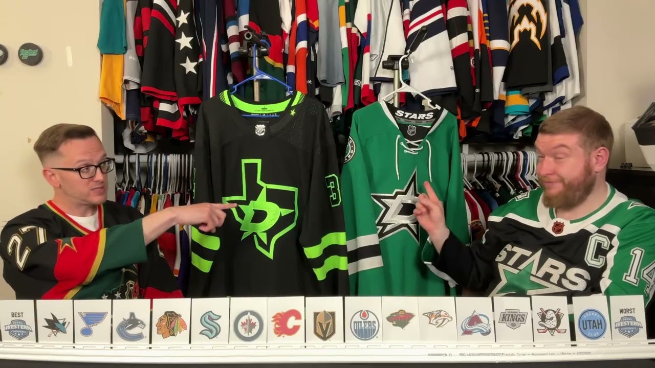
John, where are you? I I can’t see you. Well, you have to look past the turnover. My eyes. Well, Phil, where’s John? Yeah, you’re better off just not worrying about that. Oh, wow. That got dark when he’s tired. This is hour six. This is what hour six of filming looks like. So, let’s just get through this. Let’s just just Next on third. I’m still [Music] Welcome back to another episode of Ugly Thirds. Uh, today’s topic is the Dallas Star seeding stripes. John and Shrems, take it away, Bill Prios. Thank you. Try to put a little more pep in my step here. Okay. I’m still fresh as a daisy and twice as fragrant. You slept like till noon and it’s Sunday. That’s what you do. I’m going to go out on a limb and say without this third, Dallas is right here. Maybe. I’m not putting it quite that high. Without the third. I’m still not putting it quite that high. I’ll explain why. And I don’t care what you think. Well, then fine then. Mom and dad, stop fighting. This is fine. Everything’s fine. That’s fine. Victory Green. There is something about Victory Green. Yes. As a mascot, Victor E. Green is phenomenal. Wonderful. When we were in Dallas, I was stunned at how popular this was because you were stunned by the color of it and seeing it in your eyes. It is. And there were only two Motor Jerseys. Yeah. Yeah. It was you and one other. That’s it. In the whole rink, I made my rounds. That was so intimidating. Guarantee I made my rounds. We don’t have the white. Let’s start with the white. All right. So, let’s go. Phil, go ahead. Actually, because this is the Reebok, I put both in that we’re missing technically. Okay. So, that’s it. That’s That’s where you know there’s a difference in the collar. Um the white I was shocked to not white because I think the white is a great looking jersey. I really do. Um there is another slide and you’re probably gonna have to look, Phil. uh because I forget where I put it in the set. Uh when you go to the team store, how far you have to go down until you hit a white jersey. So I I and I thought, okay, so maybe white jersey is just not as popular in general. And so I looked Toronto, it’s in the fifth row. Uh Chicago, it’s in the third row. Um Columbus, fourth row. Like, but you’re you’re between like three and six row down, you’re going to see a white jersey. Go ahead, Phil. Show the Dallas team store. That’s scrolling down three columns worth by row 16. There is no white jersey. And you’re thinking, “Oh, you just toggle back and forth.” No, it’s green and black on all of those toggles. No, there’s there’s white right here. Third row. You sure about that? That’s a white cuz that’s black. I have my doubts, Phil. Okay. I mean, it’s still Oh, you go. You pull up any other team store though. You don’t have that. The white is actually one of the ones that they’ll put on there. I will notice say though, more team stores are doing that where it’s one toggle versus having them separate. But you like go on go on any verify for yourself. You don’t have to necessarily put it up there, but verify. That’s that’s where it continue. Um 2013 they switched to Victory Green which is earlier than I thought it was. I thought this was like an Adidas thing or a last year of Reebok thing. No, it lasted a couple years. Um they did a great I mean I I love the the hanger effect with stars just in case. Um there was a lot of push back on the dropping of gold. Um which is weird because they pretty much had dropped green in the Reebok era. Um, Phil’s probably unable to show himself at the moment. U, but he’s wearing the Reebok one that looks like Dallas University. Um, to to go from that to this is probably the best upgrade of the Reebok era. And I I think we said as much when we looked through our our um era tour. Yeah. So, um, it it is such a good look and it’s well balanced with black pants. Um, there is Are you How’s your research coming, Phil? Well, I’m on the team store, which looks completely different than what you looked at. I went on a laptop. Does that help? Well, no, but like hangerhockey.com is their team store. Oh, I was on I was on NHL. So, the white one doesn’t show up until the last page. It’s three pages. So, um, they don’t have a a toggle, but they do have the pink one on the third row. So, it’s like, why why haven’t we found one? is they’re not showing up on eBay because they’re not selling a lot. That’s that was my takeaway. It’s victory green. It’s victory green. You you wear victory green. Um there is one major complaint and it’s in the number font. Okay, Phil, could you pull up thoughts on what the complaint is? I’ll I’ll start there. How about that? The green on white doesn’t look good. It’s hard to see. That’s it. It could use a black outline, I think. And that’s what everyone says. Yeah. Um I don’t know that a black outline would look good on the green, though. No. So, do you mismatch it? Do you go with black numbers and name, which does take away from some of the victory green? Um, that is the one complaint. And I feel there’s I understand why Dallas does it this way because it’s fine. It works, but it’s not as great. And if you go to the next slide, you’ll see in action. Like there’s a significant difference between how legible both are. Yeah. How much they pop. I’ll give you that. So black’s on the jersey for both of them. So like it’s not unrealistic that No, it’s not. They’ve had to have tested it. Then there’s this thing. So, which I am I am very torn about given how well loved it is people from Dallas to to to see this as a detriment. I think that would hurt a lot of people’s feelings based on what we saw. About feelings based on what we saw. Um, so first off, you have the the Texas state outline. And if there’s a people like who love the state outline, it’s Texas. Yeah. the Texas state like it is the most common shape in Texas. Um the it being the secondary logo that is usually No, no, it’s not even. It’s a pants logo. Um it it’s it’s cool. And I I actually do enjoy that it’s not a proper crest. If you want to get in here, Phil, it’s it’s just jersey. Like the only twill is the green. If you want to go that side, that’s fine. Um, but like it’s this this fabric and this fabric are exactly like it’s just green on top. So that’s kind of fun. Um, I do love in the font on the back that the speed holes are used as a design element because they are not universal. You’re going to have to zoom in on this one, but probably not as far. It makes a drop shadow. Yeah, these number kits are a little pricier to deal with, too. I’m also noticing like certain certain ones are not cut as well and so like it looks like a burnt out pixel like. Can you zoom in zoom back in again? Like you can see there that’s a number that’s that’s a hole that’s not drilled as well. Uh and up here there were a couple that look like burnt out pixels. I do also enjoy this on the the sleeve numbers. It’s the same thing. You don’t have to zoom in for that. It’s the same thing. Um and and then one two last details, vexological details. Uh the come and take it flag in the caller effect which was used uh leading up to Texas independence. Um the Gonzalez militia had a cannon given to them by the Mexican government. The Mexican government under Santa Ana was coming to take it back. And they put up a flag with a picture of the cannon on it that said come and take it, which is so very American. In English or Spanish? It was in English, which because again, it’s so very American. Do not care. Uh, and then the Texas flag is hidden here. This probably have to zoom in because it goes around the collar, but you got to have it. It’s It’s the law. You have to have a Texas flag somewhere. Um, so you have a star and then you have the white and what would be the red. Um, right there. Almost as bad as Maryland. Yes. But subtler. Um, you know where the green comes from though. I will give them this much. There’s a reason for it. It’s not just let’s blow out everyone’s eyeballs. Wait on me, Bill. The slide. Uh, maybe. Is it the the skyline? The skyline. Okay. They they they pulled it from that green used in the Dallas skyline. Um so it’s it’s a city connected jersey before that was a thing. Doesn’t make it good. It justifies it. Doesn’t make it good. Just because you can doesn’t mean you should. So the last one we need to rank it in here. Where do we put it? Definitely towards the Phil has thoughts down here. I think this logo is great. I think they the move to silver rather than gold was bold, but this is the same star that appears in the top of the North Stars jersey. There you have it. That’s the same It’s the same star at the same angle. Uh dropping gold was was not popular, but I think it was the right move. Um, I’m I’m in I’m in this range. What do you think? The third brings it down for me. I would put it right here. If not for the third, if not for the third. But I think we’re we’re dab dabbling down here a little bit. And maybe people don’t see it as much of a detriment, but if we’re looking at the whole picture, the whole picture, this is very different. And it’s it’s bright. It’s so loved. That’s the problem. It’s so well loved. You make the final decision. I got us in the general decision. Is it better or worse than Edmonton? Edmonton does not have a third. Nope. It’s It’s a look that’s been around a long time, but from a very glorious past. um a glorious past, but if I’m putting them headtohead, home and road, it’s it’s going right here. Okay, it’s better than so that third doesn’t drag it down enough. So, there you have it. That’s the Western Conference ready to go, ready to be put in a bracket. So, stay tuned. We’ll do some previews of uh the East, probably do four competitions at a time. um let you vote on it for a week. Um and let’s get to a champion. Who is the best look in the NHL right now? Yeah. So cool. Awesome. We did it. We actually did it. He shrimps. I’m John. Phil, why don’t you take us out? Don’t forget to hit that like and subscribe button. Ring the bell to get notifications when we post new videos and come back for another episode of Ugly Thirds. I can’t wait to find out that our microphone wasn’t working for the past six hours. Oh, that’d be great. Cannot wait.
Follow John’s jersey adventures on Instagram: https://www.instagram.com/hockeyjerseyguy/
#hockeyjerseys #hockeyjersey #nhljersey #jerseycollector #jerseycollection #nhl #hockey #uglythirds
9 comments
Lmao y'all have it all wrong. The blackout jersey alone made this a top 5 jersey set. The regular home/away jerseys are not great at all. They're meh at best.
Add Silver outline to home & road #'s & 3rd logos & #'s
The blackout jersey has grown on me – kind of like a neon fungus……sadly I don't have one.
The best third jersey Dallas could have is the RR2 – bring it back Dallas!!!
Also the blackout jersey has been half price on the team store – does that mean they're dumping it??
Of course it's already sold out in any proper man's size!!
I love the blackout jersey. It’s bold. It’s garish. It works. It does a lot more for me than their home and away, which are bland in contrast. I think they should lean even harder into the neon.
All I can say is ugh. At best they are better than Utah, Nashville, and Colorado. The 3rd is awful, and the logo for the home and road is so average. A D in a Star, that is so innovative and original…
Horrible jerseys for the Stars. 🤢 But they deserve it.
This is so boring and uninspired. It ranks higher than UTAH but that's it.
Whoever selected that color was either never exposed to Mr. Yuk stickers as a child or liked little green cartoon aliens.
I had the exact same reaction to seeing so many of those blackout jerseys in the stands in Dallas. I don't like it at all. Admittedly, I'm kind of a traditionalist.