
Washington Capitals NEW Alternate Jersey Revealed!
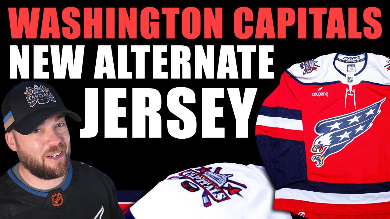
Hey everybody, welcome to Postit Post. It’s Neil here. Thanks for joining me for this one. Today’s a good day. Typically Mondays are not that great of a day. You’re going back to work, you’re starting school, whatever it is. But on this Monday, two jerseys got released in the NHL. I guess as I’m filming this, maybe there’s going to be more. But on this Monday, two NHL teams released their new jerseys. That is the Washington Capitals and the Detroit Red Wings. Uh let’s jump in right into Washington. You can see, you know, I got some Washington merch here. Let’s jump in and let’s take a look at this. I’m going to take you through the photos as I saw them in the in the exact same order and I’ll break it down and give you my thoughts. And I have to say before we get I’ll bring up the first one so you can see it if you haven’t seen it already. But my first impression of this entire jersey was not so much the jersey, but how fantastic of a job that the Washington Capitals did. I was recently critical of the Ottawa Senators on the channel and my last video, previous video before that, whatever it was, at how botch their release of that jersey was, their new alternate jersey. They basically had no imagery. It took them forever to get anything out. Even the NHL didn’t have that much. So, Washington Capitals absolutely home run here with their release of this. I’m very excited to look at these images with y’all. Okay, so the first one we have OV himself dawning this. It looks like a pretty genuine smile, I think. So, I mean, there’s lots to talk about here. Okay, the Screaming Eagle, which you can see on this jersey. This has shades of averse retro 1.0, Oh, the original Screaming Eagle, the I guess ’90s jersey, the alternate jersey from seven, eight years ago, whenever it was. Um, it’s got stadium series from 2018 against Toronto. It has so many different aspects of this. This is really a Frankenstein jersey, but at the same time, it looks very Washington Capitals. It’s pretty close to the home jersey in terms of general, you know, if you just peripheral vision out of the corner of your eye, it, you know, looks pretty close to a home jersey. So, I I really think they did a good job here. Overall, even though it is kind of mismatched and an amalgamation of of a whole bunch of jerseys, it does look cohesive. So, so let’s dig in deeper and look at some more photos. So, this next image here, you can see the assistant. So, we just saw Obie with the C and then the AD there. I’ll talk about that in more in depth here in a little bit. The shoulder patch and now we have the A. So, you can see some relation there between the AD and the um you know, the captain and assistant. I don’t like that. Uh I have a better photo later that we’ll look at, but I’m very excited for the shoulder patch. I think that is fantastic. If you look at the back here, the number kit pretty generic. The name plate pretty generic as well. Striping pretty generic, but uh very very Washington Capitals from behind, that’s for sure. Now, Washington did release four photos on Twitter and they’re all supposed to be one photo. Okay, if you put them all four together, they look they make up one big thing. But for whatever reason, uh, companies and and teams are doing that now where they split it into four photos instead of just putting one. I It drives me nuts. But anyways, I’ll go through each one for you. So, Scream Eagle returns. Designed in partnership with Fanatics, this new uniform honors multiple eras of Capital’s history. That was very apparent just from looking at the jersey. The next one here, they have a lace up neckline and the reintroduced 1990s Capital Dome shoulder patch add distinctive character and heritage detail. Complnting the primary logo, the shoulder patch incorporates the US capital building uh positioned in front of two cross hockey sticks uh with a hockey puck and nestled in between the blades. Yeah, great uh great logo. We like that uh quite a bit. And then the next image they have here, symbolic details run throughout. This is one that I was mostly interested in. Three stars on the pants and three sleeve stripes in red, white, and blue represent the loyal DC, Maryland, and Virginia flag fans. Sorry. Uh finishing touches include a District of Columbia flag loop label at the back hammock, creating a hidden discovery element while honoring the team’s home and the cap’s word mark at the inner back neck as a final nod to the team pride. If you know me, you know I love uh city flags. So, the fact that there’s one on here, major bonus points, major bonus points to the Washington Capitals. Absolutely love that. I love that decision. Now, the final little graphic they of the four they have here is the screaming eagle logo’s dynamic pose invokes energy motion capturing intensity of the game. Marketing mumbo jumbo. The iconic white uh rounded shoulder yolk and classic hem striping. Okay, moving on to the next image that I saw, which is basically the whole jersey. So, I think overall they did a really good job and this is coming from someone who does not like rounded shoulder yolks. I am a very big fan of the squared off look. I think it’s way more modern. It’s way more uniform. Uh, and I don’t think that that classic rounded look looks good on every single jersey or team or brand. It just doesn’t. Okay. But in this specific jersey, I do think it works quite well. I actually really like the shoulders. I did see some critical comments on Twitter and some other uh areas online that uh did not at all like the shoulders. I’m not in that camp. I personally like them. I think that uh actually there’s nothing about this jersey that I really dislike or would probably change. It’s it’s it’s it is clashing a little bit because you’ve got some rounded design language up top, but very angular and square and flat uh down below. So, it’s not totally cohesive, but I I do like it. I think they did a good job. Now, this next image I have is a very similar image, but you can see the C and the ad there. So, uh I have an up close photo of that. I’m going to go on to that and you can see how close it actually is. Like that’s way too close. I don’t like that at all. I understand jersey ads and why they need to be there. Although I don’t understand it because I hate it. But let’s just go back to that previous photo. And you can just it’s so crowded and the C is on that side because of this logo comes all the way up here. It’s it’s it’s it’s taking that space. So the C has to move over. But the the the ad really big time clash big time clash there with that. Uh, now I have a close-up photo of the Screaming Eagle itself. An amazing logo. Absolutely loved by the majority of people out there, regardless if you’re a Capitals fan or not. On the back of the inside of the collar, which we kind of saw a call out to earlier, you can see the photo there and that and there. So, that’s that’s nice. And then a beautiful photo of the city flag. Love it. Absolutely love it. I can’t believe they put that in. I’m so happy about that. And then here’s a photo of the back of the jersey. And that looks very, very Washington Capitals. And I have one uh final photo I think here of just it in different lighting. I love looking when you know when a team releases a jersey. I like to look at all the photos. It doesn’t matter if they’re a little bit similar. Sometimes they’re in different lighting. Sometimes it’s not a flatlay uh like digital version. It’s an actual version like this where you can see some crinkles in it and stuff. You can see how light plays off it. I think that’s really important because sometimes jerseys look better in other lighting and sometimes jerseys are just awesome in any lighting. Uh, so I I like to look at all the photos that the teams released because I want to see I want to see everything and uh I think this looks good in all lighting. I really like it. And then the final little uh bit of information I have here is they’ve actually released a schedule of when they’re going to wear this. So it’s going to be 1 2 3 4 5 6 7 8 9 10 11 12 13 14 15. I think it’s 15 games this year, which is amazing. I assume that all of these are home games. I don’t know their schedule by heart, but I assume that they would wear this dark, you know, jersey at home, which is a little bit of a shame, but uh it might give a couple of people a reason to actually go see a game in Washington. Uh that would be really fun. That’d be really fun to do. They even playing uh some some pretty good teams during these dates as well. So yeah, there’s the schedule in case you want to mark that on your calendar. They can see down below they also have other merch that they’ve released as well in in combination with this. But I’ll go back to what maybe the first photo that we saw here of Obie. Round out this video, I guess, at this point. So, I would love to know your thoughts down below in the comment section. Yes, it’s very similar to reverse retro 1.0. Yes, it’s very similar to the home jersey in some aspects. It’s not super innovative. It’s not super different, but but it is almost like a cap on Obie’s career. He’s coming up on retirement in the next couple of years. uh one of the first jerseys that he wore as if an NHL player was, you know, that screaming eagle back then. And to kind of end that era with a similar jersey is very poetic in a way. So I really appreciate that the Washington Capitals did that. Whether it was a request by Ovia or whether he doesn’t care at all doesn’t really matter. There is, you know, there is some some fairy tale kind of poetic aspect of that. So I really appreciate that just from a visual perspective. And I really like that they did this. It’s not a perfect jersey. It’s not a perfect long-term alternate, but it is quite nice, and I think the majority of people are going to like this quite a bit, and it looks really great in a uniform as well from the photos that I can see. So, yeah. Um, not a huge Washington Capitals fan, but a huge fan of this jersey and the release that they made. I think they did a a stellar and fantastic job. But, like I said at the beginning of this video, they’re not the only team to release a jersey today. The Detroit Red Wings also did, and I have a lot to say about that one. There is some specific details on that jersey that are very unique in the NHL. Very unique. So, catch me for that video coming up on the channel very soon. Subscribe if you’re new to make sure you don’t miss it. And yeah, leave me your comments down below of this video. Let me know what you think about this Washington Capitals Alternate New Jersey. Is this a good decision? Is this a bad decision? No right or wrong answer. Just would love to hear your opinion. Thanks for watching. Have a great day. We’ll talk to you soon. Adios.
Episode 1761
Supporting the channel can be done here:
YouTube Membership: https://www.youtube.com/channel/UCnWUMMlROKuT3roikjMp9TQ/join
Monthly Patreon contributions: https://www.patreon.com/Post2Post
Direct contributions: https://www.paypal.me/Post2Post
DEALS:
Save on jerseys by **FIRST** going to https://www.coolhockey.com/post2post and then using code “POST2POST” at checkout! This will save you 10%.
Save $20 off your first purchase at https://seatgeek.com/ with code: POST2POST
Save 10% off any template at https://sportstemplates.net/ with code: POST2POST
Want to submit YOUR jersey concepts to get reviewed? Please watch this video to find out how: https://youtu.be/fb_h_mB19fo
Play games with me on Twitch!
www.twitch.tv/post2post
PO Box: Unfortunately, the PO Box is now closed.
Find us on Social Media here:
https://www.Instagram.com/Post2PostShow
https://www.twitter.com/post2postshow
Have a business inquiry or want to send me a fan video intro?
E-mail me here: productions@post2postshow.com
*Due to the amount of e-mails, a response cannot be guaranteed*
#NHL #WashingtonCapitals #Capitals #Washington
14 comments
Alterante Jersey Washington Capitals
Edmonton Oilers new alternate LEAKED
Now we need a blue Weagle uniform. Do the caps hate logos cuz they sure don't do much
Ive generally believed the Caps have been milking the screaming eagle for too long but this as an alt works on a lotta fronts. The white shoulders from their inception and the removal of the vertical lower stripe modernizes it instead of dwelling in nostalgia. Keep the eagle on a third, and once Ovi retires and they change their main set switch to the Weagle full time
I like this jersey and Im a Devils fan
That should be the home jersey.
As a caps fan besides the black sweater you're wearing….it's legitimately my favourite they've ever released.
My gosh, the jerseys just get fuglier and fuglier.
Shoulders: 1974
Center and shoulder logo: 1997-2006/ RR20/RR22
Colors: 2007-present
Numbers: 2007-present
Nameplate font: 2021 Navy W
Sleeve striping: I can see a little SS18 and RR20
Wow someone finally decided to release a jersey without squared off shoulder yokes…
As a Canadian I have mixed feelings about how much I like this jersey.
If the Screaming Eagle was replaced with the main logo that they used for a Stadium Series game some years back, this jersey would have been what the Caps would have worn if the Caps were playing in the Original Six era. As it stands, awkward ad placement notwithstanding, this is a smart shirt.
I thought it was the new home, red home …. red alternate 😅
Not a Caps fan. I AM an Ovechkin fan, and a screaming eagle fan. This is so good.