LA Kings Center Ice Painting 7 comments Logo looks sick… but the ads is ruining it. I dig it, ads are ads, but the logo itself is pretty darn cool if i do say. It’s a cool logo, but busy as hell. Bring me back to when the ice surface had maybe 1 ad logo on the ice Ads are gonna ad. This goes hard! Oops they made a mistake, they put the Toyota logo twice. They’re purple and gold uniforms are probably my favorite uniforms ever and I wish they’d wear them more Leave a ReplyYou must be logged in to post a comment.
They’re purple and gold uniforms are probably my favorite uniforms ever and I wish they’d wear them more

7 comments
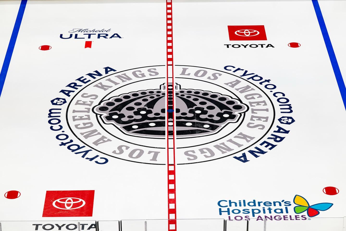
Logo looks sick… but the ads is ruining it.
I dig it, ads are ads, but the logo itself is pretty darn cool if i do say.
It’s a cool logo, but busy as hell.
Bring me back to when the ice surface had maybe 1 ad logo on the ice
Ads are gonna ad. This goes hard!
Oops they made a mistake, they put the Toyota logo twice.
They’re purple and gold uniforms are probably my favorite uniforms ever and I wish they’d wear them more