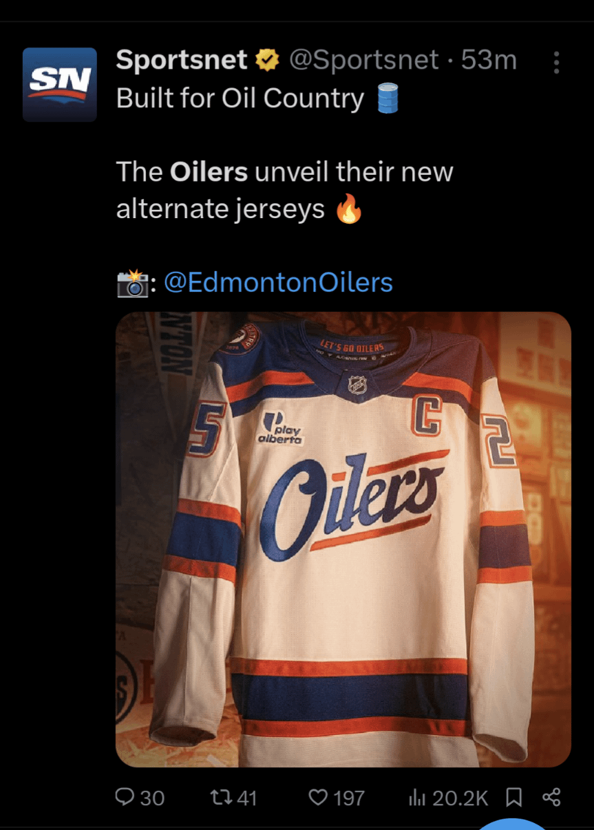
Not an Oilers fand but I kinda like these. Has a nice simple vintage look and not too overly designed. 25 comments The kids today can’t read cursive. They won’t know what it says. Nurse is the new captain? Horrific. Atrocious. They killed the elite Oilers crest. would be 10x better with the actual logo instead of a script. i like the cream color and shoulder yoke design Looks like a Target brand jersey Looks like AI ngl They look like beer league jerseys for a team that actually takes it serious You know what would help it look “vintage”? Taking that stupid jersey advertisement off of it. Are these Florida proof??? I think my problem with it is that it looks like an Oilers affiliate team, like an AHL jersey or something. Boring I think it looks like a jersey they’d make up to use in a beer commercial. Oh boy, these look pretty ugly… Shit look like a can of beer. Carling specifically. Prey sure you meant to say fan and not fand but just a little typo nothing to big I’m not really a fan of white jerseys, now if we invert the colors as an alternate… I can’t see McDavid wearing that for more than a year This looks sick as something for a fan to wear, but when I try picturing it on the ice something looks off about it Looked good until they panned out 🫠 “Look what I can do in Word, boss!” Not a fan of wordmarks. I get that ‘Oiler’ isn’t as easy to turn into a logo as, say, a jet, but these are very ‘meh’ imo. I think they’re fine? The vitriol is stunning. I remember the old McFarlane gear thing they were going with in the early 2000s, now that was ass Somehow it gives me Ottawa Charge vibes. Further proving McDavid to Toronto Plain like their captain looks like a beer can Leave a ReplyYou must be logged in to post a comment.
would be 10x better with the actual logo instead of a script. i like the cream color and shoulder yoke design
I think my problem with it is that it looks like an Oilers affiliate team, like an AHL jersey or something.
This looks sick as something for a fan to wear, but when I try picturing it on the ice something looks off about it
“Look what I can do in Word, boss!” Not a fan of wordmarks. I get that ‘Oiler’ isn’t as easy to turn into a logo as, say, a jet, but these are very ‘meh’ imo.
I think they’re fine? The vitriol is stunning. I remember the old McFarlane gear thing they were going with in the early 2000s, now that was ass

25 comments
The kids today can’t read cursive. They won’t know what it says.
Nurse is the new captain?
Horrific. Atrocious. They killed the elite Oilers crest.
would be 10x better with the actual logo instead of a script. i like the cream color and shoulder yoke design
Looks like a Target brand jersey
Looks like AI ngl
They look like beer league jerseys for a team that actually takes it serious
You know what would help it look “vintage”?
Taking that stupid jersey advertisement off of it.
Are these Florida proof???
I think my problem with it is that it looks like an Oilers affiliate team, like an AHL jersey or something.
Boring
I think it looks like a jersey they’d make up to use in a beer commercial.
Oh boy, these look pretty ugly…
Shit look like a can of beer. Carling specifically.
Prey sure you meant to say fan and not fand but just a little typo nothing to big
I’m not really a fan of white jerseys, now if we invert the colors as an alternate…
I can’t see McDavid wearing that for more than a year
This looks sick as something for a fan to wear, but when I try picturing it on the ice something looks off about it
Looked good until they panned out 🫠
“Look what I can do in Word, boss!”
Not a fan of wordmarks. I get that ‘Oiler’ isn’t as easy to turn into a logo as, say, a jet, but these are very ‘meh’ imo.
I think they’re fine? The vitriol is stunning. I remember the old McFarlane gear thing they were going with in the early 2000s, now that was ass
Somehow it gives me Ottawa Charge vibes.
Further proving McDavid to Toronto
Plain like their captain
looks like a beer can