
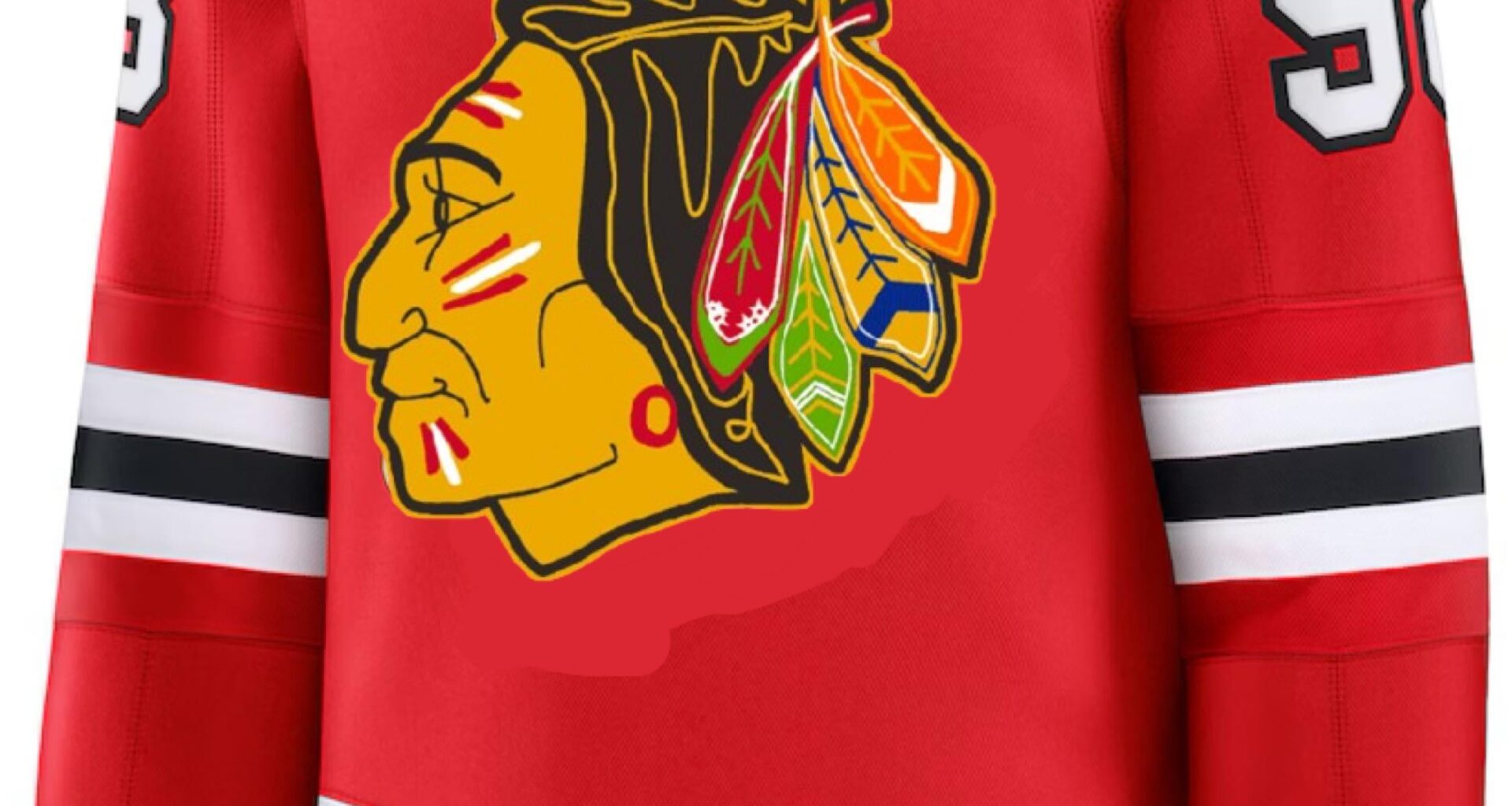
Please forgive this hasty crap photoshop. I tried putting the 60s logo on the centennial jersey.
Would you have preferred that the blackhawks done a more radical redesign for the centennial jersey? Things like the shoulder patch being lower on the arms or a different hawk head. I like that they kept it original but it feels too similar to a regular home jersey in my opinion.
8 comments
I dont want that logo back. Im glad the team moved on when they did.
Nah I think the tribute they did with the gold outline throwing it back to older logos is perfect. If anything I wish the 100 century logo was less generic
I would’ve liked a throwback 3rd. Or even a black 3rd.
I prefer the gold outline on the current logo
I like this logo and think it’d be perfect for the centennial jersey
They could have done literally anything else and they would have had a better centennial jersey. I can’t be the only one that thinks the jersey is incredibly lazy especially when you look at the other centennials. This one’s definitely the weakest.
Commit to the bit lol [1926-27’ Black Hawks kit](https://nhluniforms.com/Mobile/Blackhawks/Blackhawks01.html)
I would prefer a retro logo, definitely. I was really hoping for black 3rds this season at the very least; they’re so showtime
I would. The 60s logo kicks butt