
NHL Edmonton Oilers NEW Alternate Jersey!
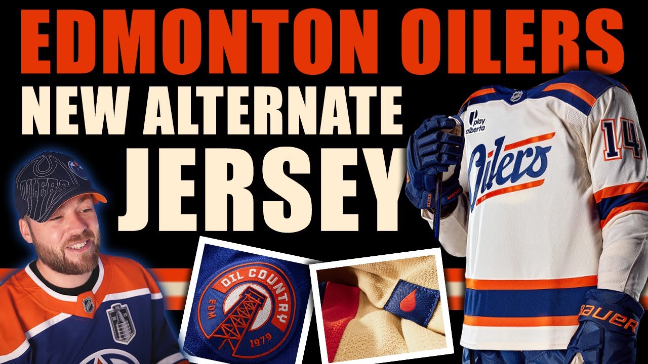
Hey everybody, welcome to Post to Post. I appreciate you joining me for this one. It’s been a pretty good couple of weeks in the NHL. We got some awesome releases of some jerseys around the league from East to West, all kinds of great stuff releasing. And the Edmonton Oilers made the most recent announcement, which was their alternate jersey. I have many opinions about this jersey. Let’s jump right in. Let’s look at some photos and let’s discuss the good, the bad, and the ugly of this one. And starting off with the first one that I actually saw when I went through this. I always go through this in these in these videos like this. I look at the photos in the exact same order that I originally saw them in cuz I wanted to kind of I like to talk through my thought process of this one and I have I have many things to say about this. So, this was the first one that I saw and this did technically leak like a couple of weeks ago. I didn’t talk about it because I knew it was coming soon. I knew the release was coming soon cuz the season was about to start. So, I really wanted to wait and actually and get like proper photos and I’m kind of glad I did because I have I have other things to say than I originally would have. Now, first impressions is I like the shoulders. I like the primary color, which is an off-white. I like the striping. Uh the the number kit looks very good. The shoulder patch looks pretty decent, and the inside of the collar looks good. I don’t like the logo. The logo throws me off a little bit. It personally to me looks like something that would be look great on the front of a hat, on a t-shirt specifically, uh maybe even a sticker or or like a like a bumper sticker or something. It just it just I know it’s classic and I know it’s like kind of retro looking. It’s not a bad textual style font logo. It’s just I’m I’m just I’m just a little bit tired of it. I guess I think the Oilers have a lot more to work with and I think they could have just done something a little bit better than that. I also don’t like the the stylization on the O. It’s got this little swooping thing that comes in. It almost looks like it it just reminds me of like a silhouette of like Hitler. Like if there’s a little mustache down below, it would look like a Hitler face or something or Hitler head or it would look like kind of looks like the Pringles guy logo. He’s got like the swooping hair. I don’t know. It just it looks it looks a little bit silly. I don’t like the O. So yeah, that’s my that’s my first impression thoughts of the jersey. Now the back of the jersey I think is pretty much perfect. Like I wouldn’t change anything. I think they absolutely nailed that number kit. That looks phenomenal. The name plate as well having it straight on there and they also match the Fanatic logo with the same orange as the rest of the jersey. That’s great. It’s not white. It’s not black. They actually color matched it, which is amazing. And it it does complement the jersey. I can see a little tag down there with an oil drop on it. That’s pretty nice. And now the next photo that I saw confused me a little bit. So, we have the entire uniform here. So, the pants look good, the gloves look good, socks, everything looks pretty good. But I got looking at this when it first came when I first saw this. I’m like, is is is it off-white or or is it white? And I looked a little a little bit closer. I’m like, no. Okay, that’s off-white, right? That’s off-white. I was right at the original it was off-white. Okay. So, I went on to the next photo and this is on the team store or whatever and I I got looking at it. I’m like, “Okay, well, it is off-white because the background itself is very white. It it is actually white.” And the jersey is not as white as that. So, okay, it’s off-white, but it’s not as off-white as the original photo that they released. So, and I know that this is a digital rendering. It’s not exactly the same as an actual photo and stuff, but still, the color accuracy matters. And this was the biggest failure I think of this release. And what I mean by that is, well, we’ll talk about it very soon. So, here’s the back. And uh, like I said, very good on the number kit. I think they did a really good job. The blue with the white stroke with the orange stroke on top of that. Great color matching. And then here’s where I started to get really confused. It’s a close-up of the logo. And I’m looking at I’m thinking that’s white. Like, that looks like white. That does not look like off-white. Is this jersey white? Like, were the photos that they took originally like a little bit warm? Like a little bit of a warm tone to make it look kind of retro? like is this jersey white? So, I had to go find another close-up photo of the logo and thankfully there was another photo. So, I found this and I was like, “Okay, that’s clearly off-white.” So, why is there such a discrepancy in color balance between this one and then this one? Like, if you’re releasing a jersey and it’s as off-white and cream looking as it looks, why is it being changed in the other photos to look more like white? I don’t Is that intentional? I have no idea. But, I didn’t like that. The next photo that was confusing to me was the back of the jersey and the Fanatics. And then I got to looking at that white again. I’m like, “Okay, what’s going on here? That also looks white.” So, I tried to find another photo of the back so I could see the color again. There’s another photo of the fanatics and it’s off-white. So, okay. So, clearly there’s just some discrepancy here in whoever photographed these and whatnot, but uh there’s another example as well. It’s the shoulder patch. And now you can see the the white down below in the bottom left. Like that’s white. That’s not off white. That’s white. So, I think whoever edited these stripped out the warm tones in the white. I don’t know why they did that. I think that I feel like that’s a mistake because it is a little bit misleading to people who want to buy this jersey. Maybe there’s people out there who really like the retro off-white cream look and it’s like that’s yeah, that’s it’s it’s the Edmonton Oilers are in a historic team. I want a little bit of a weathered look. I’m going to get that jersey. But then they see stuff like this and it’s and it’s white. You’re like, “Oh, I don’t Yeah, it’s a white jersey.” People are very specific with jerseys. Okay. That’s not really that that stretch of a truth there. That could possibly be someone out there. But the shoulder patch logo itself, it’s fine. It’s okay. It is what it is. Not bad. Uh not amazing. Doesn’t wow me. I guess I would say there’s maybe potential for something else that’s a little bit better. Uh something I do love is that little patch at the bottom of the jersey. I did talk about that earlier. I think that’s a nice little nod just to have that oil drop in there. Uh I’ve got another photo here of the this section of the jersey. Not really much to say there. Uh and then the back inside of the collar. Let’s go Oilers. Yeah, that’s pretty good. Nothing negative to say there. And then a close-up photo of the actual striping. Like, this is what I want. NHL teams, are you listening? Give me this. Give me that that texture, that detail of the jersey. That is what I want. That’s good marketing. Give me all the details. If you release a jersey and you post four photos, thank you. If you post eight photos, thank you so much. But post 30. Like, give me all the juice. Okay? I need the juice. Give me the juice. The next photo I have here is the last one, and that is a graphic that the team uh created to talk about the schedule of the alternate jersey. I think this is amazing. I would I love when teams do this. Not all the do all of them do, but some do. And I really appreciate that extra step from a marketing lens. So, we’ve got 1 2 3 4 5 6 seven games this year uh for this jersey. So, I think that’s pretty cool. Some of them are away games as well. So, like the Monday, January 12th one against Chicago, they’re going to be wearing this Off-White jersey. Um, which is which is pretty great. And then some home home games as well. So, a good mix of both home and away. And, uh, yeah. So, Edmonton Oilers fans, I I’ll speak to you directly. I would hope that if you do have a couple of minutes, you’ll leave your comments down below because I I’ve been reading some comments on Twitter and some other online platforms and stuff. And there are very strong opinions like specifically from the Oilers fan base. Now, every time a jersey is released, regardless of team, there’s kind of a consensus among the community, whether they’re a fan of that specific team or whether they’re a jersey collectors or whatever. Like, there’s there’s lots of opinions floating around from different uh from different angles. But in this jersey release, I’ve noticed a lot of vocal Edmonton Oilers fans, and not so much from the jersey collectors and more so right from the fan base of Edmonton. And there’s been some a lot of positives. There’ve been a lot of negatives as well. So, I’m I’m more so speaking directly to the fan base here in this video, to the Edmonton Oilers. Please leave your comments down below in the comment section. I would love to hear from you. And jersey collectors out there like myself, lots of, you know, lots of jerseys in the background. We love to collect jerseys. Let me know what you think. If you’re not an Oilers fan, do you plan on getting this one? It’s kind of cool, but it’s not perfect. So, you know, a bit of a unique jersey to the collection. So, I’m not exactly sure where the majority of you stand either. And if you’re not an Oilers fan and you’re not collecting jerseys, you can still comment. If you’re just a regular hockey fan, that’s totally fine. No big deal. Would love to hear from you as well. Hope you’re having a great one. Thank you so much for taking time out of your day to watch this video with me. Leave your opinions down below and we’ll talk to you very soon on the channel for the next video. Adios. [Music]
Episode 1766
Supporting the channel can be done here:
YouTube Membership: https://www.youtube.com/channel/UCnWUMMlROKuT3roikjMp9TQ/join
Monthly Patreon contributions: https://www.patreon.com/Post2Post
Direct contributions: https://www.paypal.me/Post2Post
DEALS:
Save on jerseys by **FIRST** going to https://www.coolhockey.com/post2post and then using code “POST2POST” at checkout! This will save you 10%.
Save $20 off your first purchase at https://seatgeek.com/ with code: POST2POST
Save 10% off any template at https://sportstemplates.net/ with code: POST2POST
Want to submit YOUR jersey concepts to get reviewed? Please watch this video to find out how: https://youtu.be/fb_h_mB19fo
Play games with me on Twitch!
www.twitch.tv/post2post
PO Box: Unfortunately, the PO Box is now closed.
Find us on Social Media here:
https://www.Instagram.com/Post2PostShow
Tweets by Post2PostShow
Have a business inquiry or want to send me a fan video intro?
E-mail me here: productions@post2postshow.com
*Due to the amount of e-mails, a response cannot be guaranteed*
#NHL #Edmonton #Oilers
21 comments
my gosh, wtf is that dumpster fire…. you gotta be stoopid with $$$ to buy that lol
The S shows the shape of the oil drop and its giving me WHA vibes
the jerseys are getting worse!
The fact that the C or A is partially on a stripe makes it even worse for me
As an Oilers fan, i personally like how the jersey looks. I like the retro kind of feel to it and it seems like some old WHA jersey. But i personally won’t be buying it since it’s primarily white/off white and i don’t really buy white clothes or jerseys.
Oh boy! I really like this logo. It's both retro and cutting edge at the same time
I think it's white or at most a very, very light off-white. When you showed the side-by-side shot of the logos, the one on the left is definitely more color accurate to their team colors and the jersey looks white. With the one on the right, the orange looks way more red than it should. The bottom stripe looks almost pure red. The colors on that photo have clearly been altered so I wouldn't trust the jersey color to be accurate. Taking the one on the left and boosting the saturation a lot makes it look a lot closer to the one on the right.
For the logo.. i didn't see anything beyond text. I like it don't get me wrong …. i just thi k it wasn't introduced properly
This jersey was an absolute, unadulterated homeroom for me (personally)
they perfectly captured the essence of edmonton!
borrrrrringgggggggg
As an Oilers fan myself. It looks ok but it could have been worse. I do like the patch that says Oil country. That looks cool.
As a caveat to set the table, I'm an Australian and only 18+ months into my NHL Journey.
I was interest in the Patch having 'EDM 1979' as appose to 1972. Whilst i understand that "the NHL did not and does not recognize the WHA's records or history as being any part of its own. It explicitly treated the arrival of the WHA teams not as a merger, but rather as an expansion consisting of four new franchises which happened to have identical or similar names to some of the former WHA teams".
I was of the Impression the Oilers organisation stuck to the belief that they were established in 1972. (Similar to the NFL's 49ers repping 1946 as appose to their entry into the NFL in 1950. or the NBA's Nets repping 1967 as appose to their entry into the NBA in 1976)
I like that the negative space in the "s" forms an oil drop, but I agree the shape of the "O" seems off.
Letters that look like Hitler.
It's a cool jersey, but in my opinion, it fails because it's a majority off-white. It looks like a heratige classic. Will it stand out enough when facing off against white away jerseys?
they need to bring back the cog or the two tone instead as an oilers fan but love the jersey
I feel like anyone who likes this jersey needs to raise their standards because this is not good
I went to the release and I bought it before I got out of my seat. I’m a young jersey collector with 57 jerseys and I’m a huge oilers fan. Would a white version of the Todd McFarlane jersey be better? Probably, But I’m glad they are trying something different and new, it’s the first new Oilers logo in 25 years. Also in the negative space on the “S” there is an oil drop hidden away.
I do like the jersey. Like you I wasn't a big fan of the logo. It has grown on me a little bit but still wish they had the traditional oilers logo on it. I'm still going to probably get it .
Hey Neil, Go over to Google and say Tulsa oilers baseball jersey and that's what the Edmonton oilers font kind of looks like
All script logo jerseys suck. I don't know why any team thinks this is a good idea. If that Oilers Jersey just had a logo on it. It would look great. I don't know what that is. It looks wake a low end fashion Jersey