
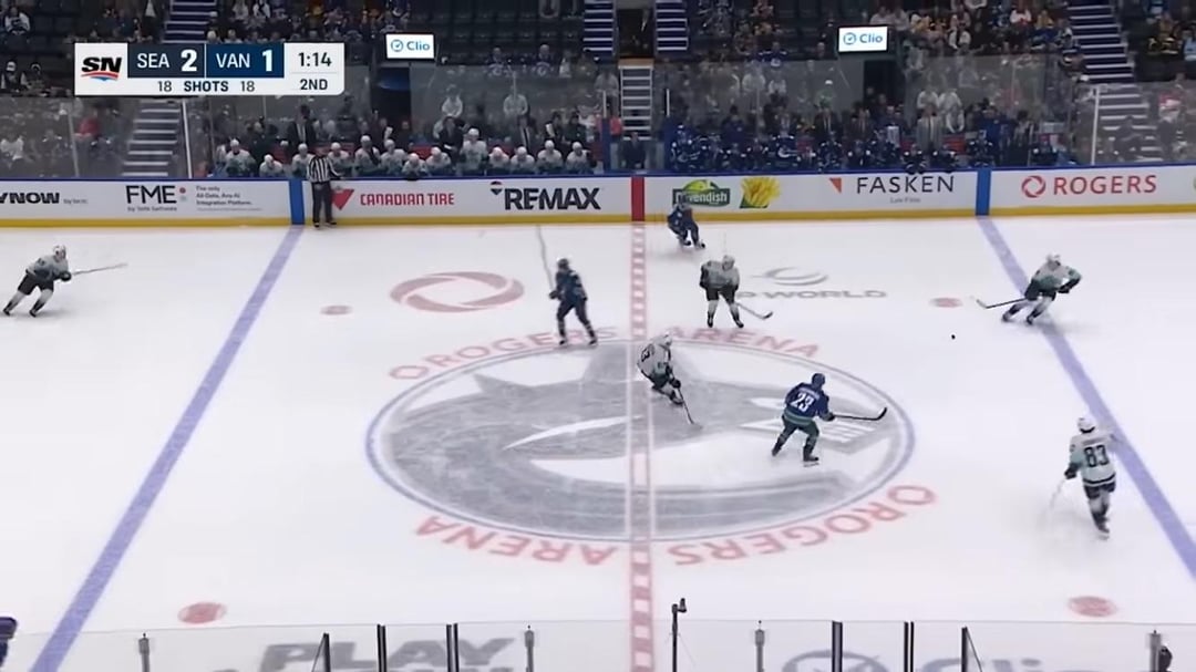
Noticed watching the kraken highlights that they returned the centre ice logo to the away orca colours, but it’s still off centre. (Photo 1) Last season they tried something new with the off centre logo in home colours in a blue ring. (photo 2) In past seasons it’s just been the orca logo shrunk down so the whole thing fits. (photo 3) which one do you prefer??
20 comments
infuriatingly bad both of them.
I don’t know who thinks the zoomed in, partially cut off thing is good because it looks fucking awful
I think this year’s just doesn’t work. especially when the ice gets all scuffed up, it’s so hard to make out all the details, and if you’re not gonna fit the entire whale in, at least fit just half and not cut out parts of it at the bottom.
Or, be a little more daring and put the skate as the logo
Third one looks the best, I’m not a fan of these off centered ones.
I’ll be the first in the thread to say I like the new one, and I don’t like the old one
Aligning the bottom of the logo with the bottom of the circle looks cohesive. Matching a curve to a curve.
Centring the logo always looks off because the top fin of the orca negatively effects the balance. You’re centring a logo that is vertically not symmetrical. It doesn’t work for me.
I never even noticed the logo wasn’t centered and now I can’t unsee it….I need a drink now. This is going to be a concern for me moving forward.
If they win games the logo can be bright neon green flipped and rotated 45 degrees
Looks like it was done by a 4 year old.
I’m watching the puck and players. Couldn’t care less what is “printed” on the ice or how it’s oriented unless it’s the blue lines or goal lines. 🤷🏻♂️
Skate logo would look way better in the center.
I prefer last year’s. It’s easier to make out the details in the bottom part of the logo with it in white.
Last seasons was a mess, the blue above it???? Designed by a kid. Why do they continue to crush and crop the logo? So off balance.
I thought last year sucked lol
They should go old school and do a small logo on both sides of the red line.
They just colour swapped it, but it’s the same design.
We haven’t had a nice one since the 50th Anniversary one (2019-20).
I don’t mind the more zoomed in logo, seems like a lot of teams are experimenting with centre ice designs. I would have maybe preferred this years design with the home logo (white instead of blue) just because the blue is so dark here it almost looks black and throws the logo off a bit because it looks like all one colour and you can’t see the more intricate parts of the design (like the pieces coming off where the orca is jumping out).
Also they should have more fun with the centre ice line rather than having it look like a candy cane – some teams have really cool ones incorporating parts of their logos into that.
Reverse juju from last season
Center ice has a circle, the Canucks have a circle logo. It’s not hard.
The one from last season looks the most modern. I vote for it.
I don’t know what’s wrong with having the logo intact in the middle of the circle instead of zooming in and cutting off portions of it. Good god.