
NHL Minnesota Wild NEW Anniversary Jersey!
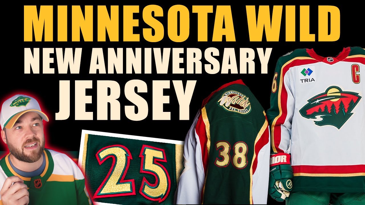
Hey Wild fans, hockey fans, jersey fans, thanks for joining me for this one. The Minnesota Wild have released their new alternate or 25th anniversary jersey for this upcoming season. We’ve had so many awesome jersey releases in the last couple of weeks. Minnesota’s no exception. And it comes in interesting timing specifically here on the channel because last Friday which is just a couple of days ago we uh went through some designers work from the community some jersey concepts and the title of that series was Fanatic’s future and they’re specifically alternate jerseys and that was part three by the way we did home away and then alternates but in that video Shane who’s the designer his vision for the Minnesota Wild is extremely close to what we just got as a release jersey. So it was super interesting timing. Shane was uh reading the cards a little bit I think and predicting the future. So, I want to jump into the photos that Minnesota revealed or released and then uh I’ll give you my opinion obviously as we talk through them and then I’ll show you his actual concept side by side uh a little bit through this video so you can see how uh how close he actually came. So, let’s bring up the first one. This is the first photo that I saw and my immediate first impression was wow look at that gold. That is the same gold that we see on the Vegas jerseys. It’s the same style of gold that we see around the new uh Blackhawks home jersey. They have put that little bit of gold kind of uh stroke I guess around it. It’s got that metal style reflection and I think it looks very good. However, this specific photo here doesn’t really show it in the best I guess frame. So, let’s continue on with the images that they released and we’ll find a better one and uh dig a little bit deeper. So, the next photo that they released that I saw was basically the number kit. They were talking about that and they said the return of the original number set from 2000 featuring notched edges which are replicated in the primary logo. So, this is one of the best number kits that has ever existed in the NHL. I think it’s probably the best part of this jersey to be completely honest. I absolutely love that they brought it back and I think it was such a brilliant decision. It was a a must have. If you’re going to bring back this jersey, you’ve got to bring back that brilliant number kit. So, uh 10 out of 10 on that decision from Minnesota. This next image shows off the shoulder patch, the original 198 1998 wordmark highlighted in the shoulder patch. So, the team was established in 2000, but the actual, I guess, teaser or visual kind of branding or inception of the team actually happened in 1998, I guess. So, that’s where that comes from. Then, we’ve got this photo of uh well, let’s read expanded use of the metallic gold and the numbers and striping. I love when teams do this. I love when teams release detailed shots like this. That’s what I want. This is the juice that I crave. So, thank you to Minnesota for doing that. Looks really good. And now we have a little bit of of a better photo here in in different lighting. I always say that it’s great to see photos being released or jerseys being released uh with photos taken in different settings. And uh this looks very good. The gold really pops. The red is is pretty thick here. And this is the point really where I want to show you Shane’s concept that we looked at on Friday. So I’ll bring it up on the screen. You can see it side by side. And his vision um for FA’s future and his alternates specifically in this series was basically the exact same jersey. Now it’s not identical. The red is a little bit thinner. The gold isn’t gold. It’s more of like an off-white. The number kit is like on the green is uh off-white, but on the actual jersey it’s gold. So, there’s little details that are incorrect or not the same, I guess. Not incorrect, but you know, not the same. But, uh he was so close. So close. So, it’s really really impressive and interesting timing that we got to look at that basically as the jersey was released. I had filmed it prior to the jersey releasing, so I couldn’t comment comment on it in that video. But, uh yeah, I I really like this decision. It’s not my favorite jersey. I said that in the video on Friday. I’m like, “Yeah, it’s okay.” I was never really a huge fan of it, though. It is what it is. But I think the little details on this one that they did release. Like, I really like that red section expanded. And I really like the gold really being a highlight of this. It’s a It’s a great pop of color on this jersey. Uh the next photo here, you can see the number kit. You can see the uh patch on the shoulder. We will continue to this one. Again, different lighting, but it still looks pretty good. That gold really does pop. It looks so good. And then the back, like the numbers look amazing. They look so good. So, uh, very happy with, uh, with the photos that they released. And they also released full uniform set as well. So, we get to see the socks, the gloves. Now, I will say that there are some discrepancies here in color, specifically in the pants and the uh, bottom of the jersey or I guess the green in the entire jersey. It’s not the same shade. So, clearly Fanatics is the manufacturer of the jersey. And is that Warrior? I don’t know. Uh, the manufacturer of the pants. So, two different greens. Maybe those are the home pants. I I I don’t know. But uh in this next photo, Caprioff has a different shade of green on the pants. It’s closer, but it’s still not identical. So, I really love it when teams spend the extra effort to dial in the colors of other aspects of the uniform, getting the specific shade of colors right on the gloves, on the helmet, on the pants, the socks, everything. I just really appreciate that extra level of execution when it comes to uh branding. So, some teams do it, some teams don’t. It looks like Minnesota has a little bit of work to do there on their uniform. But these are basically preliminary photos. So maybe the actual on ice version, you know, like down the road when the season starts, maybe that will be proper. And just again, I have to comment on the numbers. The nine and the seven specifically looks so good. If you go on to the next one, you can see the one and the seven there. Another really good angle of the jersey. And also, I think the socks are like sometimes socks don’t really match the jersey that well, but I feel like they did a pretty good job on the socks. Like if you look at the red thickness of the socks, it’s basically the same red thickness as the red stripe on the jersey. So like there’s there’s pretty good balance there. In the next photo, you can see the number two. So that looks pretty good. Um overall, I’m pretty pleased with the jersey. Like again, it’s still not my favorite Minnesota Wild jersey. And but I love the fact that they brought it back, but brought it back, I guess, with with really intelligent uh improvements. So I’m not exactly sure if I’m going to get this one in my collection, possibly. Uh this is this is the only Minnesota Wild jersey that I have. I guess that’s not technically true. I have a stadium series Reebok, but in the Adidas and Fanatic years, this is the only one that I have left. I sold all my others. So, you know, might be nice to have a white one. So, I’ll keep my eye out on prices and see how well uh this sells. And if it sells too well, then maybe it won’t be available for me. But I wanted to highlight one more thing, and that’s the Minnesota Wild social media team. And whoever this is, uh whoever made the decision, I guess, behind this, I really appreciate. So, someone took old photos from the Minnesota Wild from there that inaugural season and they brought them back out onto the ice and basically staged them to make it kind of look like where the original photo was taken. So, this isn’t a perfect example because obviously it’s a little bit off. The angle’s a little bit off. This one would be a tough one to do, but I I just love the fact it’s a really cool concept where you’re like bridging past into future. I just thought that was a really good idea. So, there’s four photos here. This is the first one. The second one, this one was staged much better. You can see the net aligns quite nicely. Uh, obviously the proportions are off a little bit, but uh, yeah, very, very cool. And then this next one was also really well done. It’s got the bench there. You can see the fans in the background. It it aligns pretty well. And then this final one here of a player coming over the boards. Like, it’s it’s kind of an insignificant post. and this post will not reach the feeds of of a lot of people due to the algorithm or whatever, but I just think it’s a very unique innovative post to do. So, I don’t know if it’s a social media intern who had this idea, whether it’s some kind of social media manager or marketing manager or what, but whoever was involved in the decision behind that, I think that’s pretty cool. So, shout out to that person or that team that decided uh to post this. I think that deserves some credit because there are so many obligatory photos and graphics. They they just all run together uh from these from these hockey teams and uh I just think this is just a little bit different. So, I wanted to highlight that and give some praise where I think praise is due for the Minnesota Wild social media team. So, uh there you have it. Let me know down below in the comment section how you feel about this jersey that they released. I’ve been trying to not read so many comments on this one. I decided not to kind of go down the the reply section on Twitter and Facebook and some of the other platforms because I wanted to make this video first and really read the opinions of uh of my viewers here on the channel. So, if you got a couple of minutes, let me know down below in the comment section how you feel about this one. And then I’m just going to check my computer because I want to tell you what the next video is going to be. It’s going to be the San Jose Sharks. Uh and it’s ready to go. I’m ready to film it. I’m going to film it right after this one and you’ll see that tomorrow. tomorrow. So, the San Jose Sharks released their jersey as well, their new anniversary jersey. And I definitely have opinions on that. So, stay tuned for that one coming tomorrow. If you’re not subscribed, I’d obviously love for you to hit the subscribe button and join me for that one. And uh all future videos as well. So, have a great night. Thanks for watching and we’ll talk to you very soon. Adios. [Music] [Music]
Episode 1768
Supporting the channel can be done here:
YouTube Membership: https://www.youtube.com/channel/UCnWUMMlROKuT3roikjMp9TQ/join
Monthly Patreon contributions: https://www.patreon.com/Post2Post
Direct contributions: https://www.paypal.me/Post2Post
DEALS:
Save on jerseys by **FIRST** going to https://www.coolhockey.com/post2post and then using code “POST2POST” at checkout! This will save you 10%.
Save $20 off your first purchase at https://seatgeek.com/ with code: POST2POST
Save 10% off any template at https://sportstemplates.net/ with code: POST2POST
Want to submit YOUR jersey concepts to get reviewed? Please watch this video to find out how: https://youtu.be/fb_h_mB19fo
Play games with me on Twitch!
www.twitch.tv/post2post
PO Box: Unfortunately, the PO Box is now closed.
Find us on Social Media here:
https://www.Instagram.com/Post2PostShow
Tweets by Post2PostShow
Have a business inquiry or want to send me a fan video intro?
E-mail me here: productions@post2postshow.com
*Due to the amount of e-mails, a response cannot be guaranteed*
#NHL #MinnesotaWild #Minnesota
17 comments
Minnesota use this as your permanent away jersey
Only change I''d make is the collar, should've been green with a red trim like in the concept you showed. The red collar is a little too much in my opinion and green would've set well with the shoulders/arms.
Best jersey of all time
Their BEST road jersey! I'd LOVE to see this as their full-time road jersey. Along with a home version of this jersey. I'd like to see the current home Wild jersey to become an alternate.
Love that they brought in some personality with the Number fonts and other stuff.
As a Wild fan myself. I don't remember the Wild coming into the NHL since I wasn't a NHL fan yet. Now that I am an NHL fan that shoulder patch looks awesome and the whole jersey itself look absolutely amazing. Keep up the great work sir.
Something to note, when the NHL switched to Reebok in 2007, they kept the white jerseys and made it more streamlined. The red on the original 2000 jersey is thicker than the 2007 Reebok version.
one of the first jerseys i ever got as a kid 🥲 might need bring this one back for personal nostalgia reasons alone. so good.
another cool detail with these is that they’re actually wearing white at home like they used to 🔥
As a lifelong Wild fan I bought the jersey immediately when I saw the article about it, just waiting for it in the mail now. Reminds me of players I grew up watching like Marian Gaborik, Mikko Koivu and my favorite Derek Boogaard (R.I.P.) Love this decision by the organization, I'd say "Shut up and take my money" but they already got that so ¯_(ツ)_/¯
Some people might like it…I am not one of those people, it looks cheap. It looks like something you'd find on a 00s sitcom show that can't replicate an actual team so they make a knock off version. Disappointing really 'cause the wild, whilst not my team often have some of the best jerseys in the league.
Rebrand back to the 2000's
Well, to my surprise, most people have dythirambic comments. I will politely yet strongly disagree.
No matter how it is used, I always disliked the color scheme. They look like Santa Claus HC or "What if Team Belarus suddently had budget".
What they should adopt full time to me is what you are wearing (bright green, yellow and white). "But but but it's the North Stars' colors!" I already hear some people whining. Well I would argue that those might as well be the State of Hockey's colors.
After all, the Wild has never done better or even as good as that 3rd Round loss in year 3. What history is there to honor, really?
Start fresh and get rid of the red!
I always think about Wes Walz when i hear Minnesota Wild.
this has to be the most new jerseys in a single offseason in a while in the nhl
Great jersey by the Wild, There are some similarities to the Houston Aeros home jersey.
😁. When I saw the numbers I hollared.