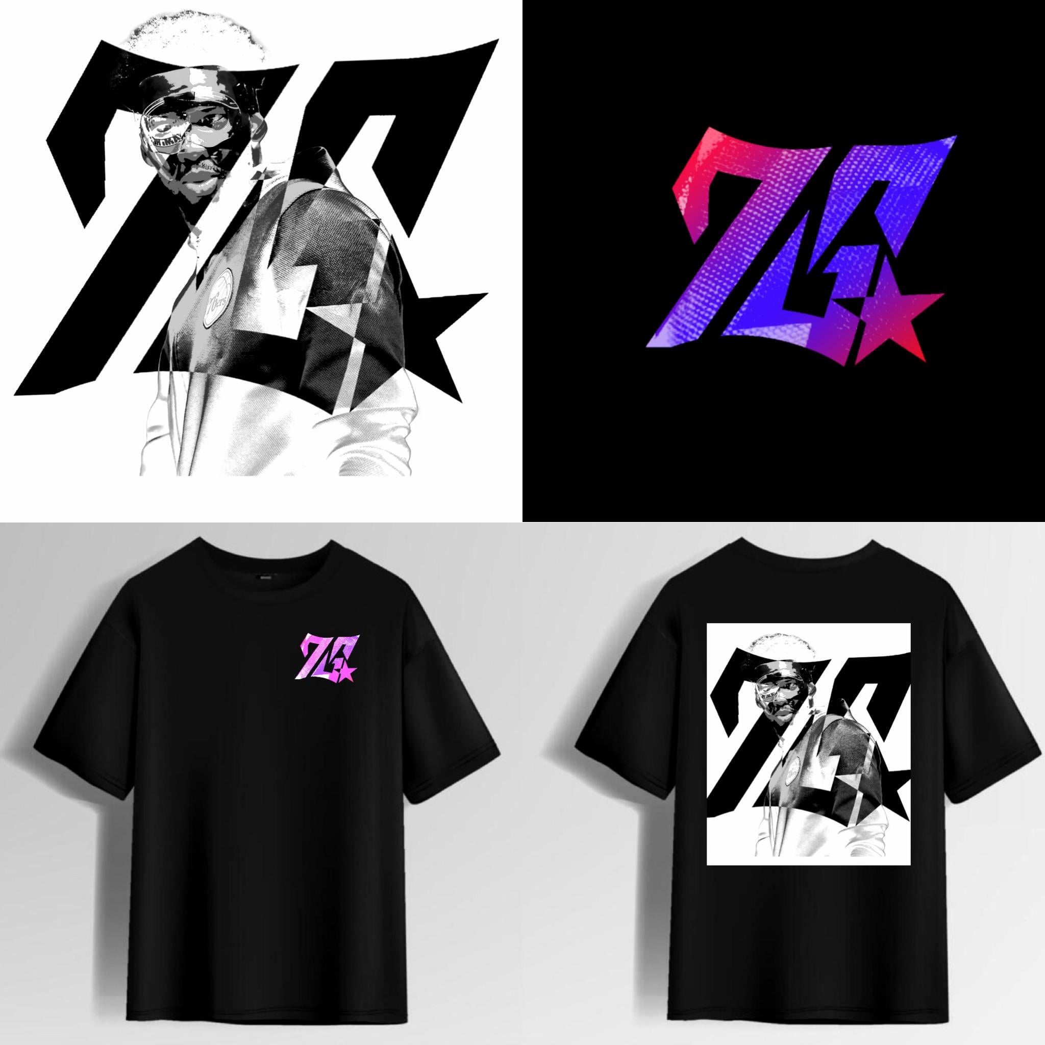
Tried to make it both a “76” and a “PS” for Philly Sixers. Could you guys see this being a secondary or tertiary logo? I am trying to build a portfolio as a graphic designer, so any feedback is appreciated.

Tried to make it both a “76” and a “PS” for Philly Sixers. Could you guys see this being a secondary or tertiary logo? I am trying to build a portfolio as a graphic designer, so any feedback is appreciated.
14 comments
I think just the angled 76 looks dope, the extra stuff to make it also be “PS” makes it feel a little too busy.
I fuck with it
I like it as a more modern take on the logo, do you do commissions by chance?
At first glance – All I see is 70. Not 76. Sometimes my eyes want to see 78 as well. Still not 76.
7S?
Not feeling it.
Kelly Oubre would wear this.
Did we sign machine gun Kelly?
I see 7G before I see 76 or PS
not my thing. but i could see people liking it. i like that’s its very electric tho if that makes sense
I like this, I’d be curious to see what it would look like with more flare to the ends (serifs?) of the numbers. Another look maybe angle the split more, clean up the numbers, and make the star huge, eating up some of the negative space of the 6. Either way I like the look, the suckers haven’t really had a new main logo for a long time
Appreciate the effort but this ain’t it, in my opinion. Too much of an attempt to be modern-looking and Philly should be a classic ethos imo. Also, looks like “7G” to me.

looks like a 7G to me. also, I don’t see the PS anywhere. the logo looks nice on the black shirt but I think it needs some fine tuning to make it look more “Sixery”. right now it looks like a random logo.