
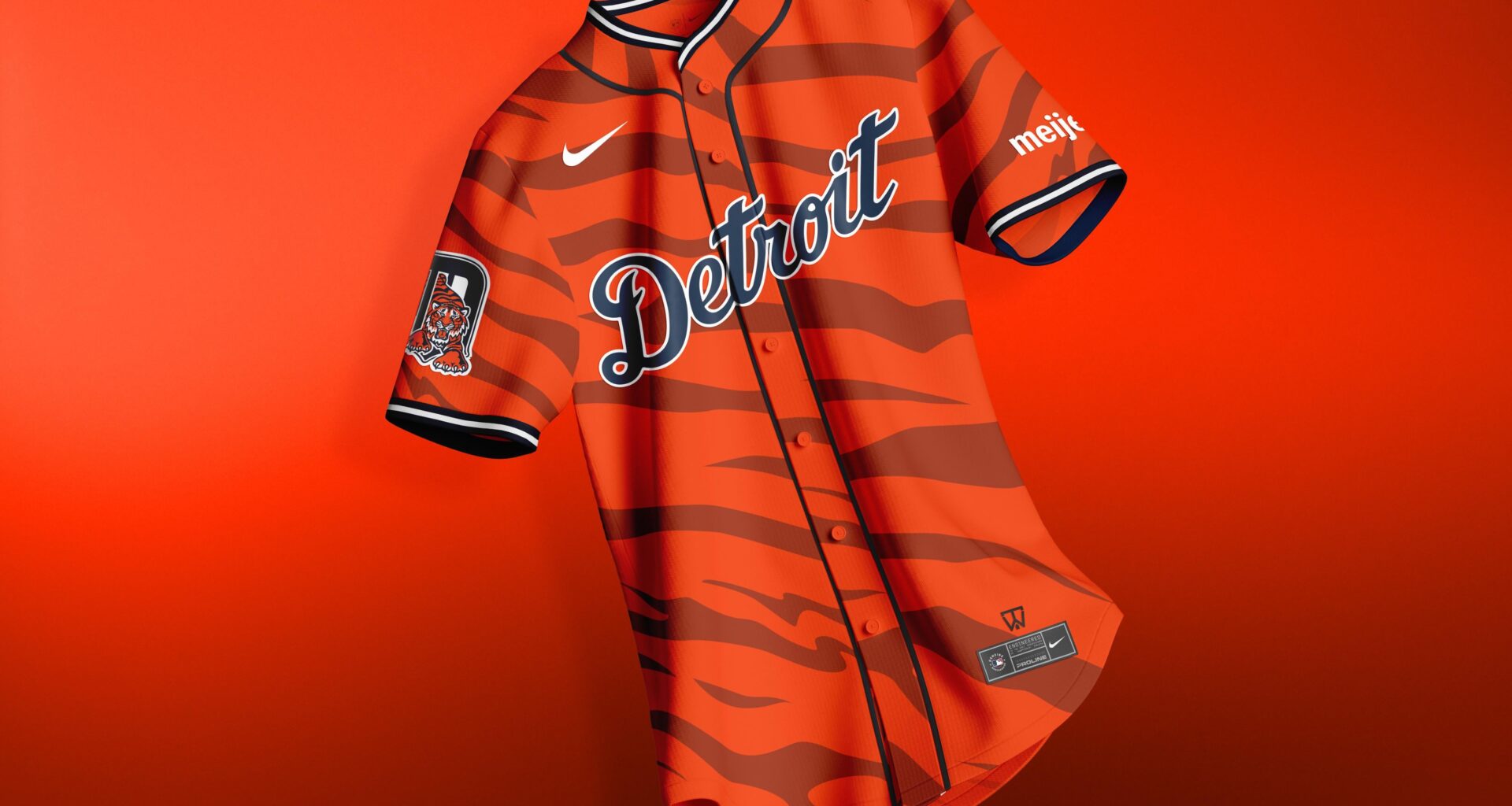
Been seeing all the “orange out” talk for the ALDS, and it got me thinking; we really don’t have a ton of official orange gear to match that energy. So I decided to cook up this Detroit Tigers City Connect / Alternate concept that leans heavily into the orange.
Went with a tiger stripe pattern to make it pop, but kept the script “Detroit” across the chest for that classic look. Added the navy trim to give it a little extra edge, and included a sleeve patch to make it feel authentic like something Nike would actually release.
I wanted this to feel like something fans could actually wear to the orange out games: bold, clean, and still very “Detroit.”
Would love to hear what y’all think, should the Tigers really lean into this kind of look for a future alt or City Connect drop?
Praying we win this Game 4! LET’S GO TIGERS 🐅
18 comments
Better than the actual city connect IMO, although I like the nods to cars / the motor city on the current city connect design
I was hoping for something like this for the city connects when they announced them. We don’t use orange enough and it would’ve been sick to get some jerseys with much more orange incorporated
[removed]
Surprised they didn’t go for a white out in last night’s game, that would have gone more with the home uniforms
i like this a lot. i really do wish they would lean into orange more.
That jersey is 🔥 !!!!!
I appreciate the effort but I just want our whites at home and the 80’s pullovers on the road.
I thought the point of the city connects were to reflect something in the city other than the baseball team branding.
https://preview.redd.it/ad6h0qefextf1.jpeg?width=1024&format=pjpg&auto=webp&s=75acbbaad856e4beed21417530b6c75b87e5ef2c
Okay, a well needed update is coming
Not bad, I’d go more subtle with the stripes but pretty solid imo.
You should try making the tiger stripes as tread marks to feel more related to city connect. Although I do love it like you currently have it as a fun alternate jersey
I wish they used the Tiger D more.
Please can we have an orange jersey for the city connects it would be so much better than what we currently have
I’d buy it
I wish the City Connects we have now replaced that awful blue with orange. That’s not our shade of blue and it would look much cooler with orange.
I would love an orange jersey. It’s been lacking.
Nah for me, but I dig it better than than the current city connect.
Horrible stuff OP