Phil unboxes the new Minnesota Wild 25th Anniversary Jersey – comparing it to the original #review
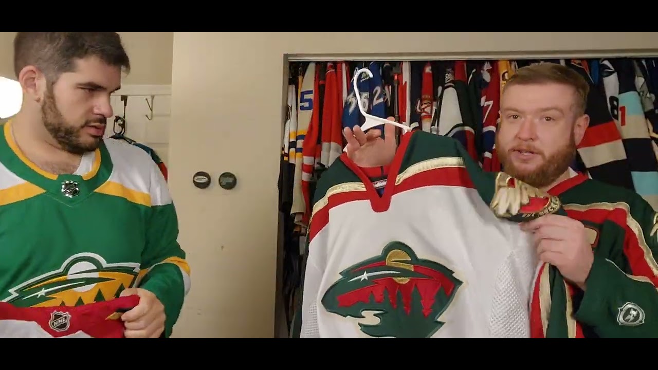
I don’t intro these things. You intro these things. All right. Well, welcome to a special unboxing here on Ugly Thirds. Um, actually, I walked home and John’s like, “Did you just like buy all like the new jerseys?” I’m like, “Almost.” Yeah. Know, I guess I’ll do hashtag Phil bought it. Phil bought it. Um, I said, “I’m not buying Boston yet and St. Louis is my nothing special.” Anyways, um, bunch of teams have anniversaries this year. Um, and so this is the first one. And, uh, so what do we got? Well, Phil bought the anniversary jersey. Yeah. So, and I have the original to compare it to. So, yes. So, Minnesota Ziplo. Look at that. Yeah. They’re upgrading on that. I’ve noticed. So, it is uh Minnesota they’re having. It’s what? 25th. Yeah. All right. There’s a note. No patch. All right. Okay. So, this is the anniversary jersey that Minnesota has come out with. And I mean, first of all, I mean, compare Well, do you want to compare the original? Let me just talk about on its own merits first. Okay. Well, um I mean, got the detailed crust there, which, you know, is it a bear or Well, not a bear. It’s a Yeah, it’s a it’s a bear cat of some sort. Bearcat. Yeah. Or is it a forest? Who knows? Yes. Um, and then you’ve got the the shoulder patch, the original and there’s a hockey wild. And that’s it. There I think there is a patch that goes on. Yeah, it’s supposed to be a 25th patch, but uh you know, no offense, Fanatics, but that’s cheap. Like you pay how much for this and you don’t want to put a Well, that like the the leaving this off the other shoulder to put the patch like Yeah, that’s and then they they were ested ested in 2000. Um, all right. Hold. So, I have the original one. So, you I mean the color difference. I’m not shocked by that. I mean, that’s that’s the fanatic difference. Um but um I mean so we have the striping’s different. Solid gold versus sparkly gold. Mhm. There’s definitely a color difference there. Not a ton, but it’s there. Well, and the red So the red here is small and kind of expands. No, it grows here. It does not It does not grow. Um, and probably Oh, you do have the cuff. I’m impressed they kept the cuff. So, I mean, it’s it’s uh obviously obviously Oh, and you don’t you don’t get the nice the nice meshing of the original one. A little bit of meshing in there. Yeah. Well, I mean, a little bit. So, um, look, it’s a pretty faithful remake. Oh, hold on. Hold on. You got the little tag on the back. Oh, you got to have the little tag on the back. On the back. So, it is Well, this is the Northstar, right? There’s just a little star. A little star there. Look at the Would you look at both sides? And there’s no there’s no um some of them have a bottom bottom effect. This one does not. So just grab a hanger. Grab a hanger. Um yeah. No, I mean like it’s it’s a pretty faithful remake. Personally, I wish it was this one. I think it’s the better, more interesting jersey, and it also has been gone longer because this this got a Reebok treatment. um a worse much worse rebuk treatment. Um some awkward stitching actually let me look at the crest there which all right you you bring that up just how they how they did things differently. So you can see how the sun here this is on the on the fanatics the sun here is is fully just embroider stitch like there’s stitching throughout. Uh if you look at the you know at the red here, it’s that same thing where it’s the stitching throughout it and then the twill is it is the green. It’s obviously that red is stitched onto the green. Um they did it as a separate panel. This is a piece of fabric. Um and so the stitching around the trees, you get some real awkward overlap and zigzag places. Um I do like I do like the raised tree thing there. Well, I was say like in this one just the difference in the construction. Well, because like here the red pops more than it trees and you don’t necessarily see the trees as much, but this one you can really tell. Um I mean on camera it actually doesn’t do that much, but in person I feel like this pops out more to me and this one it it’s the red shiny. The red pops out more than that. So yeah, the shiny red is a big difference there. So but then you you do get you do get the puff of puff effect. So I mean that’s what they they started doing that a couple years ago and so I mean look it it is a very faithful recreation. Uh, I think they did it because they want a white out, which okay. I mean, if that’s that’s your lie, it’s okay. Um, still would have preferred to see these comeback. Um, but you know, it’s it’s good. What What are your thoughts on your pickup, Phil? I mean, if if I would have known there was no patch on, I would have ordered the patch because that’s a little annoying. Uh, I bet you if you buy it from the team store, I bet you those have a lot more. So, uh, I’ll just add it to his list because he’s got a lot of patches put on for me. So, um, so yeah. So, yeah, once it has the patch, I mean, right now, like you might be asking yourself like, you know, well, it almost is a carpent copy. I’m like, you have the shiny gold get of course different, but like, you know, without the patch, I mean, that’s why you get straight throwback and a pretty faithful one like for the for the modern template. Yeah. And like I could see this become like well becoming like a third at some point. No, I think this goes away after the year. I think I think this I think they’re one and done in this and uh it shouldn’t replace their current white because their current white is one of the best in the league. So, all right. Well, that takes care of it for the 25th anniversary jersey for Minnesota. So, he’s Phil. I’m John. Phil, you want to you want to take us? Yes. Yes. Just stop. Um don’t forget to hit like and subscribe. Ring the bell to get notifications when we post new videos. We’re going to have a lot more unboxings here coming soon. So come back for another episode of ugly thirds. Bom bom bom. It’s a windows reset.

8 comments
Can't wait until i get mine in. NGL super excited
Outside of the RR years, this year has to be near the top regarding jersey releases and rebrands. One thing that pissed me off that’s starting to become a trend with fanatics is not including the specialty patches on jerseys…
2:42– the little star as in….. a North Star?? 😛
Kings new crown alternate jersey
You guys need to place an order for Pittsburghs new jerseys,
I am not enthralled
You guys are 👍
I'm actually glad they went with the original white jersey for the anniversary since it was the original home jersey when they came into the league. It's also refreshing because most teams opt for the color base for the alternates.