
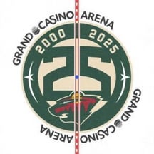
I realize this is rather nit picky, but does anyone else strongly prefer to have the arena name on the sides of the center ice logo (like Utah, for example) as opposed to asymmetrical on the top and bottom?
Although maybe I’m just biased against anything that says “Grand Casino Arena”
20 comments
Yeah it looks clumsy
I wonder if the words would basically just run into each other if it were painted on like utah’s. Might be why they decided to put it at the corners
Yep. It looks bad
Agreed. I also just don’t like how the 25 is so much bigger than the wild logo. They should be flipped. Yeah 25 is great, but we aren’t the Minnesota “25”ers.
No. It’s nice to see something different from time to time.
I’ll kill myself before I call it anything other than “The X”.
Yes, the asymmetry hurts my brain.
I also find it interesting that sits still “Excel Energy Power Play”, but I wonder how long before they change it to some stupid gambling reference.
What do they say when its time for a power play now?
Nah dog. Nah.
I like it
I hate it. It looks like they couldn’t figure out how to space the letters. I know it’s intentionally done this way, but it doesn’t stop my brain from thinking otherwise
Arena Grand Casino
Love when my two teams get a comparison!
I just like to complain about the most trivial things. It fills my life and online posting presence with joy.
Chum fucked horseshit
Wouldn’t have noticed it unless it was pointed out but definitely looks wonky.
Upvoting for fun off day OC.
TBF, not sure why Xcel would bother advertising in the first place. It’s not like there’s a competing electrical company.
Yes, this has bothered me since day one. I think they need to center “Arena” or just say Grand Casino.
Will always be the G spot to me
My husband has made this comment several times so you’re not alone. I however wish it actually had the cream color, not the dehydrated urine color I saw last night