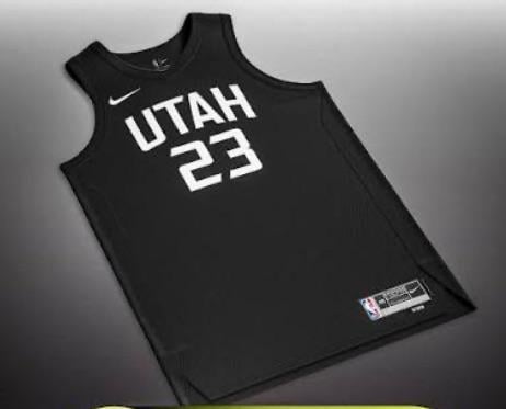
Still just a leak at this point. But if it’s real: the innovation of these jerseys… Just wow. Maybe next year we can remove everything and just have it be a blank shirt.

Still just a leak at this point. But if it’s real: the innovation of these jerseys… Just wow. Maybe next year we can remove everything and just have it be a blank shirt.
12 comments
Huh
Oh hell no
this is why i’m worried about ryan smith’s taste determining how a few billion gets spent on a “sports and entertainment district.”
There’s gotta be some color on it
I thought we already collectively decided these ones suck? How are they back??
I hope he gets bullied again for this and for tusky on social media so they have to change em. Just like those fucking highlighter bullshit jerseys
To be fair that post from Pro Line Mockups said it was a black base and hinted at it using a gradient like the dark mode jerseys from a few years ago. The post said it could even be them doing those awesome dark mode jerseys again. I’ll admit Ryan Smith shows some really bad taste sometimes but I really don’t think it’ll be that image from above as the jerseys.
I doubt Nike will approve this (lack of) design.
Looks like shit. As a local I don’t like Ryan Smiths’s attitude. He has a gentrification problem, granted SLC is the definition of gentrification. But trying to tear down historic parts of slc put a bad taste in my mouth. I would love some New Orleans Jazz throwbacks and maybe an Utah mammoth collab. A Polynesian print jersey would look awesome and would be an awesome shoutout to Utah’s islander population. I hate this “modern” look.
If I remember right, the Jazz were the only team to not get a city jersey last year, because they did the redesign so quickly. I wonder if this is last year’s leftover trash that they’ll have to wear now?
I’m tired of every team wanting a black jersey, because black jerseys “look cool”. What happened to jerseys having their own personality. Now when I watch games every team has 50 different jersey designs.
The throwback black Utah license plate edition.