
Colorado Avalanche REVIVE Quebec Nordiques Jersey!
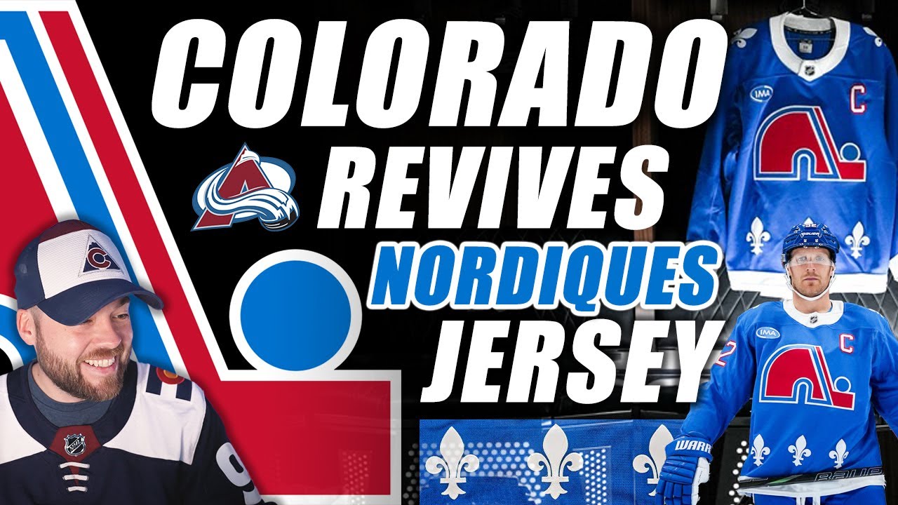
Hey Avalanche fans, hockey fans, jersey collectors. Thanks for joining me for this one. A pretty important jersey just got released in the NHL by the Colorado Avalanche. It is essentially an entire full uniform Quebec Nordics throwback jersey. Uh it is pretty great. However, there are some issues with this release. I want to wind back just a couple of days. Actually more than a couple of days. The uh Colorado Avalanche have been teasing this for what feels like weeks, I guess, and people are frustrated. And I apologize for the interruption, but today we have a special guest appearance on the Post to Post channel. It is Pickle the cat who does not like being held. That’s okay. He’s going to hang out with us for this one. And he was just napping, but as soon as I started talking, well, that means I got to get up and and cause chaos. So, he’s going to Yeah, he’s going to join us for this video. So, we have to go back maybe more than a week, maybe more than two weeks. The Colorado Avalanche have been teasing this what feels like forever. And I I like a good tease. Okay, give me a little bit of snippet here, a little bit of snippet there, maybe one day, maybe two days, but then give me the real thing. Don’t like don’t tease me weeks in advance and like at least give me the date that it’s coming. Don’t tease me one day and then three days later show me something else. Because in my mind, oh that means it’s coming soon. That means it’s going to release tonight, maybe tomorrow, the next day, something like that. Not in 3 weeks. So I I look at how the LA Kings released their jersey and how great and successful that release was. It was so good. And it doesn’t matter that we didn’t know the Kings was coming and that we know that the the uh Avalanche jersey is coming. I’m not talking about it being a surprise or anything like that. I’m talking about the execution of the release itself. LA did it right. They released everything on one night and it was amazing. The Avalanche teased us over three weeks or so and people just got so frustrated. And I’m not I don’t really consider myself an Avalanche fan these days, but I even I was frustrated just like as a Jersey collector like, “Yeah, the t-shirts are cool, but just give it to us.” Like, it was way too much. Way too much. So, it really did make quite a few people angry and specifically Avalanche fans. If you look online, there’s a lot of people upset. So, here are some of the images uh we can go through uh of the teasers. So, this was released uh weeks ago. This is one of the first ones that I saw. And then moving on, we got the gloves here. The next one is what looks to be some kind of pack or kit or something like that. You can see the pants to the left as well. And then here is another teaser where they’ve got the whole stall, the gloves, everything. Basically, the entire uniform except for the jersey, which is pretty cool. And then they showed a couple of more photos. Actually, I think I don’t have them, but uh I think a couple days after that they showed these, which is, you know, them them warming up. This was wasn’t too too recently, and they’ve got the pants on, the gloves. It’s the same stuff that we’ve seen, but it’s just, you know, again, lacking the jersey. So, we knew that the Nordique jersey was coming back, or at least a variation of it. We didn’t know exactly what it was going to look like. When I made a video a couple of weeks ago about this, I I guess theorized that it would it would be the exact Nordik’s jersey except for it might have the Avalanche logo recolorized with the Nordik’s colors. That’s not what we got and that I’m okay with that. Like it’s a it’s just a legit reskin of the Quebec Nordics. That’s totally fine, but you know, at the time I wasn’t sure. Uh so here’s another photo just of the pants, the gloves and stuff. And again, another photo of just the team floating around. But here’s a very interesting one. This is the one that interested me the most. It’s the goalie kit. It’s the old school kind of weathered leather look of the pads, the gloves, the blocker. I love when goalies do that in heritage games and just retro, you know, uniforms, jerseys in general. I think that is awesome. So, shout out to uh to this kit for sure. And then boom, we got the release. So, this is what I would say a disappointing release. This is the first and only graphic that we got for it was at least 30 40 minutes. I can’t remember when the second post came out from the from the Avalanche, but this is basically all we got. And I was just like, okay, like that’s fine. Like, okay, we get to see the jersey finally. That’s great. There’s some detail in there and stuff, but that’s all you’re going to give me for almost an hour. Like, give me give me on ice shots. Give me detail shots. Give me more. Like, just drop it all on us. You’ve been making us wait all this time for this jersey to come out, teasing us with these little images and stuff and now you’re you’re just going to post this for the first hour. I don’t get it. I I don’t get it. So, I really don’t like this release by the Colorado Avalanche. I love the jersey. I love the uniform. I wouldn’t change much about it. I’ll get into that a little bit later, but I I just don’t like the release the the the PR behind this, the marketing uh strategy. Not a fan. And then this was the other image. I’m, you know, I’m looking for more images. I go to the site. It’s just, you know, a different size graphic of the of the same thing. And then finally, we got some actual images. Unfortunately, there is a massive vignette on every single one of these. So, it it’s it’s not the best photos. Like, these photos, not great for this jersey, for this iconic Quebec jersey. Like, these are the photos that we get. It’s just it’s a little bit disappointing. The first thing I noticed is actually something I’m not going to mention right now. If you know me, you already know what I’m going to say. I’ll save it for the end, but it’s a nice uniform. I’m not really disappointed by anything too too much uh other than the stupid jersey ad on the front. Like, can we just get one jersey that the a team has like an alternate or a specialty or something without a jersey ad? Like, do they all have to have jersey ads? So, don’t love that, but it is what it is. I guess nothing we can do about it. Next image here shows the back. It looks really good. Uh here’s a side shot. I mean this it’s going to go down as one of the best Adidas fanatics era, you know, in the last basically 10 years uniforms that is that was ever created. Like it’s that’s how iconic this is. And we will have a discussion at the end as well about the decision behind this, I guess. Not not the uniform itself, but the decision behind this. Uh moving on, they’ve got another shot here of four players. Looks great. It’s going to look amazing in the game and on ice. They they did include some some detailed shots. Uh the back name plate. Uh some side shots. Some shoulder patch stuff here. Atlantis cog. Really good angle of the flirtilis on the shoulder. The numbers look so good on the blue. The the C looks good. The logo looks good. Like this is going to be a great jersey to have in your collection if you can get it cuz it’s as I’m filming this already sold out on the store in basically every size. So cool. Uh next we’ve got a little bit close-up of the helmet there. So you can see that. I will talk about that very specifically here in a little bit. And then McKennon some shots there too. And then the Avalanche released some more images or some graphics I guess with some images on and actually provided some detail. So I’ll kind of read through this. Nordics translates to northerners in English and the igloo logo is representative of the rugged landscape and northern climate of Quebec. The igloo opening also closely resembles the letter N. This Sorry, I’m getting distracted by pickle. Uh, this central element of the jersey uniquely captures the pride and connection of the Quebec Nordics in the northern regions of the province. Uh, continuing on to this image, inspired by the French flag, the blue, red, and white color palette is meant to symbolize the importance of the province’s French Canadian roots. And moving on to the last one here, the flirtillis. The prominent inclusion of the flirtilis uh along the bottom hem and adorning the shoulders of the jersey is a nod to the Quebec provincial flag and represents pride in the French Canadian heritage. So yeah, I mean obviously we like that they’re not the only NHL team in existence to use the uh St. Louis uses it in the back inside of their collar for their city flag. A lot of French influence in St. Louis. Now, I want to talk about the actual colors here. And this is something that I have mentioned in the past, recently on the channel. Recently as in I think the last video I made on the channel or maybe the the previous video. It’s color specificity. When we’re talking about uniforms, we’re talking about different materials, the light shining off those materials in a different way. So, when you’re trying to color match things, it can be difficult. If we look at this uniform, the jersey is a specific blue. If we look at the pants, it’s also a specific blue. Specifically different. Like it is a different blue pants than it is the jersey. The socks look pretty similar to the jersey in my opinion. And the helmet is different blue than the jersey. More so closer to the darker blue of the pants. The gloves are more so with the pants and the helmet. But I maybe people don’t notice these things and it’s okay if you don’t. There’s like I’m not saying that I’m right here. I’m just saying that like this is the NHL. This is the top league and they still can’t color. Some teams just still can’t color match stuff. It drives me nuts. Here’s an example. Let’s go way back, okay? Way, way back to the original Nordique days. Here’s Foresburg. Here’s an example of a uniform. Now, what do you see on here that’s not color matched? The jersey, the gloves, the pants, and the socks all are color matched. The helmet is not. Okay, this wasn’t that unusual back then. It’s the you’re you’re dealing with different branding and it’s just the manufacturing process was a little bit different. So as close as you could get was, you know, pretty much what you did. But it’s 2025, almost 2026. We have never been more technologically advanced than we are right now. How can we not get the same color in the different materials? I I I don’t understand it. It drives me nuts if I was on an NHL team involved in marketing and jersey design and something that would be such a top priority to ensure and do product testing to ensure that it looked correct in every aspect of the uniform. I think that attention to detail is important. One final photo to show you that they actually just released right before I started filming this one is the jersey hanging in a in in a locker and it’s it’s cool. It’s underneath the Josak kind of name plate there. I I think this is a beautiful photo. I think this is a beautiful shot. Why wasn’t this the first one that we got? Like this is such a good photo. I love the creativity, the dynamic lighting. It’s It has drama. It has personality. It’s It just It makes you emotional a little bit cuz it’s like bringing back history. Like it’s it’s such a powerful image. And it’s the last one that we got hours and hours like 5 hours after it was released. So, I don’t know. Just a little bit disappointed. I’m disappointed in the team’s release of the jersey. I love the jersey itself. The uniform isn’t perfect. It needs work. Um, if I’m going to change anything about the jersey, it’s specifically it’s the it’s the collar. Too much white in my opinion. I know it’s trying to match the original, but it’s too much white. This little piece here, make this white. This should be blue. That’s my only little critic criticism for the jersey. And uh, we can talk through the decision behind this. I love the Nordics branding. It’s so classic and nostalgic. I live in New Brunswick, so Quebec is just, you know, just four hours north of me a drive. So, I’m very familiar with Quebec in terms of a province. Uh, my father, who you’ve probably seen on the channel if you’re a longtime viewer, was born and raised in Quebec in Montreal. So, I’m no stranger to Quebec and I’m no stranger to the Nordics. So, I love the imagery. I love the branding. I like that they’re kind of kind of coming back with some of this stuff. I love the retro stuff in general, but I completely understand how big of a slap in the face it is to Nordics fans. When you’ve got an arena in Quebec City that is NHLsized already, ready for an NHL team, the city wants a team back. The fans want a team back, you know, that arena would be full every single night. Like, come on now. Like, the NHL arguing that it it’s not big enough or whatever the the reason is, it’s absolute nonsense. Like, Quebec deserves a team. They’ve got the fan base. They’ve got the heritage, the history, they’ve got the branding. All that stuff, all the hard stuff is done. That’s the stuff that usually takes a long time to do is figuring out the branding and copyrightiting things and creating a fan base and trying to find success and and all that stuff. You know, Quebec’s already kind of been through that. They already have the that hard work done. So, to me, I just think it’s this continual slap in the face. Same with Hartford fans, like the with the Whalers jerseys and stuff. like I love those. But again, it’s it’s just such a slap in the face to that fan base and those that that area. It’s like, man, if if if this branding is so important, there’s so many people that love it that you’re continuously bringing it back. This is the second Norak inspired jersey in the last 5 years. This is there’s the three Hartford Whalers ones in the last five years, I think, as well, or maybe six. If there’s this much interest, then I can completely understand fan f, you know, actual Nordic fans, actual Whalers fans from back in the day being upset by this. They’re like, “Okay, well, if it’s this important, then bring a team back, you know, like let’s let’s actually let’s actually do this.” So, I understand the frustration there. Uh, but as a non Whalers fan and non Nordics fan and as a jersey collector, obviously I like these jerseys, but I think it’s an important conversation just in general to talk about the path that the NHL is going with expansion and and how they’re approaching it. And I think I heard recently that they’re not considering expanding until 2030 at the earliest or something like that. And it’s going to be like minimum two billion per team. Crazy because a couple of years ago, well, not a couple, like seven years ago, I think it was 500 million, then it was 600 or 650, 650 million, and then it was 800 million, and now it’s two billion. What’s going on? What’s going on here? Anyways, lots of rants in this video. There you have it. The jersey is released. Thank you so much for watching. As Pickle walks by, he’s looking for some attention. Thanks for watching. I appreciate it. Hope you guys are having a great day. If you got your hands on this jersey, congratulations. I fully suspect that I will not be able to get my hands on this jersey. I didn’t even try. And uh yeah, you know, maybe someday this jersey will come back in in a in a better stock or maybe I’ll find it somewhere online in the future. I have no idea. Would absolutely love to have it in my collection, but it is what it is. So, let me know down below in the comments section how you feel about this one. And we’ll talk to you very soon in the future for lots of hockey videos on this channel and of course keeping you up to date on every single jersey uniform, logo release in the NHL and other leagues. I appreciate you. We’ll talk to you soon. Adios. [Music]
Episode 1789
Supporting the channel can be done here:
YouTube Membership: https://www.youtube.com/channel/UCnWUMMlROKuT3roikjMp9TQ/join
Monthly Patreon contributions: https://www.patreon.com/Post2Post
Direct contributions: https://www.paypal.me/Post2Post
DEALS:
Save on jerseys by **FIRST** going to https://www.coolhockey.com/post2post and then using code “POST2POST” at checkout! This will save you 10%.
Save $20 off your first purchase at https://seatgeek.com/ with code: POST2POST
Save 10% off any template at https://sportstemplates.net/ with code: POST2POST
Want to submit YOUR jersey concepts to get reviewed? Please watch this video to find out how: https://youtu.be/fb_h_mB19fo
Play games with me on Twitch!
www.twitch.tv/post2post
PO Box: Unfortunately, the PO Box is now closed.
Find us on Social Media here:
https://www.Instagram.com/Post2PostShow
Tweets by Post2PostShow
Have a business inquiry or want to send me a fan video intro?
E-mail me here: productions@post2postshow.com
*Due to the amount of e-mails, a response cannot be guaranteed*
#NHL #coloradoavalanche #quebecnordiques
31 comments
I love that their wearing them against carolina with the whalers jerseys.
Ordered my Landeskog Authentic Pro this morning! Can't wait to see it in person!
My heart ( and my avatar ) say yes .
My wallet says no . I got the white one pro-stiched , MacKinnon name & number for huge moneys a couple years ago .
I'm always a Nordiques fan who became a Avalanche fan .
Love the nordiques… BUT this is just for the cash..
If they would care for real, the jersey would come adds free……at least..
Fanatics doesn't have the quality control to color match like that.
so so so tired of the nordiques and whalers gimmick. as someone who isn’t a fan of either team, i still see it as a big spit in the face at the cities that lost their teams and they release versions of these jerseys biannually. be original
You know that the whalers (hurricanes) vs. Nordiques (avalanche) games are going to hit hard when watching them.
The jersey launch for this was so bad with everything being sold out in a span of minutes. All this teasing just to screw up the launch is shameful.
11:24 Absolutely one of the biggest frustrations I have with Bettman is no more Canadian expansion. I know there is a 99.9999999999% chance it ain't going to happen but the next at least 3 expansion teams for the NHL should be from various spot from Canada.
It's like the best thing to have happened and also the worst thing to have happened at the same time here?! I still own both my original Nords & Whalers uniforms after so many decades and now the league are making them play one another?! I don't know what to do or think anymore…My mind has gone blank right now.
Don’t like the fact Avs can basically wear the nordiques retired numbers in their jersey. That really doesn’t sit right with me.
nice kitty
Not only was it one of the worst jersey releases ever, I waited patiently just for them to not even make blanks available in Canada. Only Makar and MacKinnon on the NHL shop website. So disappointed.
wheres the best site to buy a cale makar jeresy addias without the A on it?
the kitty is saying hey dad I want to go out
I hope Arizona gets a team
and Hartford I don't know
Atlanta needs a hockey team
I think the teasers was a part of the hurricanes and Avs matchup. The two teams planned on renewing the “rivalry” (they aren’t rivals because they’re in opposite divisions) and had to communicate with Carolina to bring their whalers gear with them. I think the social media team couldn’t hold in the excitement they had and released pictures in the past few weeks.
For me living in North Carolina, I’m upset they’re doing that because I can’t watch the games which is 2 of the 6 times they’re playing and wearing them.
I don’t like the collar or the sleeve cuffs. I’m pretty disappointed with this jersey tbh
Oddly enough I did a video on my channel talking about this and why I personally believe the NHL will never go back to Quebec which i truly wanna be wrong about but don't think I'm going to be
As a Dallas Stars fan, I dislike the ‘Lanche very much, but these jerseys and everything they represent are great!
can we please just revive the actual quebec nordiques, not just the jersey
I like it!
Love it. Even after a generation or two, this uniform is still freaking awesome. This is a part of my youth and my culture. Kudos to Avs fans who honour and respect it. 🫡
I kindly suggest Cale Makar should not wear #8 with this jersey since it’s a Nordiques retired number.
Of course I won’t buy it, not until they’re back for real. I’ve got some principles (except for one hat). I already got a jersey which 34 years old.
#3, #8, #16, #26
I’ll be honest I’ve never been a fan of the Nordiques uniforms, jersey is bland as hell in my opinion it’s a practice jersey with 3 fleur-de-lis and the socks don’t even match.
Lov your vids… seeing these Alternate jerseys is kind of a kick in the gut to the NORDIQUES fan .. they deserve a team back in QUEBEC..
Sucks they're already sold out that's what frustrates me
Neil..we up here in CANADA all know the answer why there is no team in QUEBEC… GARY (JERK OFF ) BUTTMAN
Jerseys, pants and socks are all made of different materials, there is going to be slight variation to the colors. You notice it on almost every team. A few teams happen to have the perfect shade of a color where you don't notice it as much. Also, light reflecting off the pants produces a different sheen because they have a vinal texture.
I agree with you about the colour of the avalanche, Quebec Nordics jersey