I like the silvers numbers, kinda reminds me of the browns using two colors on their numbers. 43 comments Trash Not good Whole lotta nope up in there Boooooo Those look like 2001 XFL jerseys. Didn’t know we had a “retro” jersey. Who knew. 😂 Visually assaulting Ewe That’s as 90’s as it gets, good lord  They are bad. But every time I see this picture I always feel like that’s really Jake on the right Looks like those 80s Halloween costumes with the plastic face mask on a rubber band No ty. They also remind of the Titans Froggy fresh would like a word  Delete this from my memory. This shit is cursed as cursed can be.  Terrible! We have timeless uniforms and I hope they never get changed, and we end up like the jaguars, looking like a pop warner team The super shiny (and overly tight) black pants are… a choice. Much prefer our current matte black pants. White top black pants always reminds me of CMC spinning into the endzone vs the bucs in London. Look like shit Not bad for then, but they look dated now.  Duct tape on the sleeves Whose prototypes are these? Just Bryce. Everyone else gets a normal jersey.  I like the wood paneling in the background. The left one is pretty good for the time and great in concept, not so much the right one Vile Away is alright. Home is trash They had my boy Jake Delhomme modeling the jerseys?? Looks like Spirit Halloween costumes Jake and Vince Carter? I don’t hate them. But what we have now and ended up with is definitely better. Also the three logos on the sleeve, helmet, and pants is way too much. The numbers on the blue jersey should also either be white or black instead of silver Probably a good thing they don’t do throwback jersey games These stink Sooo bad. K-Mart knock off vibes Those are awful. The logo on the sleeve isn’t big enough These are worse every time I see them They remind me of my high school’s jerseys lol Idk. The white one is nice Leave a ReplyYou must be logged in to post a comment.
Terrible! We have timeless uniforms and I hope they never get changed, and we end up like the jaguars, looking like a pop warner team
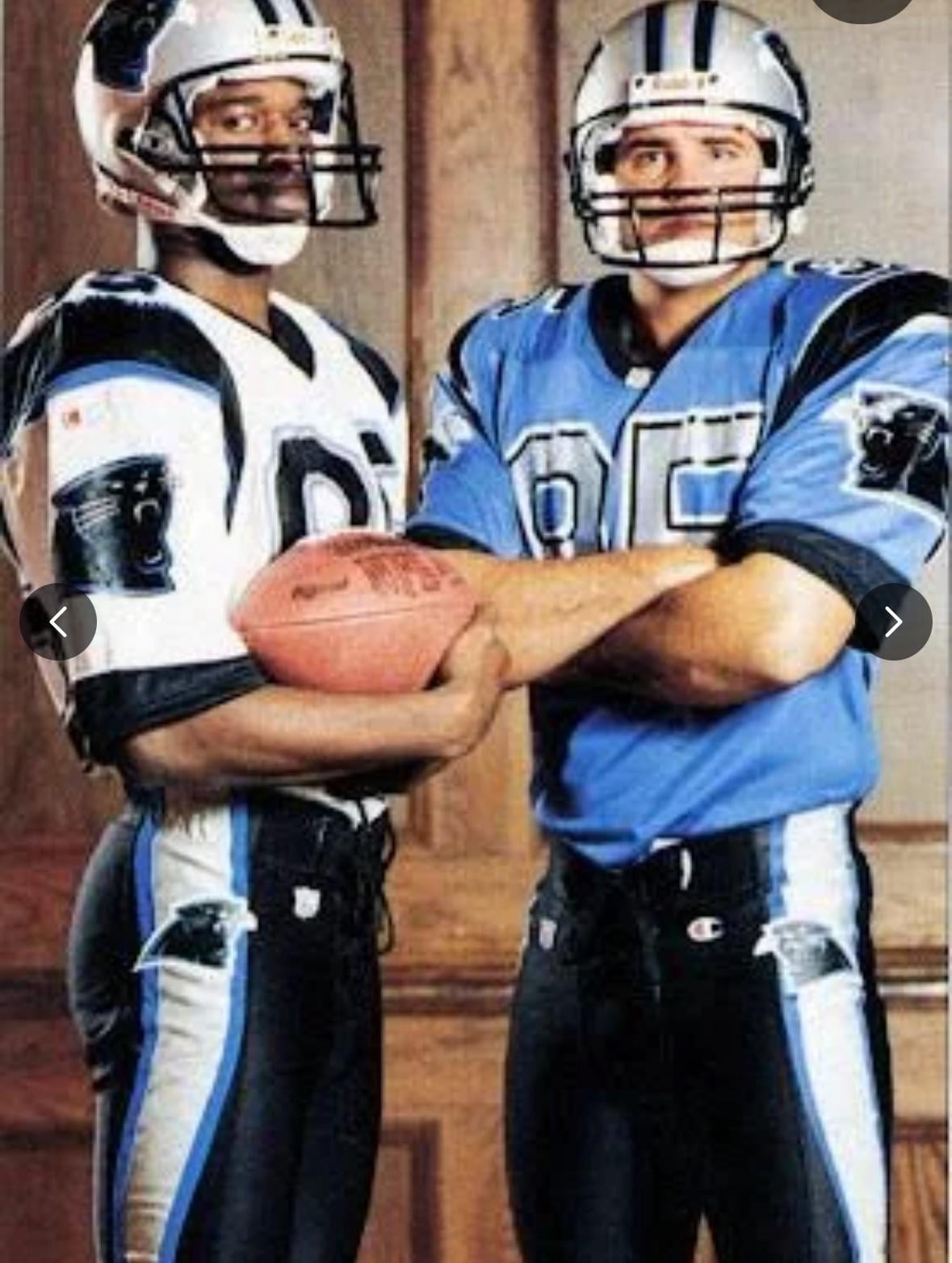
The super shiny (and overly tight) black pants are… a choice. Much prefer our current matte black pants.
I don’t hate them. But what we have now and ended up with is definitely better. Also the three logos on the sleeve, helmet, and pants is way too much. The numbers on the blue jersey should also either be white or black instead of silver

43 comments
Trash
Not good
Whole lotta nope up in there
Boooooo
Those look like 2001 XFL jerseys.
Didn’t know we had a “retro” jersey. Who knew. 😂
Visually assaulting
Ewe
That’s as 90’s as it gets, good lord

They are bad. But every time I see this picture I always feel like that’s really Jake on the right
Looks like those 80s Halloween costumes with the plastic face mask on a rubber band
No ty. They also remind of the Titans
Froggy fresh would like a word

Delete this from my memory. This shit is cursed as cursed can be.

Terrible! We have timeless uniforms and I hope they never get changed, and we end up like the jaguars, looking like a pop warner team
The super shiny (and overly tight) black pants are… a choice. Much prefer our current matte black pants.
White top black pants always reminds me of CMC spinning into the endzone vs the bucs in London.
Look like shit
Not bad for then, but they look dated now.

Duct tape on the sleeves
Whose prototypes are these?
Just Bryce. Everyone else gets a normal jersey.

I like the wood paneling in the background.
The left one is pretty good for the time and great in concept, not so much the right one
Vile
Away is alright. Home is trash
They had my boy Jake Delhomme modeling the jerseys??
Looks like Spirit Halloween costumes
Jake and Vince Carter?
I don’t hate them. But what we have now and ended up with is definitely better. Also the three logos on the sleeve, helmet, and pants is way too much.
The numbers on the blue jersey should also either be white or black instead of silver
Probably a good thing they don’t do throwback jersey games
These stink
Sooo bad. K-Mart knock off vibes
Those are awful.
The logo on the sleeve isn’t big enough
These are worse every time I see them
They remind me of my high school’s jerseys lol
Idk. The white one is nice