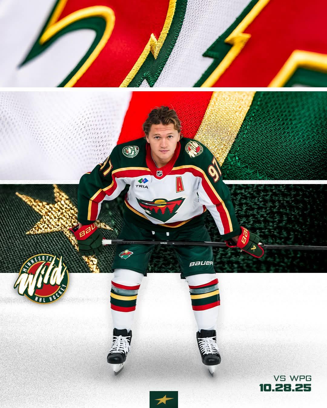
The best Wild jersey there ever was, and ever will be
October 28, 2025
Seriously hope they bring this and the green one back full time soon
24 comments
False. The 78s will always be best.
Hopefully these jerseys can bring us a little magic, the team is looking lost
For me the numbers and font make this one special.
This is Christmas sweater slander.
My favorite was always the green alternates with the wheat “Minnesota” across the chest but these are also fire
It will be really fun watching them lose in these sweaters.
Wish it was available in adult sizes
Never should have changed from these
Ain’t gonna lie man these gotta be one of the worst jerseys I just don’t see what everyone else see’s.
I’ll take the alternate reds over this any day
I think its second worse behind only the green version of this
I know this take’s going to get downvoted to oblivion, but I can’t stand these jerseys. I feel like the people who love them are mostly attached to the nostalgia.
These sweaters are stuck in the 90s. That’d be fine if it was just a throwback, but there’s a vocal crowd that actually wants these back full time.
Everything about it feels tacky to me, from the kitschy metallic gold, to that “Wild” wordmark shoulder patch that looks like it came straight off a 90s kids’ TV show about jungle animals, to the extreme number font. The piping and those green shoulders especially don’t belong on a white jersey.
The Wild have one of the best logos in sports, but somehow they keep pairing it with some of the worst sweater designs imaginable.
Not bringing back the stripes for the pants is a huge miss. It tied to uniform together
🤮 I never liked it. It looks like Christmas.
Bro that looks so good!
Let’s agree to disagree.
These are awesome and bringing them back is long overdue!
This looks soooo good
To bad that TRIA advertisement looks like ass.
Eh
Ketchup, Mustard and Relish.
If the point of a hockey jersey is to make you think of hot dog condiments, then they are without equal.
I made a tier list of my favorites. Debate welcome.
Its a cool throwback, but the current primary uniforms are perfect for the Wild. Despite being a 2000 expansion team we have a old time hockey brand. A Wild uniform is supposed to look like it can belong in any era. These uniforms are clearly late 90s-early 2000s
The Tria ad patch aside, this is the best jersey and hopefully this gives us some of the magic we had earlier this month back

24 comments
False. The 78s will always be best.
Hopefully these jerseys can bring us a little magic, the team is looking lost
For me the numbers and font make this one special.
This is Christmas sweater slander.
My favorite was always the green alternates with the wheat “Minnesota” across the chest but these are also fire
It will be really fun watching them lose in these sweaters.
Wish it was available in adult sizes
Never should have changed from these
Ain’t gonna lie man these gotta be one of the worst jerseys I just don’t see what everyone else see’s.
I’ll take the alternate reds over this any day
I think its second worse behind only the green version of this
I know this take’s going to get downvoted to oblivion, but I can’t stand these jerseys. I feel like the people who love them are mostly attached to the nostalgia.
These sweaters are stuck in the 90s. That’d be fine if it was just a throwback, but there’s a vocal crowd that actually wants these back full time.
Everything about it feels tacky to me, from the kitschy metallic gold, to that “Wild” wordmark shoulder patch that looks like it came straight off a 90s kids’ TV show about jungle animals, to the extreme number font. The piping and those green shoulders especially don’t belong on a white jersey.
The Wild have one of the best logos in sports, but somehow they keep pairing it with some of the worst sweater designs imaginable.
Not bringing back the stripes for the pants is a huge miss. It tied to uniform together
🤮 I never liked it. It looks like Christmas.
Bro that looks so good!
Let’s agree to disagree.
These are awesome and bringing them back is long overdue!
This looks soooo good
To bad that TRIA advertisement looks like ass.
Eh
Ketchup, Mustard and Relish.
If the point of a hockey jersey is to make you think of hot dog condiments, then they are without equal.
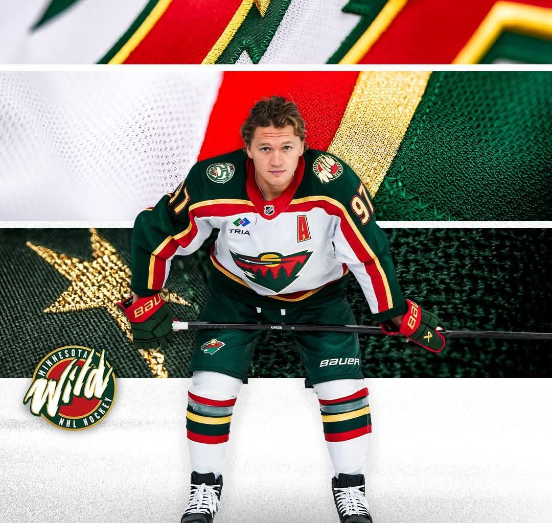
I made a tier list of my favorites. Debate welcome.
[<image>](https://imgur.com/a/UFM1JUZ)
Its a cool throwback, but the current primary uniforms are perfect for the Wild. Despite being a 2000 expansion team we have a old time hockey brand. A Wild uniform is supposed to look like it can belong in any era. These uniforms are clearly late 90s-early 2000s
The Tria ad patch aside, this is the best jersey and hopefully this gives us some of the magic we had earlier this month back
I just want the red back.