
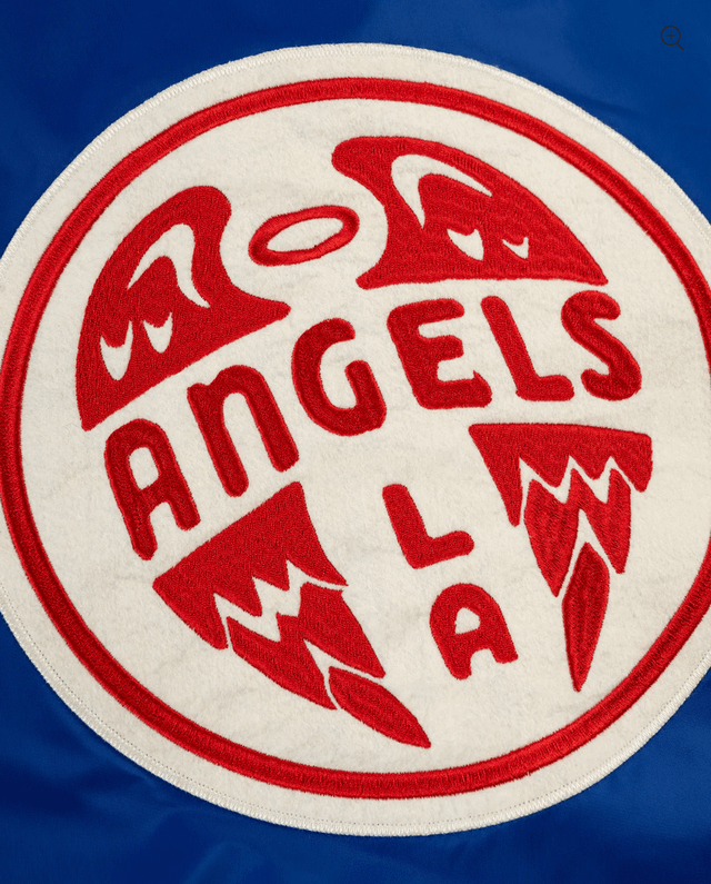
Was browsing Ebbets Field and came across this. I'm kind of a sports logo fanatic, so I was shocked I had never seen it before. Absolutely bangs.
This logo/color scheme (maybe a darker or lighter blue to contrast with the Dodgers), plus some California Gold accents, would be a great base for a brand refresh.
Cap logo could still be a version of the Halo A, but this would be a primary crest.
15 comments
What is an “AngelsGla?”
Gives me a city connect vibe. We need to get away from current uniforms, too much damn red. Bring some blue back
I hate it.
LA = Dodgers
Blue with white trim/cuffs = Dodgers
Crazy if you actually look into the history of the PCL angels
This looks like dog water.
An owner refresh would be 100% better. And they aren’t not from Los Angeles
GLA motherfuckers!
I actually want this to take off. Coza Nostra style. “It’s our thing”

NO, SIR. I DON’T LIKE IT.
Probably impossible to copyright it.
Looks like you asked chat gpt to come up with a throwback patch for the LA chapter of the hells Angels
GLA
Nope. Any tie in to LA/Los Angeles is bad fucking karma. Just embrace Anaheim, the city you actually play baseball in. Until we do ain’t nothin’ gonna change.
Maybe for a throwback night, but I think the current logo looks best.
I would sport that.
I’m personally never buying anything Angels with LA in it.