
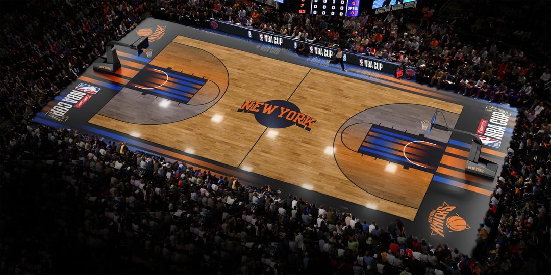
Would love to hear what you think, I wanted it to still be visually distinct from regular season games, but not as much of an eyesore. I really like the MSG lights on black kit, and felt like everything would feel more cohesive if the court matched the kit.
8 comments
Love this. It would be so nice if they designed them more neutral, it’s so annoying to watch these bright courts.
The point of the courts is so you HAVE to know it’s a cup game. They should put a big ass trophy in the middle and call it a day.
The cup courts are obscene. They’re so distracting. I also really hate non-natural wood-colored courts like Brooklyn and Indiana’s grey.
God damn, that looks amazing. The shading inside the 3 point line, the ombré at the top of the key.
10 out 10. No notes.
They should just change the three-point area and the paint like the [Maui invitational](https://mauiinvitational.com/images/2022/11/20/x_jiDc7.jpg). Much cleaner look.
the cup courts are disgusting looks like its a court for some other sport
🔥
Im new to the sport. Csn you explain why they do this? Is it to brand up the cup and try and make it feel special?
I personally hate the asthetics.