
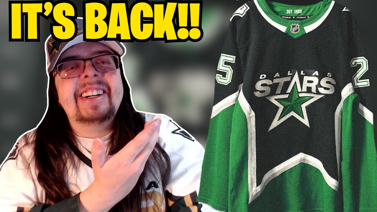
Dallas Stars Bring Back Star Jersey!
The Dallas Stars just revealed their brand new third jersey, which means we are almost done with all the new jerseys that are coming out this year. We’re just waiting on the Stadium Series jerseys, which will probably be revealed sometime in early January. That’s at least my expectation. But outside of those Stadium Series jerseys, this was the last one that we were waiting on. It was the Blackhawks and the Stars, and both of them have been revealed here in the past week. So yeah, we’re done with all of the new jerseys, which is, you know, kind of unfortunate because I love looking at new jerseys. These ones here, though, they’re quite nice. So before we do actually go ahead and take a look at them, if you guys are new to the channel and you like hockey jersey content, please make sure to subscribe. I would really appreciate it. So here it is. This is the Stars new jersey. It is their 99 jersey or the 99. Uh it’s the 99 jersey. Uh so throwing back to when they win the cup in 1999. And it is the star jersey that so many people like wanted the Stars to bring back. Of course, they did do that for the reverse retro 1.0 jersey. And a lot of people have said that this is kind of a mix between the reverse retro 1.0 jersey and the reverse retro 2.0 jersey. And yeah, it it is. It kind of is. But yeah, it’s great that they brought this design back cuz it’s it’s needed to come back. It’s a very beautiful looking jersey. It’s an awesome looking design. Like the design is just so nice. Now, I don’t think the design works as well on this template as it does in the previous era, like with the like the CCM jerseys. I think it works perfectly in the CCM template. Uh, it still looks fine here. It’s not like terrible, but I I do think it works better with the CCM template, at least just in my opinion. Now, I love the fact that this isn’t just an exact throwback to those 1999 jerseys. I’ve talked about it a lot on this channel here, but when teams do throwbacks to old school jerseys and they’re going to be a permanent third jersey, you know, not just a anniversary jersey or a one-year jersey, when it’s going to stick around for a couple of seasons, I like when teams change it up a little bit. You know, it doesn’t need to be a massive change. It can be, you know, a fairly small one. This one here, I would consider to be pretty big in terms of their change. It is basically just the colors, but it still is a pretty big change in terms of those colors, but it’s always something that I prefer. I always like to see something a little bit new with jerseys. So yeah, this one here, I love the fact that it is paying homage to those old school jerseys, but still kind of bringing it into the modern era. Let’s go through some of the details on this jersey. So we have the championship collar is what they call it. Uh inside the collar features 1999, paying tribute to the triple overtime victory that secured the 1999 Stanley Cup. I really like this part of the jersey a lot because, you know, sometimes you will see a team have their Stanley Cup years somewhere on the jersey, either inside the back of the collar like it is here. Sometimes it’s like embossed in the striping or in the back hem tag, something like that, right? Every now and again you’ll see that. It’s usually on a specialty jersey, but not often do you see, you know, a triple overtime 1999. Uh, I don’t know. It’s just it’s an extra detail that I do kind of like. I think that is pretty neat. Moving along though. So, we have the striping here. there. So, it says, “Briding the eras, the starstripe design connects the iconic look of 1999 with the identity today.” So, yeah, it’s just the Starstripe design with the current colors. Not like the colors are that different than previously. It’s just, you know, a lighter green. This one here is a lot darker of a green and it doesn’t have the kind of bronze or gold, whatever you want to call it. Uh it’s the silver now and it does have that sparkle silver as well that we see so much of nowadays. It seems like a lot of teams have kind of some sort of sparkle in their jerseys. But yeah, the stars have implemented that on these jerseys as well. The silver parts do have that sparkle to it. As for our next picture, kind of the same thing, right? Logos reimagined. Legacy logos are reinterpreted through our current colors, blending past tradition with modern energy. So, yeah, just recolored logos. Basically, just replacing that gold for the silver. That’s kind of the main thing. And then here we just have some close-up pictures of the jersey. So, yeah, you can see that sparkle with the actual logo itself. One thing that I will say about this logo is it does look really nice. It’s pretty similar to that reverse retro 1.0 0 logo. It just doesn’t work quite as well on that reverse retro 1.0 cuz it blends into the rest of the jersey. You know, the silver does not stand out on the white at all where it being on a black base here. It does stand out. So, it looks a lot better on this jersey. Here are a few more pictures together. So, we have the inside the back of the collar, which we already looked at. There is the back of the jersey. So, with the name and number, we can see what that looks like. So, it is going to be a silver outline. Then, it’s going to be green and then white on top. Uh that does look quite nice. Now, in terms of the actual customization style, if we go back to the previous picture, we can see the arm number, and that is embroidered with the green there. You can see the embroidery. Now, I don’t think that’s what it’s going to be like on the actual jersey cuz they did show off the jersey in their promotional video. And in that, of course, they did show the back of the jersey. And so, this is what the back of the numbers looked like. And you can see that is stacked. So, I don’t think it is going to be embroidered. Uh, that’s one thing with Fanatics that I do find a little bit strange. It seems like a lot of the time when the teams are releasing these jerseys here, they will have the embroidered customization style, which is usually not how it ends up looking like on the actual jerseys. And I don’t remember that being a thing during Adidas. Most of the time, I feel like when, you know, the teams released the jerseys under Adidas, they showed off the actual customization style, like what it was going to be like on ice. Even though, like with this jersey right here, this one is just a Fanatics premium. So, it’s not like the actual on ice jersey. So, I guess that is why they just throw on the kit, they don’t really care whether it is accurate to on ice or not. But yeah, I don’t remember that happening with Adidas. I feel like most of the time with Adidas, uh, when they were showing off the jersey, it always had the accurate customization style. But maybe I’m wrong. I definitely don’t think that any of them had the embroidered kits, though. I don’t think that was really ever a thing that was shown, at least under Adidas. Yeah. And then in the bottom right of this picture here, we do also have the pants, and we can see the Dallas on the side, which I like. I think that is really cool. Um, they’ve used those, you know, obviously in the past with that reverse retro 2.0 jersey. And then, of course, you know, back in the day as well. Oh, one more thing with the customization kit as well is it looks like there’s not a name bar on this jersey. At least looking at this picture right here, like I’m trying to zoom in and I don’t see anything. Now, it is a very dark jersey and very dark lighting. So, like it’s possible the name bar is there and I just can’t see the stitching. Uh, but yeah, it doesn’t look like there’s a name bar on this jersey. It looks like just the letters are stitched onto the jersey, which I always think is cool. I like that. I like when teams do that uh cuz it is something different. You know, it’s not unique per se because other teams do do it, but I like it a lot because yeah, it’s not normal at least. The last few pictures that I have are of the players. Now, the thing that I find very strange as with the photo shoot that they did here with the players wearing the jersey is they had all of them sitting down. And I don’t really get that because it doesn’t show off the jersey all that well, especially with this one right here where the star pattern is at the bottom of the jersey. So, it’s just covered up in every single one of these photos. I don’t really understand why they would do that, but that’s what they did. So, yeah, we have Jamie Ben here. We can see a little bit of what that captain’s patch looks like. So, yeah, just, you know, same thing as the numbers on the back, and it does look good. Moving on, we have Wyatt Johnston. So, you can see a little bit more of the actual uniform. You can see the socks there. So, uh, the socks I I do find to be kind of boring a little bit. Like that is what they had back in the day, but I don’t know. Those socks just seem uh really boring for what the rest of the jersey is. It It’s almost like I would want a star pattern on the socks, but I don’t know how you would really make that work. So, yeah, I’m not quite too sure what you would do, but I I don’t love the socks. I’m not in love with the socks. And then our last picture is of Auter here. Uh, so we can see kind of a little bit of his setup. Not really the full thing. Uh but yeah, once again, the these photos were weird to me because it’s like, why do you have all these players sitting down? Uh there was a lot more players sitting down that I just didn’t include. But yeah, why do you have all these players sitting down? Because you really can’t see much of the jersey, at least the actual attractive part of this jersey, the star pattern with any of these photos. I just didn’t understand it. But I do like his goalie setup here. Uh it does feel a little bit old school. So I think that is quite nice. In terms of them wearing the jersey though, they’re going to be wearing it for 12 games. So this is that jersey schedule. It’s kind of funny that they’re debuting this jersey on November 28th because that is also when the Blackhawks are debuting their third jersey. So, we’ll have, you know, kind of a fun little night there of both teams debuting their third jerseys. But yeah, my overall thoughts on this jersey are very positive. I do like it a lot. I think it looks good in black. It’s a little unfortunate that it is another black jersey, a black third jersey, but it still does look very nice. I still think that is great. I like the re-imagined colors. I like it being in the current colors. The silver really pops with the black on this jersey here. I like the green at the bottom. The collar itself is actually kind of neat because it’s a split collar, which I I don’t remember seeing all too often with these, you know, Adidas/ Fanatics collars. Usually, it’s either all one solid color or you have just like that little piece of fabric to be a different color. It’s usually not like split down the middle like it is here. So, that is pretty interesting. Uh it’s it’s different and I kind of like that. So, yeah, that is cool. If I’m going to rank this jersey, I would probably give it I think I’m probably going to give it like an eight out of 10. Uh I I think is where I’ll have it. Not my favorite new jersey from the season here, but it is still a very nice one and I still think it is. Um yeah, really really positive. So the Dallas Stars did a good job and overall, I mean, I I think this year in general, we got some pretty nice looking jerseys. So, uh, I will be doing a video, you know, recapping and going over and ranking all of those new jerseys after the Stadium Series jerseys, of course, get revealed. Uh, but that’ll probably even be later. Like, I’ll probably even do it. You I usually do it once the season ends. That’s usually when I kind of wait for that. But maybe this time around I’ll do it after the Stadium Series jerseys. We’ll see. We’ll kind of have to see. That’s it for me, though. Thank you guys so much for watching. Let me know what you guys think about this jersey in the comments down below. I’d love to hear it. But if you guys like the video, make sure you leave a like, subscribe to the channel, follow me on all my social medias. I’ll see you guys next time.
The Stars have brought back their star design for their new 3rd jersey! What do you think about this new alternate?
Join my discord!: https://discord.gg/TgeBpaEzXH
Follow me elsewhere
TikTok: https://www.tiktok.com/@thejerseyzone
Twitter: https://twitter.com/TheJerseyZone
Instagram: https://www.instagram.com/thejerseyzoneyt/
15 comments
I do really like this jersey. I wish it was green based, with a black star in it, instead of a black base with a green star. I think a jersey like that should be their home jersey. However, I still do like it. But, its ANOTHER black alternate jersey. What, does half the league have a black alternate now? Its just so unimaginative
Keep up the great videos man! Always look forward to your videos!
The silver doesn't look nearly as good as the gold, nor does this shade of green.
i like the original alot i didn't think it would look good with the Silver instead of gold and i am glad i am wrong . the lighter green and the silver work well together and the logo got a nice update to i won't mind if this jersey become the new home and making a white jersey that isn't not that reverse retro jersey the white jersey could be a reverse of the black and white on jersey .
I need one 😍
As much as I hate the Stars, this is an awesome jersey. It really is a mishmash of the RRs.
This release has solidified for me that Hockey fans are wat too fickle. People have been calling for the return of this jersey for years and now we get it and so many people are complaining about it.
I will say this…FINALLY the numbers don't run into the stripes
you're totally right about the photos…when you can't see the bottom it looks like they just took the Rangers' Lady Liberty template
This slaps. The Kelly green and silver look amazing with the black and really pop. It’s so much better than the old one they wore
They chose the worst positions for showing off the jersey. Jake doesn't even have a neck in that photo
I might get it
To me this is the best release of the whole seasons of any of the teams New Jerseys by far and I’m not even a stars fan . Will definitely be picking up one
I heard Toronto were doing a new alternate this season? Might have just been a rumor.
This jersey is beautiful