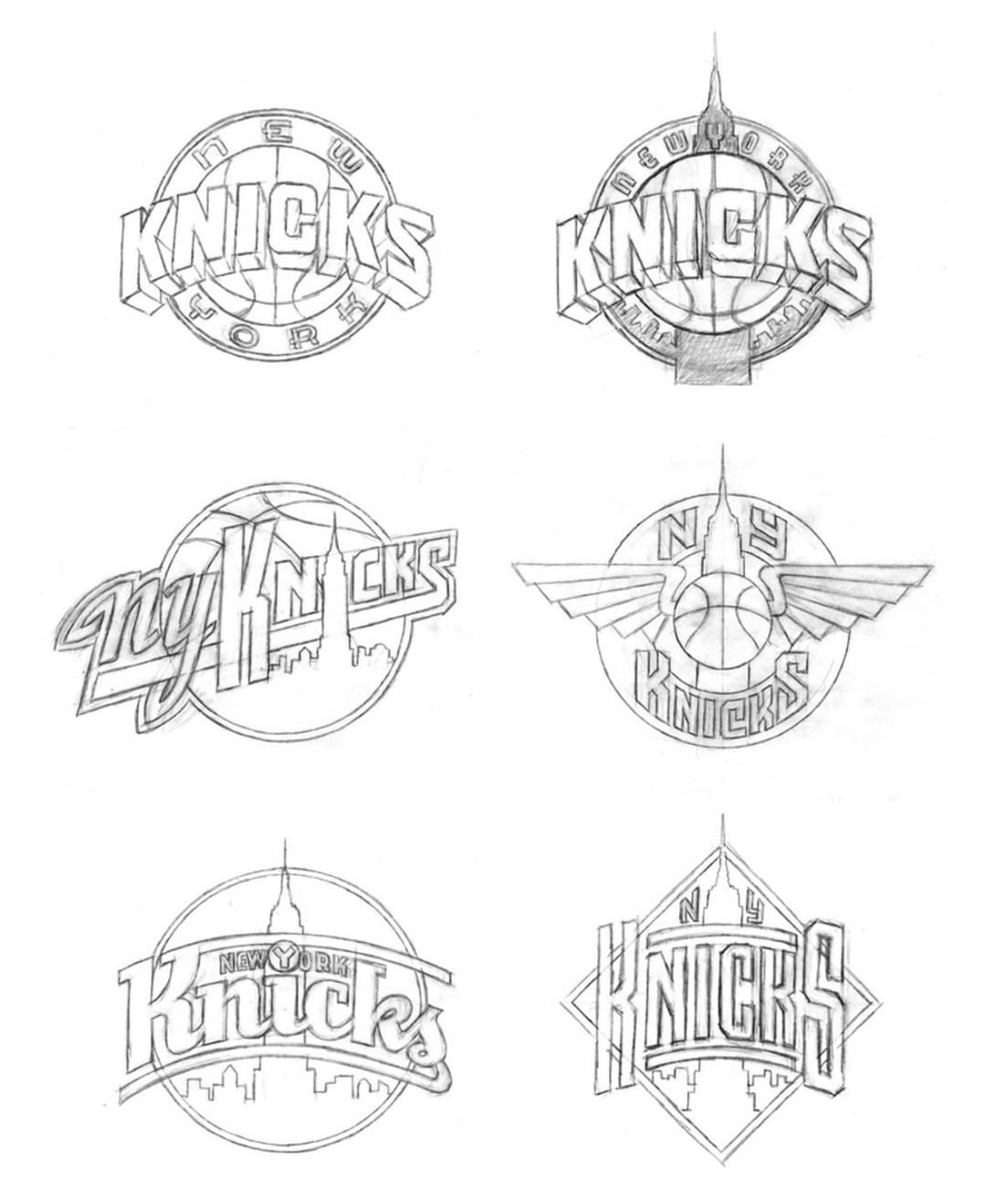
A lot of these Empire State ones would’ve been a lot more interesting than the boring minimalist logo they went with.

A lot of these Empire State ones would’ve been a lot more interesting than the boring minimalist logo they went with.
24 comments
Yup and Kith used some of these for his shirt designs last year 🙂
Cool stuff, I like a few of these!
we should have uniforms with all of these logos theyre all gas
BRING THESE ALL BACK! START THE PETITION
top right is dope.
I NEED THE EMPIRE STATE BUILDING LOGO
Love the ones that incorporate the city
Agreed – panel 1, top right is my fave
The silhouette of the city and empire state is sick. Really like that one.
The one with the wings moving me
Empire state building variations are quite phallic
Subway token logo>>>
Nice logo drawing NYC Knicks
If I remember the story correctly (been a while), they were very close to having the Empire State Building in the logo. But copyrighting issues with using the building got in the way, so that’s why the current logo is basically that but without the building.
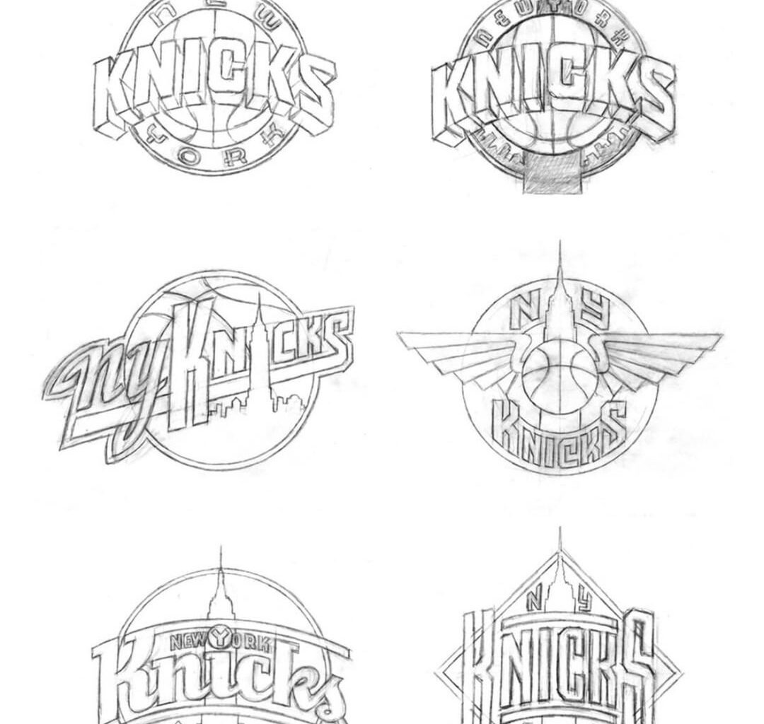
literally every single one of these is gas lol
Bottom left of the fifth page probably my favorite. I love a lot of them, and wish the logo incorporated more city motifs
Subway tokens used to be such a symbol for life in the city
They are literally all fire.
These are all sick
I love the triangle logo and it’s enduring legacy over the minimal circle logo that’s taken over the nba
in a league full of circle logos, im happy to be a fan of the one triange one LMAO
Top two go crazy
they are all fire
Very interesting
Yea we desperately need a new font and these were great ideas
These logos give me Seinfeld or late night talk show vibes for some reason.