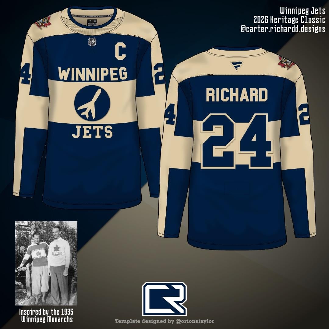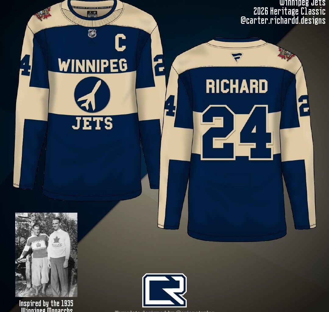
Hey all! I design concept jerseys for fun and real jerseys for a career, and i’m super pumped that we’re getting another outdoor game! I’m planning on making a bunch of different “what if” concepts for the Jets, and here’s the first, inspired by the 1935 Winnipeg Monarchs attached to the first and fourth photo. Would love to know your thoughts!


10 comments
Additional thoughts: This is definitely a bit niche and more than unlikely (I personally see them doing a Falcons throwback if anything) but wanted to do a bit of a what-if here. I don’t think there’s ever really been an NHL jersey with front lettering in this style before, so it’s a cool opportunity for something unique!
I like it. ✌️
Cool inspo but that’s a big no for me, dawg
Take my money. With some brown leather gloves/pads for the players….wow
It’s too much Leafs. Some red would help it a lot. I like the concept though.
Remove the wordmark and I’d say it’s pretty good
Nice start, but it needs some red. Without it, it too much of a leafs look, and we can’t have that.
Yup, love it. Red accents would be slick, but I can dig the simplicity here too
Make the numbers red and the sun red
This would be pretty crazy but I kinda like it