I don’t understand how this makes its way through approval processes. Surely someone had to say these are lazy and look like shit
did AI design these?
Trash Boring and Lame
This cant be real…. right?
I’m honestly hyped to be saving $250 on one of these. Fucking gross
Why are we so resistant to wear blue on black?
These are even worse than I imagined. GAG.
Correct.
Sometimes I don’t like the look of a jersey when it leaks but it eventually grows on me. There’s no way it’s happening with these
I was kind of hoping some Bucs colors were tied in somehow. Huge missed opportunity
TBL sounds like a disease the Bleuth company would throw a fundraiser dinner for.
How there’s no pirate/buccaneer tie in for a game at RayJay on Gasparilla weekend blows my mind
🤣
I don’t mind them trying something different, but these ain’t it.
just do the damn reverse retros, they’re great
What even are these colors?!
Genuinely looks like this took 15 minutes to plan, design and sign off.
I can wear this to every ugly sweater holiday party for the rest of eternity.
I guess it’s hard to come up with a pirate themed logo for the game in the stadium with the pirate ship that’s happening during the annual pirate festival. If only someone had done that.
If this is real I’m not buying g
Who designs these team special unis anyway? Someone with the league or someone working for the teams?
Hope no one buys these jerseys. Everyone involved in designing and approving this should be ashamed.
If they swapped the baby blue with black it might look pretty good
Man, the quality of our merch has nosedived in the last year or two. I haven’t even wanted any of the new stuff for a while. They must have fired or lost the talent behind some of the stuff around our cup runs.
in general we’ve had more bad jersey changes/decisions etc since we went away from black being a primary – idgaf if we won 2 cups with the blue and white – it’s always been annoying to me and they’ve always coincided with poor design changes – and that’s not even getting into all the toronto shit
Fanatics = Bad
We all know they should be creamsicle orange.
Looks like one of those cheap knock of brands or toys they make to not get sued , eh the color isn’t bad but change the tbl
It’s just the damn diagonal word mark on the chest I don’t like. I know stadium series jersey always do these weirder things but damnit man stop with the damn “bolts” style cheer logos lol

36 comments
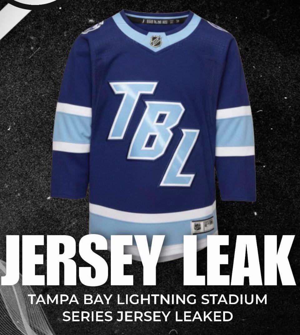
Slightly higher quality image but yeah these are dogshit.
Truly atrocious. Looks like it was made in 5 minutes.
What the actual fuck are these
Wow, I think I saw these on NHL 25, they are under template #4
Who approved this TBL shit ffs
what are we, Utah???
Better image. I cant figure out where the beading is
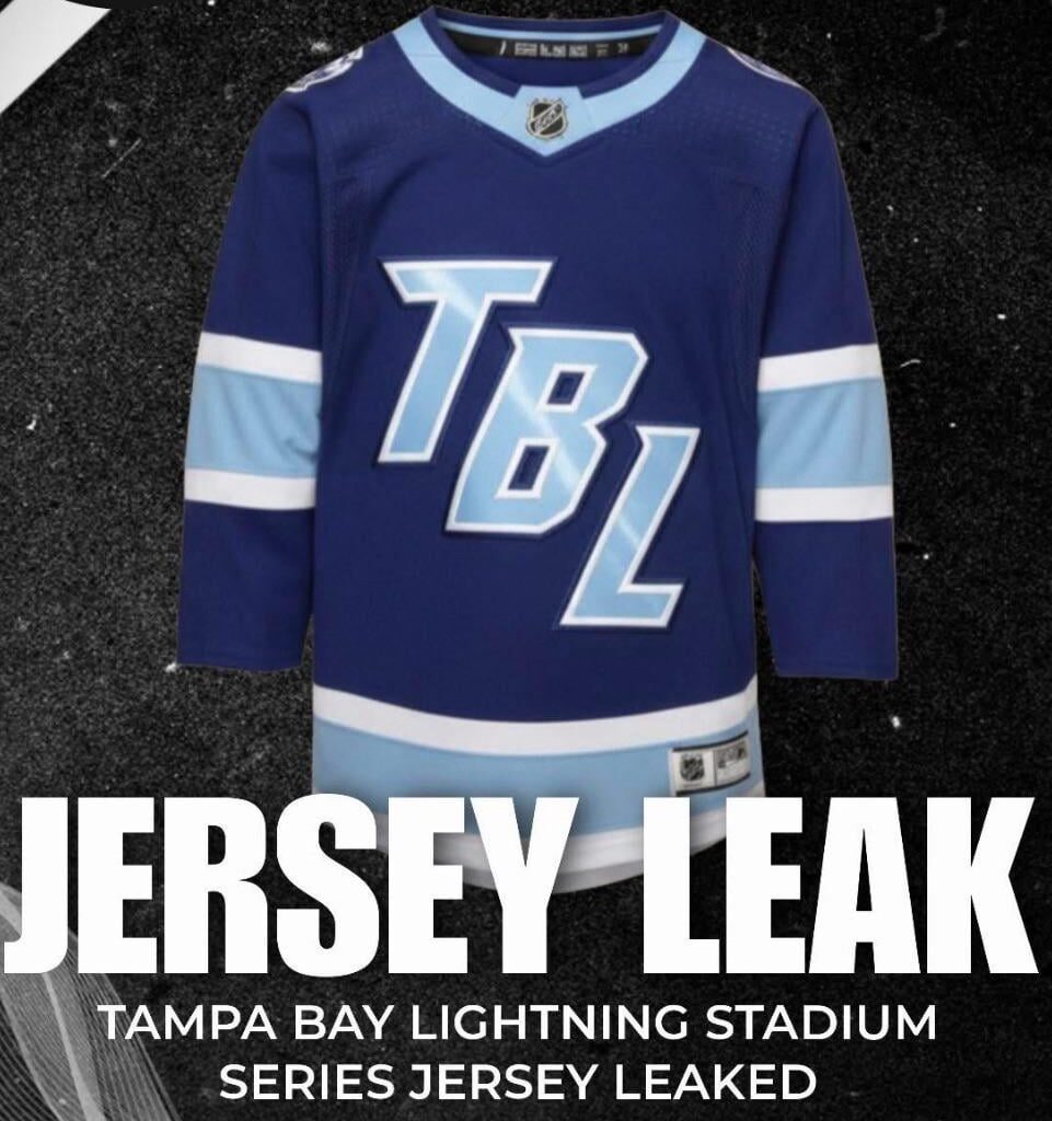
https://preview.redd.it/uldc3j1rjm6g1.jpeg?width=1080&format=pjpg&auto=webp&s=4ac0d77e81374fa28f1e477111446f518cfa771a
I don’t understand how this makes its way through approval processes. Surely someone had to say these are lazy and look like shit
did AI design these?
Trash Boring and Lame
This cant be real…. right?
I’m honestly hyped to be saving $250 on one of these. Fucking gross
Why are we so resistant to wear blue on black?
These are even worse than I imagined. GAG.
Correct.
Sometimes I don’t like the look of a jersey when it leaks but it eventually grows on me. There’s no way it’s happening with these
I was kind of hoping some Bucs colors were tied in somehow. Huge missed opportunity
TBL sounds like a disease the Bleuth company would throw a fundraiser dinner for.
How there’s no pirate/buccaneer tie in for a game at RayJay on Gasparilla weekend blows my mind
🤣
I don’t mind them trying something different, but these ain’t it.
just do the damn reverse retros, they’re great
What even are these colors?!
Genuinely looks like this took 15 minutes to plan, design and sign off.
I can wear this to every ugly sweater holiday party for the rest of eternity.
I guess it’s hard to come up with a pirate themed logo for the game in the stadium with the pirate ship that’s happening during the annual pirate festival. If only someone had done that.
If this is real I’m not buying g
Who designs these team special unis anyway? Someone with the league or someone working for the teams?
Hope no one buys these jerseys. Everyone involved in designing and approving this should be ashamed.
If they swapped the baby blue with black it might look pretty good
Man, the quality of our merch has nosedived in the last year or two. I haven’t even wanted any of the new stuff for a while. They must have fired or lost the talent behind some of the stuff around our cup runs.
in general we’ve had more bad jersey changes/decisions etc since we went away from black being a primary – idgaf if we won 2 cups with the blue and white – it’s always been annoying to me and they’ve always coincided with poor design changes – and that’s not even getting into all the toronto shit
Fanatics = Bad
We all know they should be creamsicle orange.
Looks like one of those cheap knock of brands or toys they make to not get sued , eh the color isn’t bad but change the tbl
It’s just the damn diagonal word mark on the chest I don’t like. I know stadium series jersey always do these weirder things but damnit man stop with the damn “bolts” style cheer logos lol