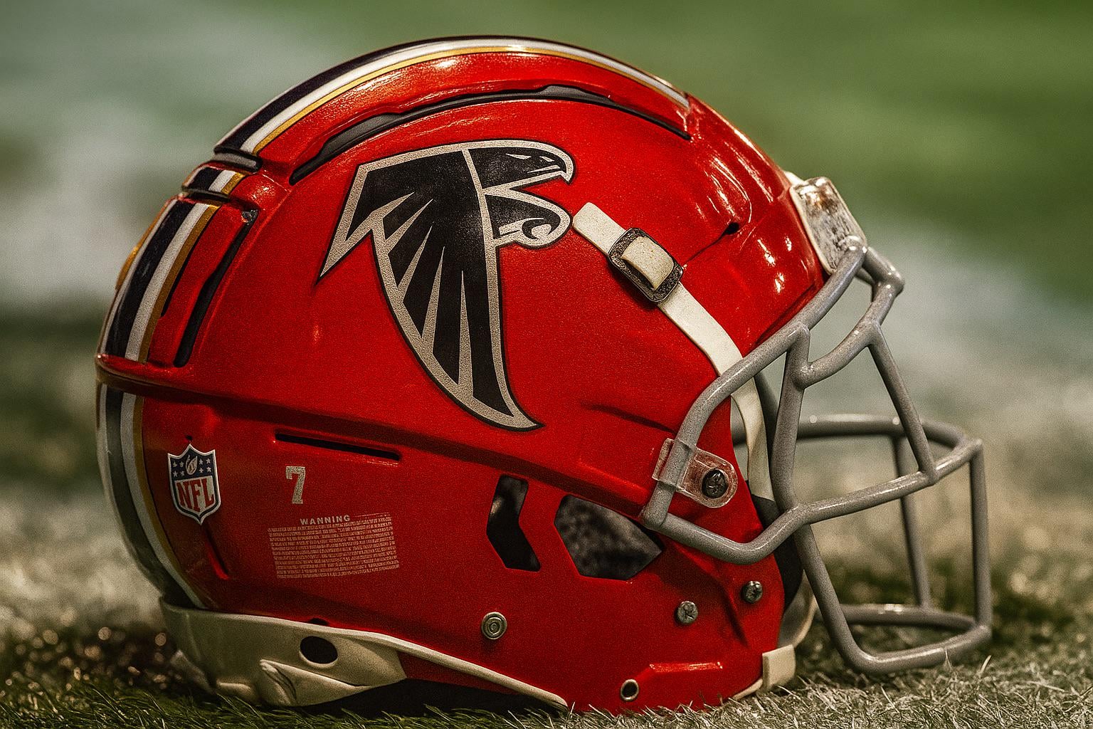
Since we’re getting new unis, I updated my concept for a modernized combo of the old and new logos. Personally would love to see something like this moving forward.

Since we’re getting new unis, I updated my concept for a modernized combo of the old and new logos. Personally would love to see something like this moving forward.
14 comments
this is perfect
Absolutely fantastic!! I love the red helmet…. I wish it was a permanent fixture. I went to a many Falcons games back in the ’80s, and whenever I see the red helmet it just takes me back to all those memories!!
I don’t know if you can claim that you updated it when it’s AI.
I’m a fan of the current logo, but this? This is amazing.
yes
I’d kill for a red Helmet

not really a huge fan of our current logo but this is literally a perfect mesh of the two
The head of the falcon..the face..jacked up
I can dig it. My only big complaint with our current jerseys are the numbers. Why make 1s and 7s the same shape basically
This is incredible work. Love the vision.
This is a perfect modern redesign
That’s definitely cool
We have one of the better logos in the league. Would be so on brand for them to mess that up
As for the helmet design—approved!