
Just a quick chart to share with the sub.
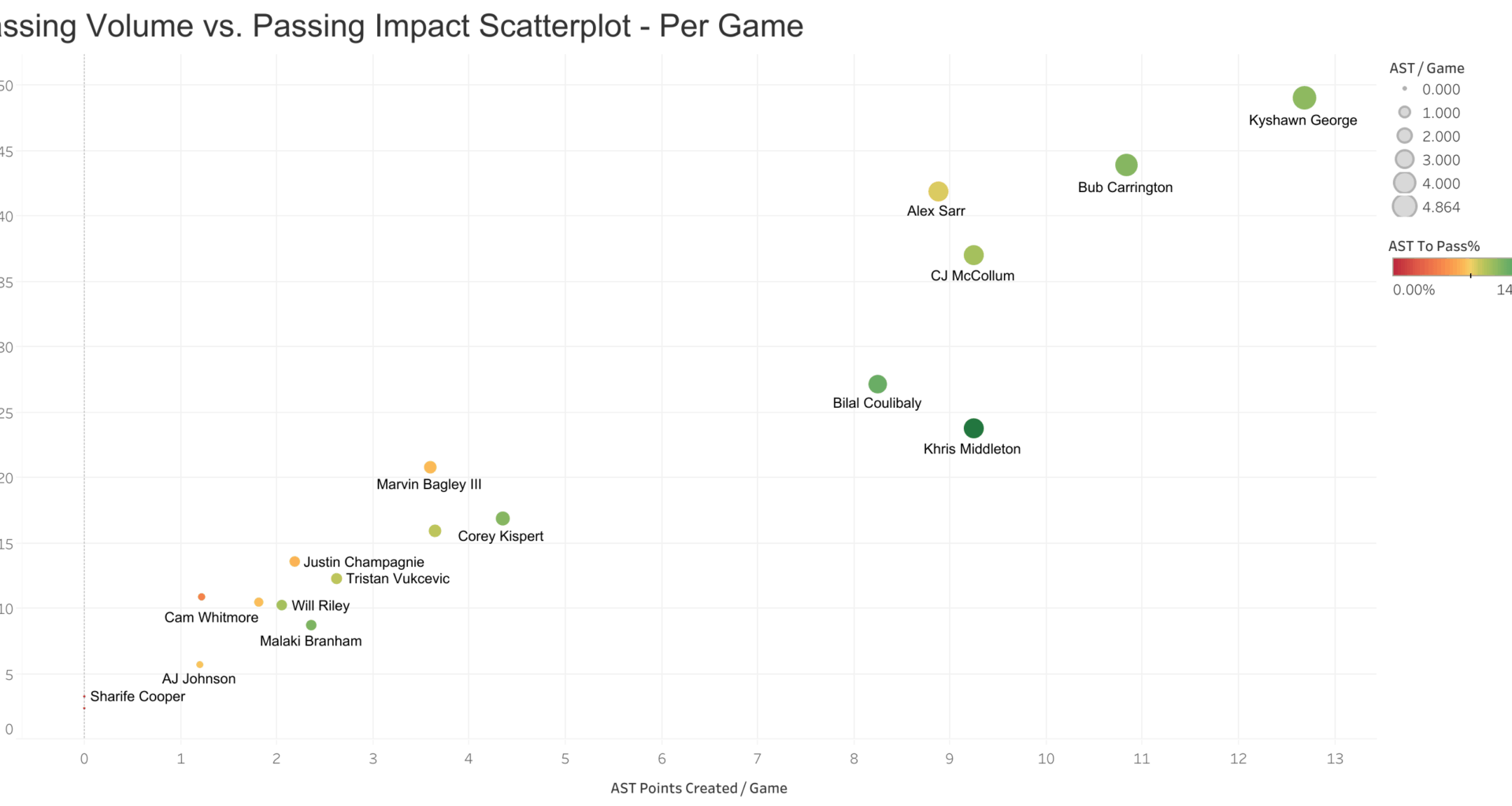
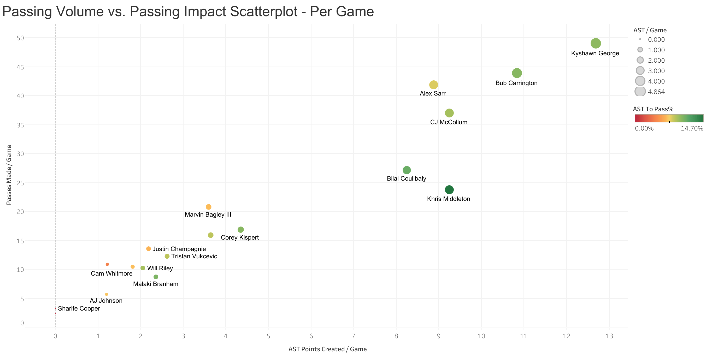
- The vertical axis shows passes made per game.
- The horizontal axis shows assist points created per game.
- Each bubble is a player
- The size of the bubble represents their average assists per game
- The color of their bubble shows represents their AST to Pass% compared to other players on the team. AST to Pass% = the number of passes that convert to assists.
We can really see just how impactful Kyshawn has been this season as he leads the team in both passes made and assist points created. He's truly become the teams primary facilitator.
Bub isn't too far behind him, especially given that Bub's playing time has been a bit inconsistent.
Some other interesting notes are Bilal and Khris' stats. They certainly don't have the same amount of passes per game or points created, but when they do pass the ball they tend to convert to passes almost more than any other players on the team.
If you're interested in seeing more charts and graphs you can check out the District Analytics page on Tableau Public
I'm hoping to build a number of reports and dashboards to share insights since this sub has shown an interest in this kind of information. It will all be free and public on Tableau Public.